-
08 14 13
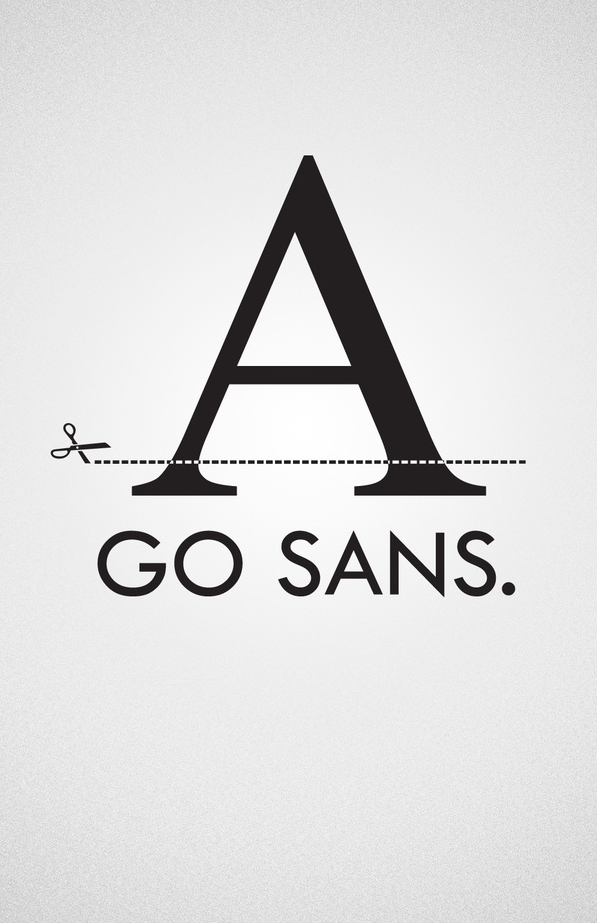
The right type… To clean up your act. To look more modern. To attach yourself to a particular era in time. For greater legibility online. Just for a change of pace. With attitude or without. A good looking sans serif can be your new great love. Go sans…
-
08 13 13
“Off-Color Wordplay From Kraft, Part of a Big Marketing Blitz”, by Stuart Elliot of the The New York Times looks at a change in main stream marketers message in advertising. Specifically, with Kraft, it is clear from the new ’Kraft Recipe Maker’ ads that we are living in the post-Zesty Guy era of advertising. This time, the off-color comes from the product’s tagline “Get your chef together.” The tongue-in-cheek tagline, a play on the more profane phase, is not meant to offend, but to appeal to new consumers, specifically the younger set. Why not make food advertising fun? Of course, not everyone is a fan. Anthony Sperduti of New York-based agency Partners & Spade contends the ads could be damaging in the long term as they foster the idea that Kraft is a “potty-mouth brand.” What bothers us about the ads is not the tagline, not the potty-mouth dialogue, but the creepy, bobble-headed Rocco DiSpirito and Carla Hall. Not to mention their B status in the food world. Simply, not appetizing or well-krafted…
-
08 13 13
Prada | Fall/Winter 2013 Men’s Campaign. While the girls get all the attention, big luxury brands still try not to forget the guys. And when Mrs. Prada calls, everyone steps up to the stylish plate. Renowned photographer David Sims captures the stars in a stylized interior populated with geometric furniture, designed by OMA for Knoll, borrowed from ‘The Ideal House’ conceived by OMA for the Prada Fall/Winter 2013 fashion show. Featuring actors Christoph Waltz, Ben Whishaw and Ezra Miller. Music credit “Splash Course” by Javier Morales & Melodyssey. Love the set build sequence in the beginning. Nice to get away from the perfectly boyish models for a change. Otherwise, seems a little tame for the generally genius house of Italian cool. And damn shame The Hour got the ax…
-
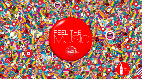
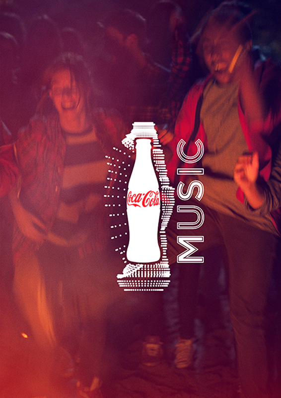
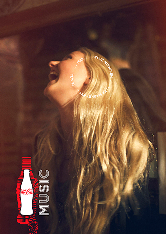
08 13 13
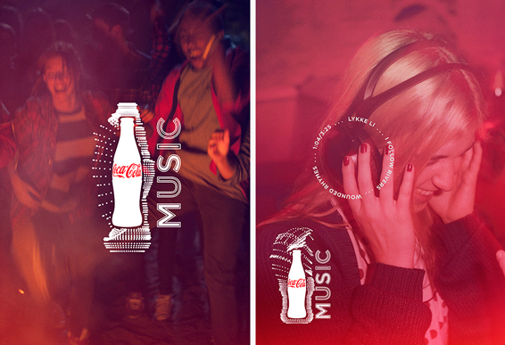
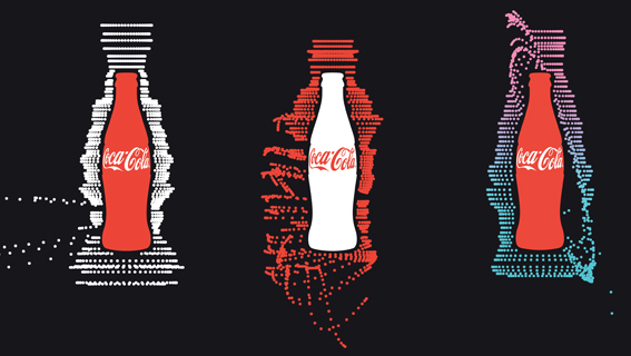
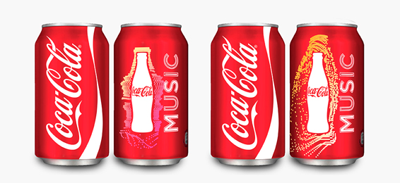
Coke looks to recharge Coca-Cola Music campaign in an attempt to connect with its targeted teen audience. The rebrand focuses on a dynamic new logo—Classic Coke bottle surrounded by bubbles that change depending on the sound signature applied. In addition, creatives and marketers have access to a new app that allows them to to change the colors, animation, bubbles and audio in the logo. New photography takes cues from Instagram, and tries to represent teens in their natural, musically lush world. Expert execution by the consistently brilliant Wieden + Kennedy (Amsterdam). Now we wait to see if younger Coke customers will dance to the new beat…
-
ID change is a brewin’… Yahoo! For the first time in 18 years, Yahoo is redesigning its logo, and doing it with a bit of panache. According to video, Yahoo! will release a different version of its current logo everyday day for 30 days. An effort they call 30 Days of Change. The initiative’s launch video shows the identity morph into various configurations, leading the viewer to wonder about the many possibilities and where they might want to go. CMO Kathy Savitt says the logo change, “will be a modern redesign that’s more reflective of our reimagined design and new experiences… We also want to preserve the character that is unique to Yahoo! – fun, vibrant, and welcoming – so we’ll be keeping the color purple, our iconic exclamation point and of course the famous yodel. After all, some things never go out of style.“ Smart idea to give the public a little time to get used to the idea. But admittedly, a little dangerous. No one wants another Gap fiasco to play out. Fingers are crossed…