-
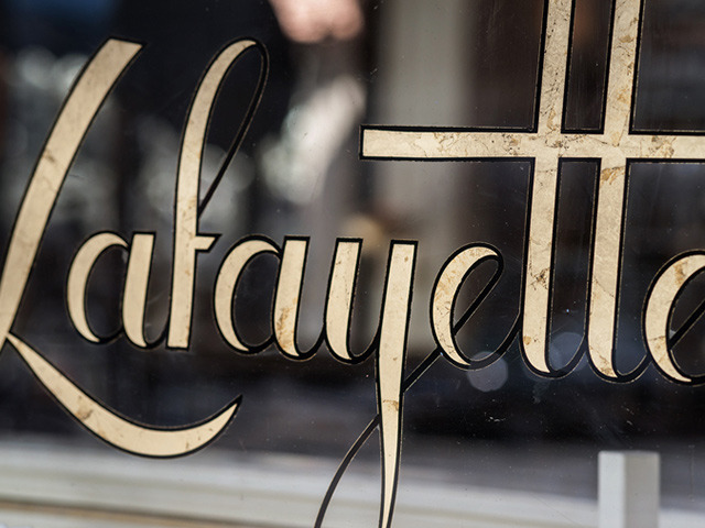
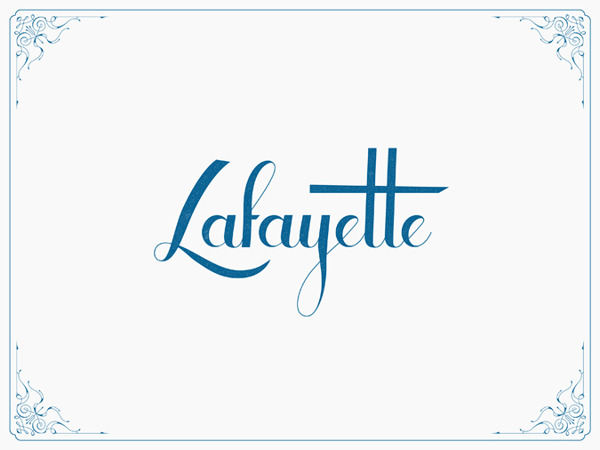
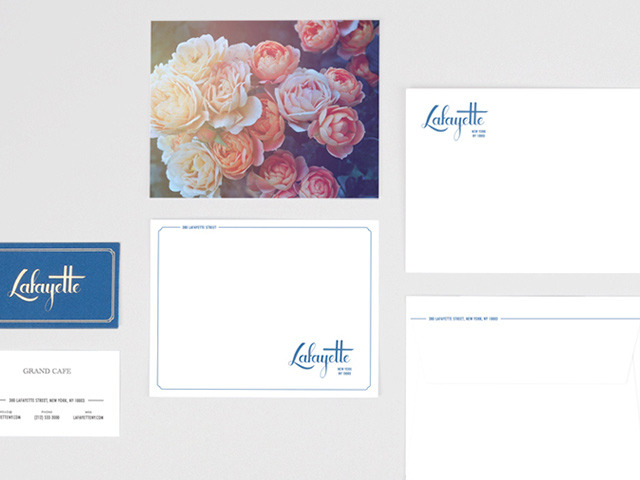
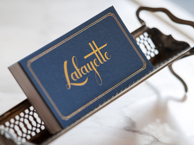
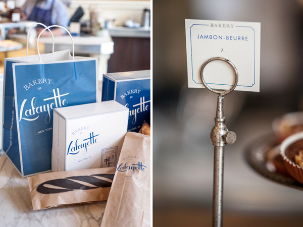
07 10 18
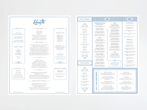
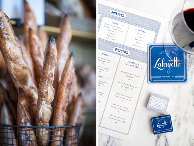
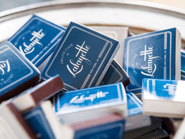
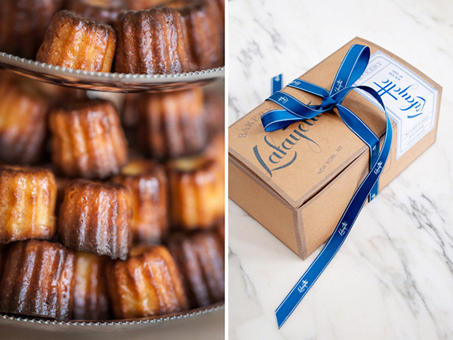
Lafayette restaurant & bakery branding by Oat.
-
06 29 18
Apple recently introduced a new advertising campaign titled “Behind the Mac” focused on its Mac computers. The new campaign is slated to be a series of videos that highlight individual stories by creators who have used Macs to “make something wonderful.” The tech giant kicked off the new campaign with a quartet of spots uploaded to its official YouTube channel. The videos feature an eclectic group of creators, including photographer and disability advocate Bruce Hall, music artist Grimes and app developer Peter Kariuki. A straight-forward take on the testimonial genre for Apple, but with the expected brand’s quality and flair. We definitely see this new campaign as a platform for many compelling stories in the months or years ahead. A solid series that straddles product advertising and user benefits…
-
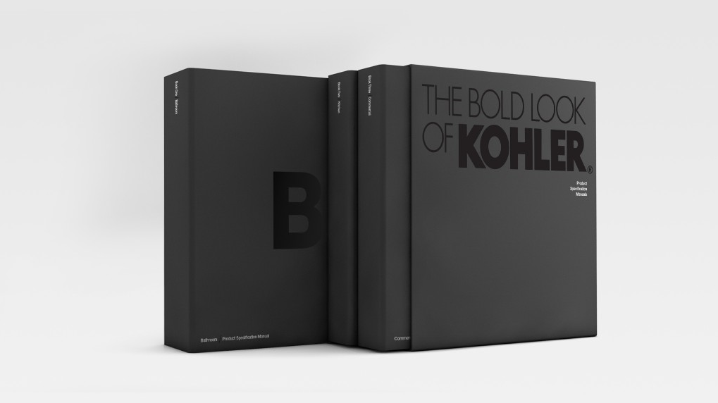
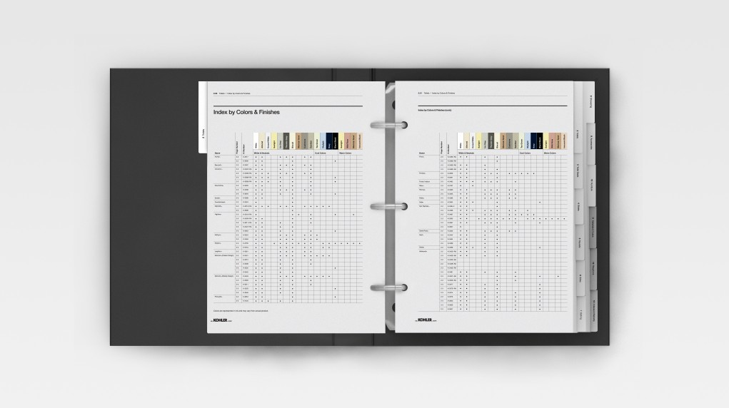
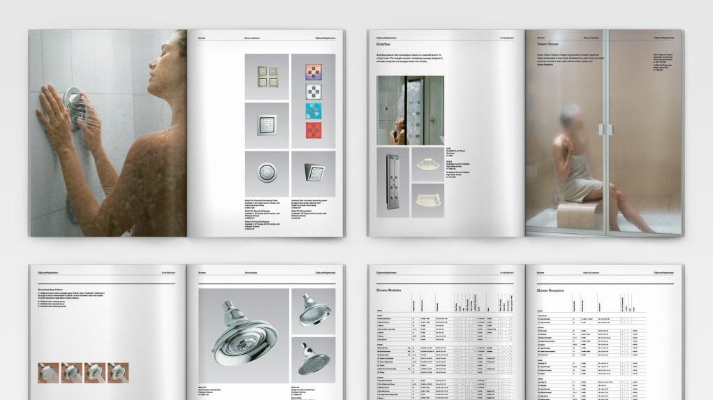
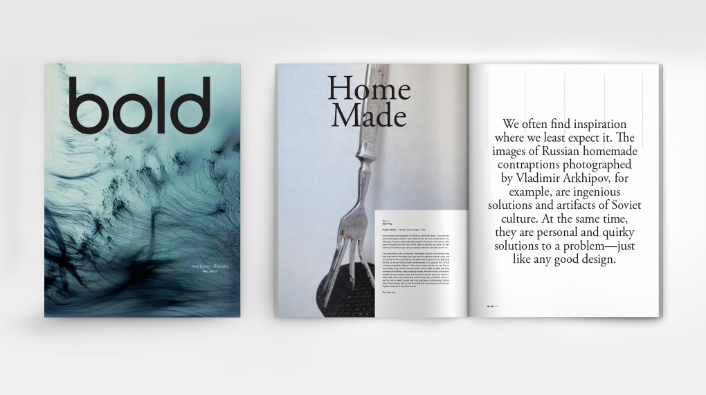
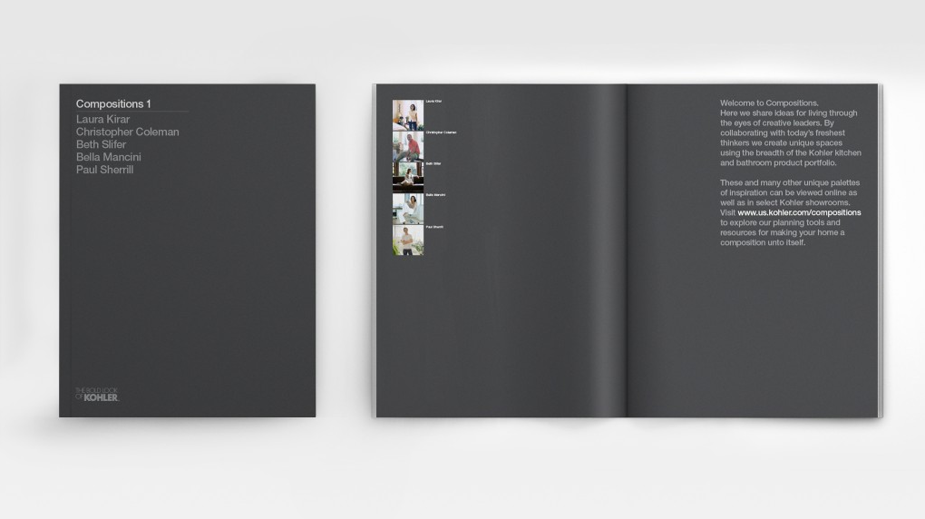
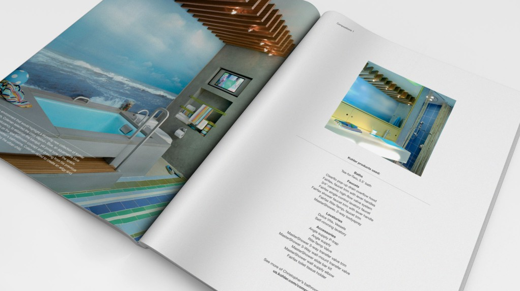
06 24 18
Kohler marketing literature system design by Ammunition.
-
06 11 18
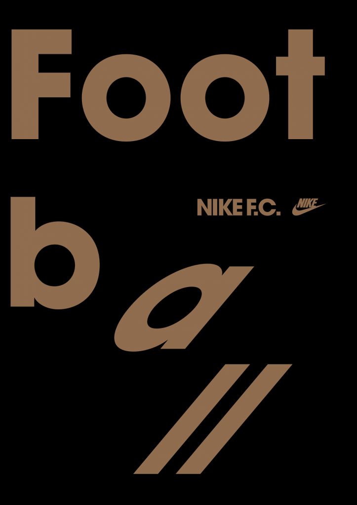
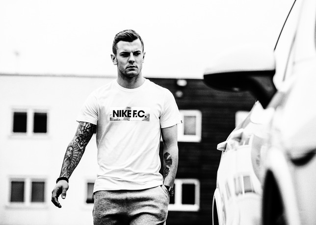
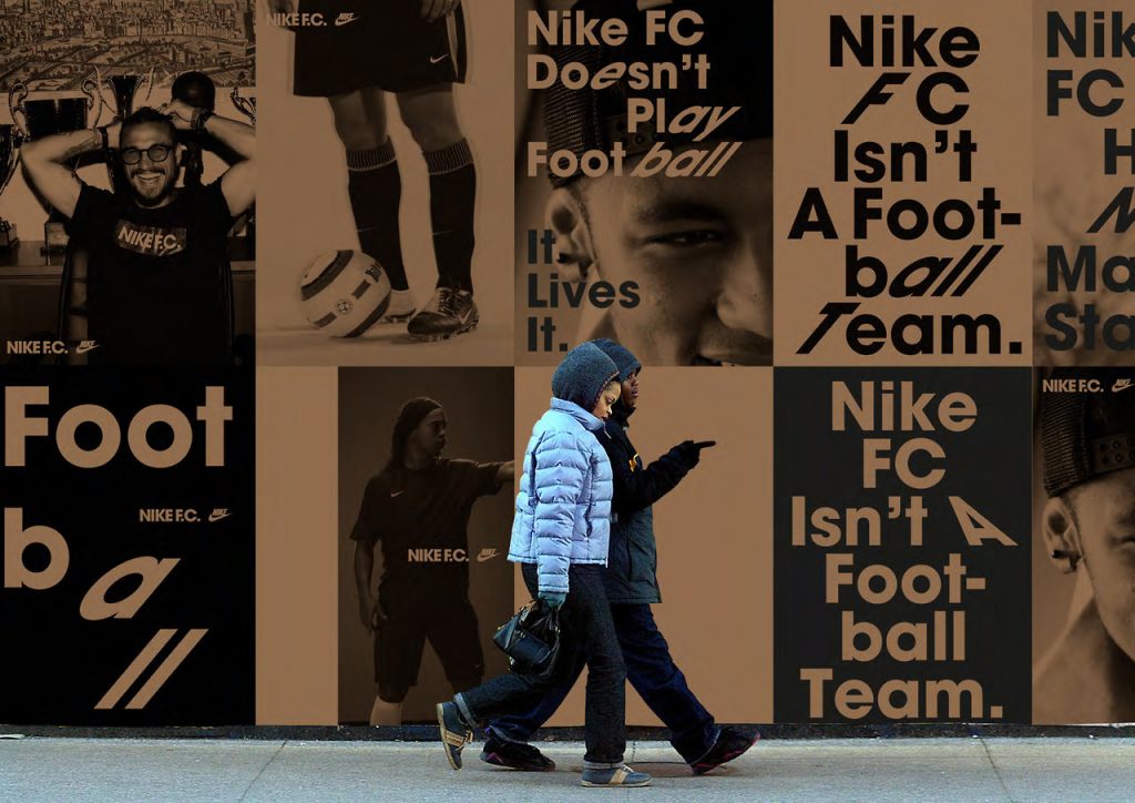
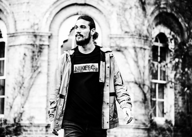
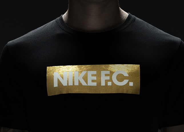
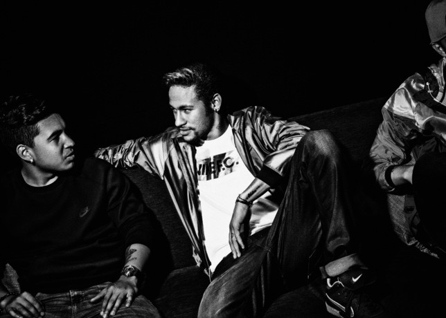
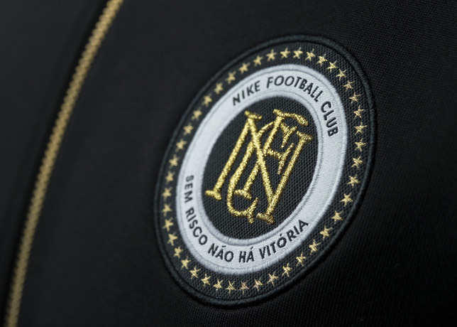
Sem Risco Não Há Vitória…. Without risk there is no victory. Nike ad campaign celebrates 20 years of football with its new Nike F.C. collection to “honor the all-or-nothing approach of athletes” the likes of Luís Figo, Fabio Cannavaro and Ronaldo who all exemplified the style and determination to do whatever it takes to win for their teams and countries. Black, white and gold color palette seems fresh in the world of football colors. Campaign is certainly consistent with the brand’s no pain-no gain style. We’re confident the new line looks like a (global) crowd pleaser…
-
06 08 18
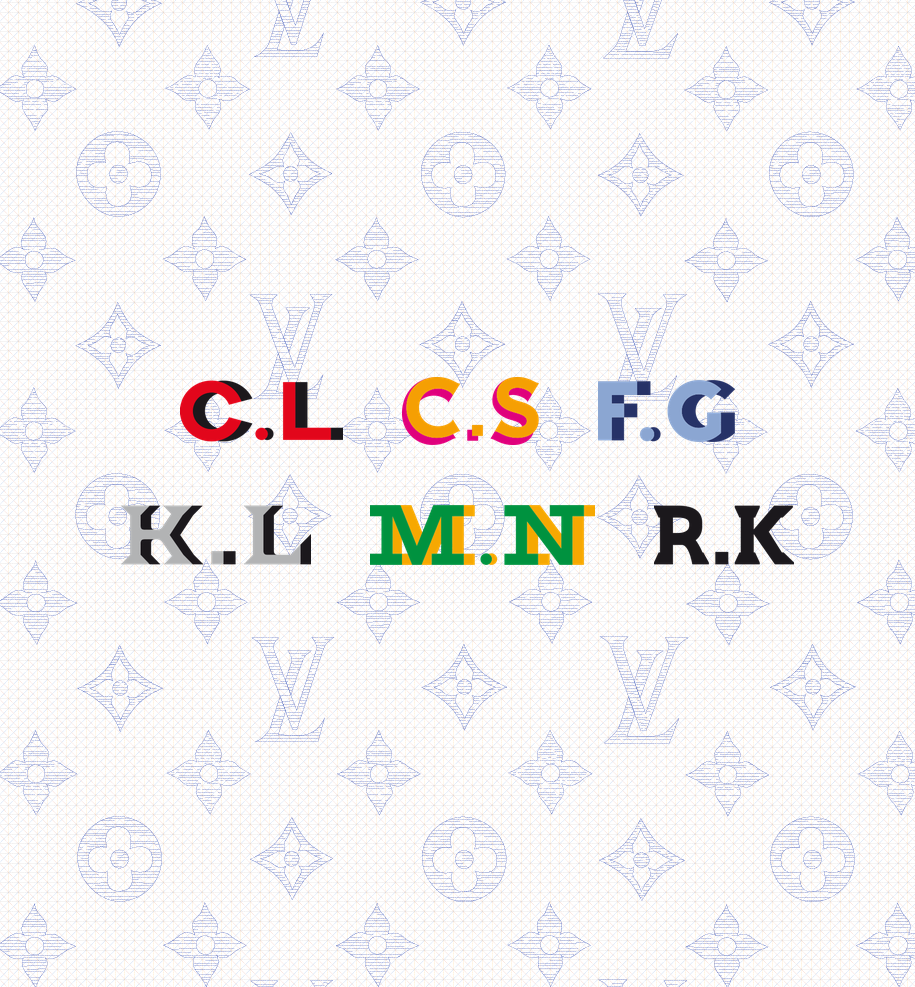
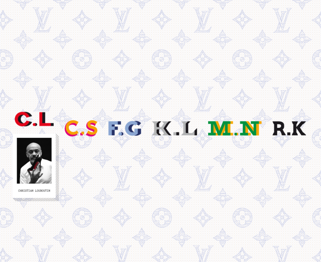
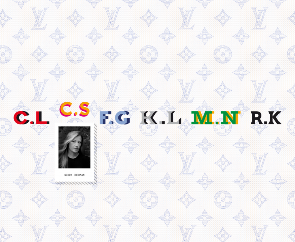
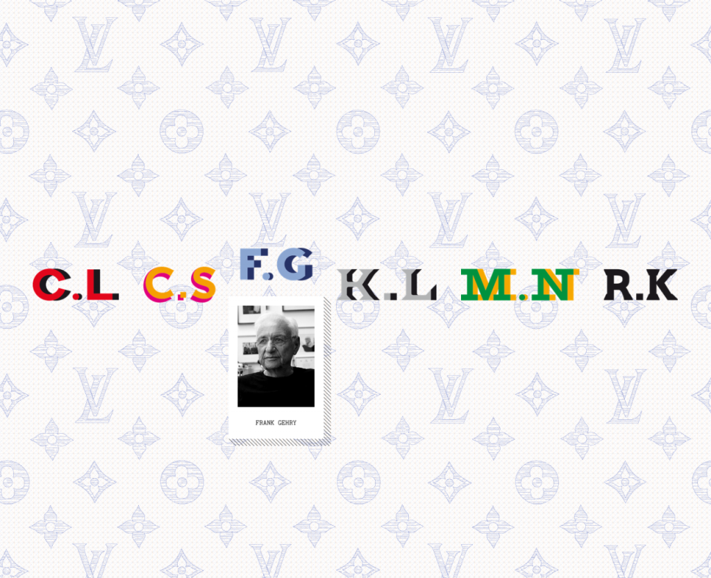
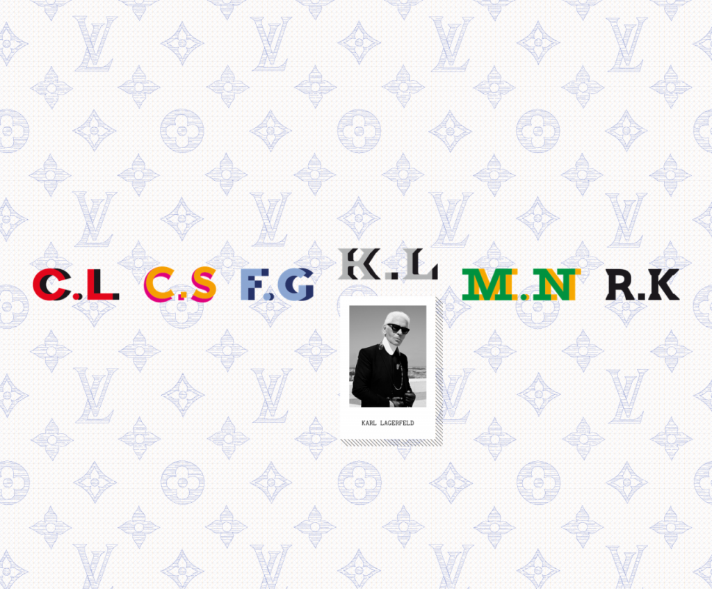
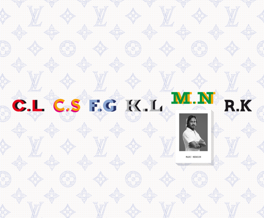
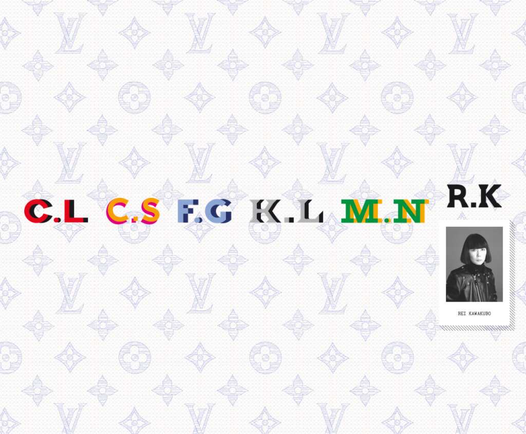
Louis Vuitton | The Icon and the Iconoclasts: A Celebration of Monogram. Louis Vuitton invites six renowned and creative iconoclasts, Christian Louboutin, Cindy Sherman, Frank Gehry, Karl Lagerfeld, Marc Newson and Rei Kawakubo to create a personally inspired bag and/or a piece of luggage, using the iconic Vuitton Monogram while keeping with the brand’s spirit of innovation, collaboration and daring. The project was initiated by Delphine Arnault, EVP of Louis Vuitton, and Nicolas Ghesquière, Louis Vuitton’s Artistic Director of Women’s Collections. Interesting for a designer luxury brand to collaborate with other designers. Certainly well conceived, executed and promoted. Major marketing points to the folks at Vuitton…