-
04 02 19
A fascinating look at the recent rebrand of the advertising giant, DDB (Doyle Dane Bernbach. The identity refresh is true to DDB’s extraordinary heritage and legacy, reflecting its classic approach with innovative thinking that salutes its storied past and an exciting and increasingly digital future ahead. The agency’s full name, Doyle Dane Bernbach, is retained within the redesigned mark in contrast to most agencies’ move to acronym of former principles’ names. The agency smartly retains the legacy of its founders who remain as two of the most celebrated figures in the history of advertising. We applaud the modernized identity and creativity demonstrated in this introduction. It will clearly serve as a flexible platform from which great creative work will undoubtedly flow.
-
03 20 19
#ffbdbd (prettycolors)
-
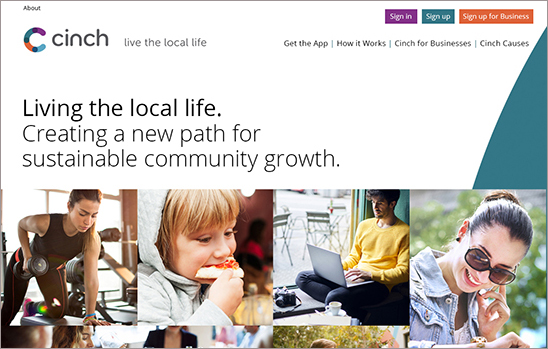
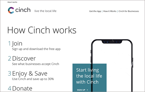
03 17 19
Kellyco@work | CINCH (brand identity, digital, promotion, social media). Designed new brand identity for consumer payment app that brings together residents, locally-owned businesses and local causes to foster meaningful community growth. Site content and design had goal of both reaching targeted consumers, as well as businesses. Tagline was also created following a series of user focus groups on brand perception. Promotion materials, presentations and social media standards were also developed.
-
03 08 19
McKinsey, the global management consulting firm has recently introduced a refreshed brand identity. The renowned consultancy that advises on strategic management to corporations, governments, and other organizations looks to better define its services along with its current philosophy. While most businesses have experienced significant change in the last five years, change for McKinsey has been especially extreme transitioning from big corporate strategic consulting to substantially more work in digital, analytics and design. The firm’s logo itself has not changed drastically (two lines vs. one line). Everything else seems to have either changed dramatically or evolved more subtly. A new approach to photography, data visualization, color palettes, fonts and other graphic elements give the brand an important new fresh point-of-view. A deeper blue is paired with white space to deliver high contrast and dramatic effect. Overall, it is a beautifully-executed, sophisticated refresh that demands attention and instills confidence.
-
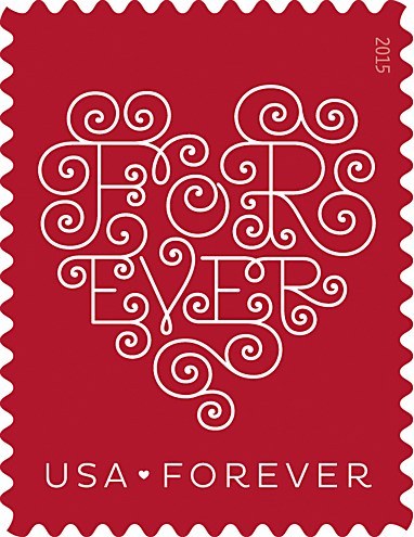
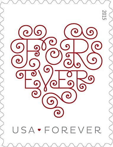
02 14 19
Recently introduced redesigned “LOVE” stamps for U.S. Postal Services. Antonio Alcalá, art director; Jessica Hische, illustrator; Studio A (Alexandria, VA), design firm. Now someone just needs to redesign the post office itself.