-
02 18 23
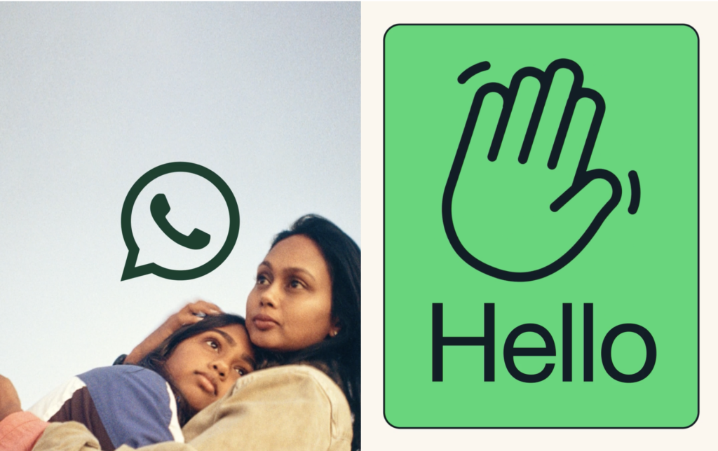
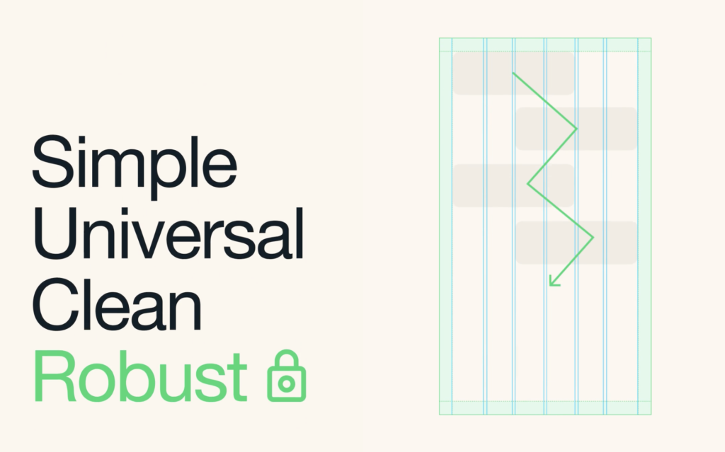
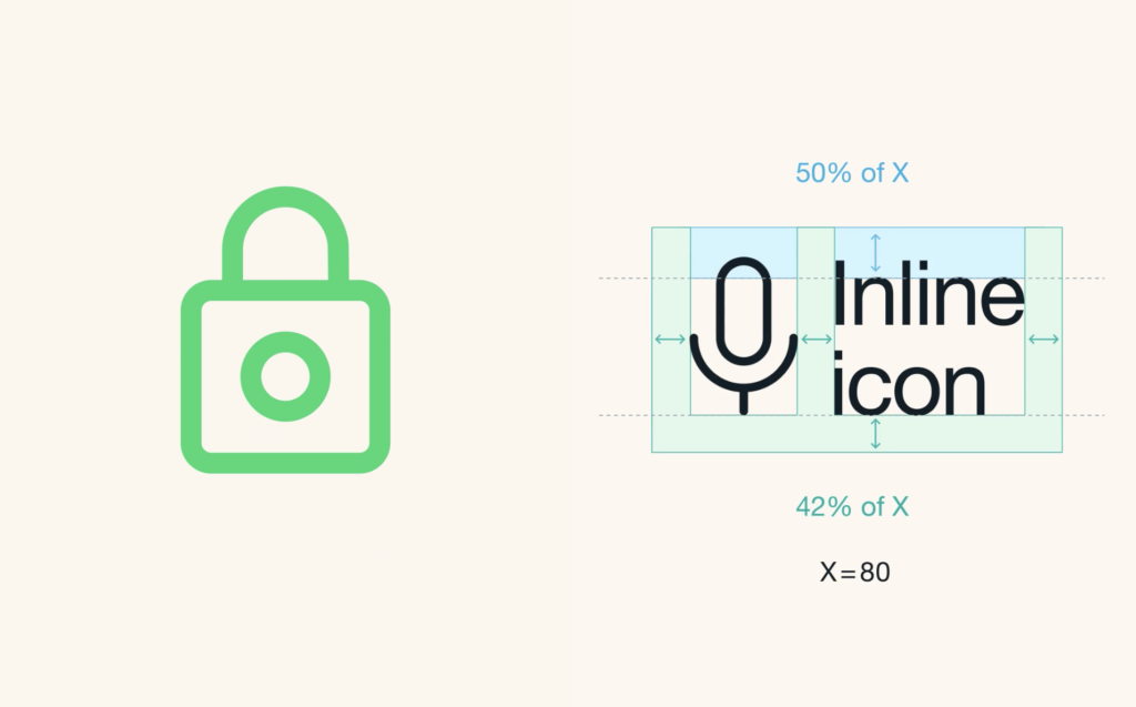
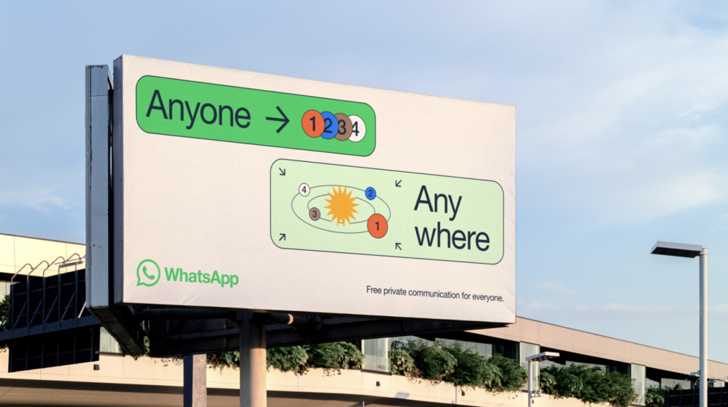
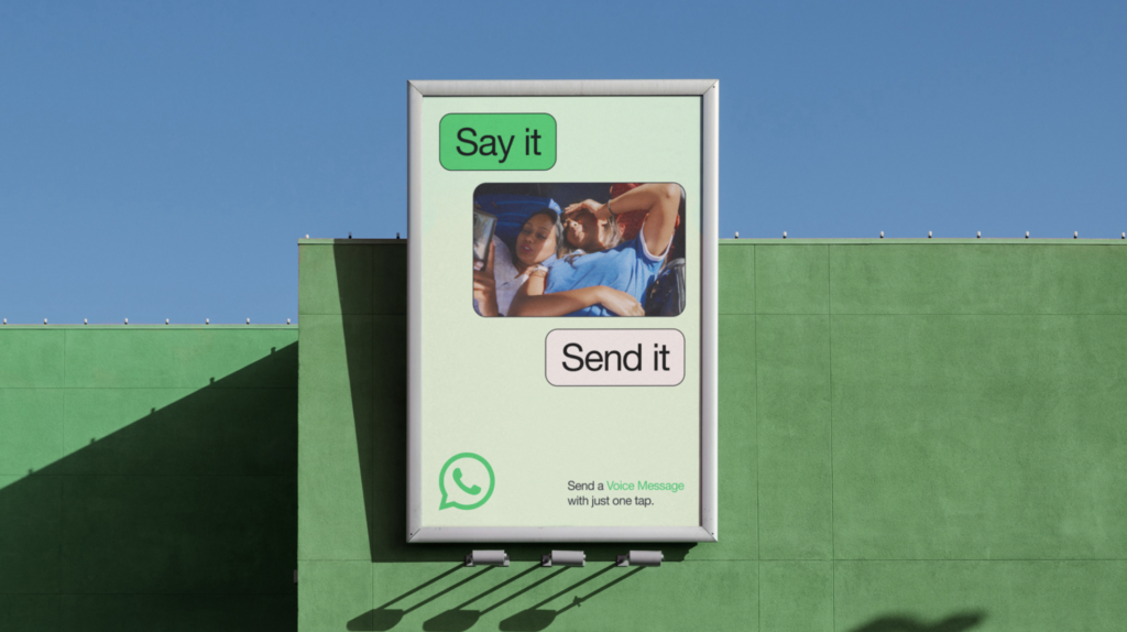
New design for WhatsApp which further blurs the line between product experience and marketing. Overall concept is “forward”, aspiring to deliver a more accessible robust experience for WhatsApp’s 2 billion+ users. A new extensive color palette is employed across different touchpoints, complementing the brand’s primary color, WhatsApp green. Dark mode settings are also effectively addressed. The primary graphic element, graphic modules housing messaging and content become flexible blocks for a broad range of storytelling. Classic Helvetica Neue is used as the primary font which provides clarity and a very clean modern aesthetic. The use of a thin black stroke around the rounder-corner boxes that house all of the content is both functional with different backgrounds, as well as a design-forward device.. Design firm, Koto has successfully delivered a needed reimagined app design for the Meta (Facebook) product. Bravo on all accounts.
-
02 10 22
Creative agency Wieden+Kennedy London has just launched a standalone branding and design firm, NOT Wieden+Kennedy to offer a faster option for clients responding to branding challenges.
With a team of designers, creative technologists, motion designers, 3D artists, brand strategists and writers, NOT W+K is slated to work with collaborators inside and outside the agency’s global network. The department is headed up by award-winning branding and design creative director Adam Rix, whose 20 years’ worth of experience has seen him work with clients including Nike, Dr Martens, BBC, Manchester City Football Club and the British Fashion Council. The dynamic graphic element (static or animated) in the identity does the spinoff justice. Not quite as sure about naming the group “not”, which straddles too cute and negative for the branding/advertising giant.
-
01 27 22
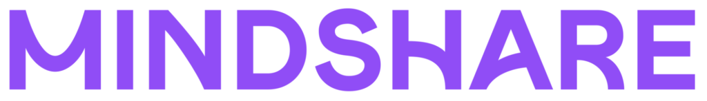
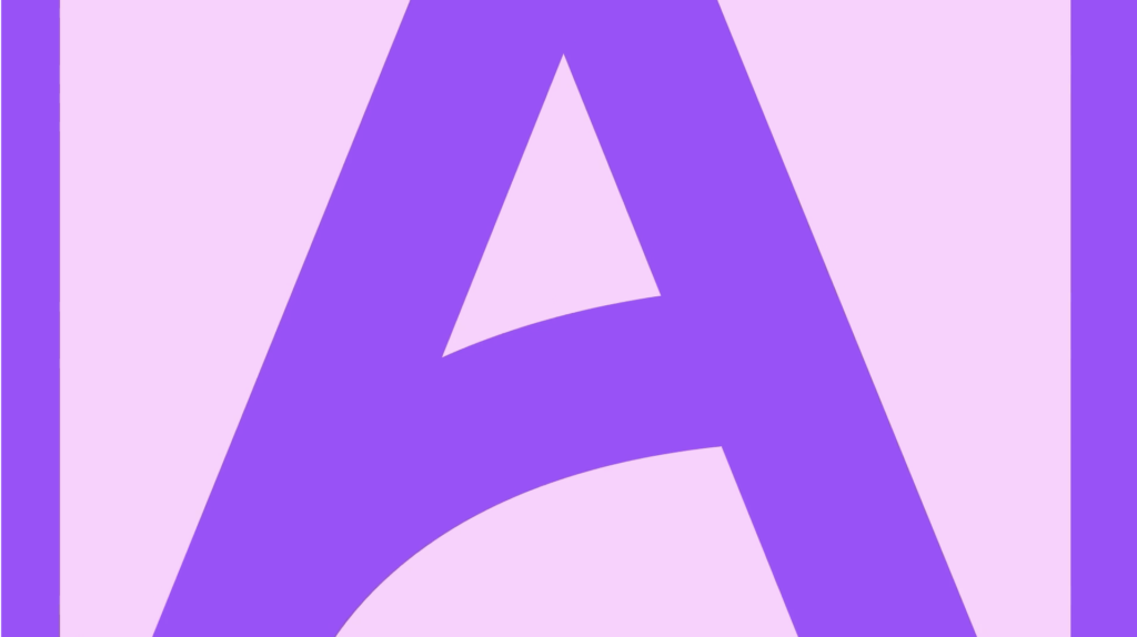
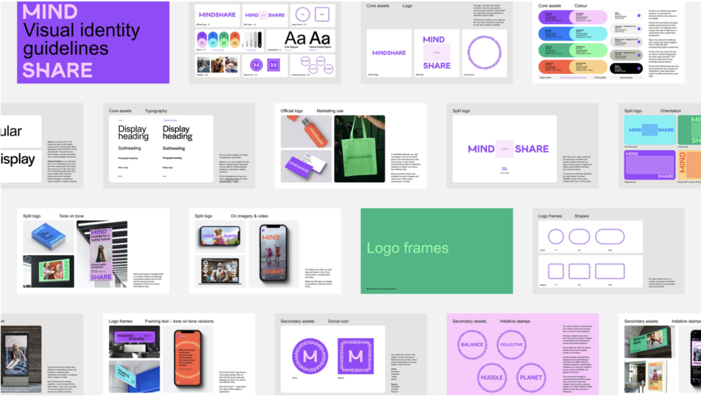
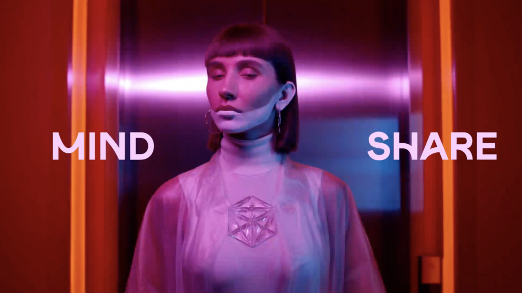
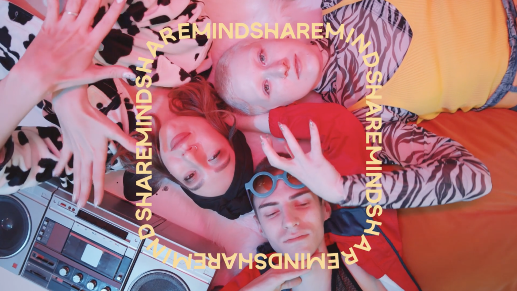
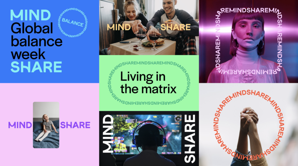
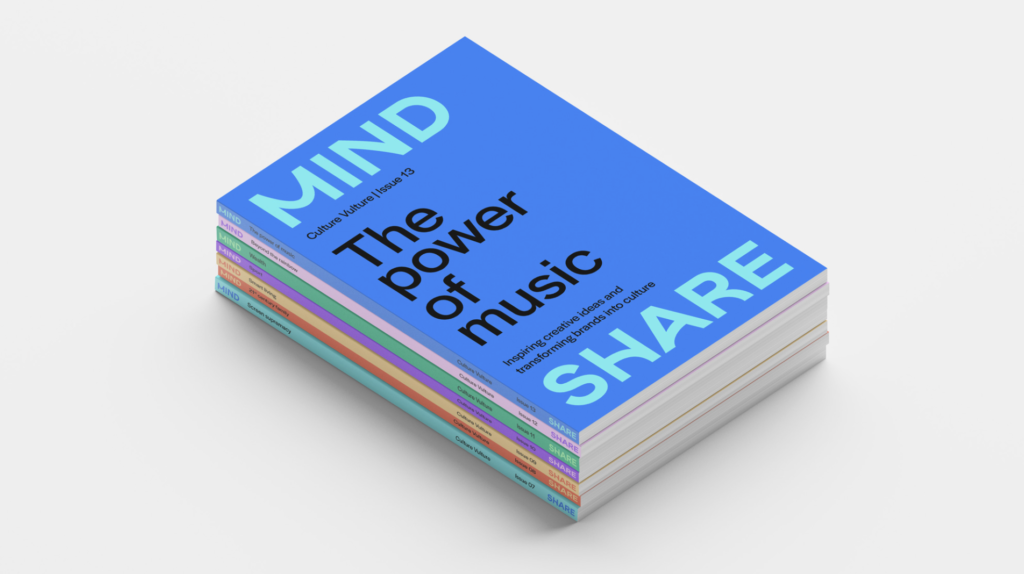
New brand identity for media agency. Mindshare, a global media agency network was established in late 90’s through the merger of the media groups of both JWT and Ogilvy & Mather. Mindshare partners with some of the world’s biggest companies. It positions itself as authentically data- and technology-enabled. The new logo is a sans serif wordmark where some of the letterforms that would normally be straight have been rounded into friendlier curved lines. The identity’s color palette is bright and accessible while suggesting knowledge and technology. Overall, a modern, almost-hip new brand identity for the mega agency group that should serve them well with its big ticket clients. The new identity was created by London, UK-based NB. No reinventing the wheel here but a solid refresh.
-
01 11 22
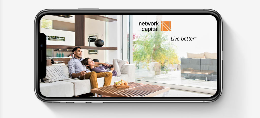
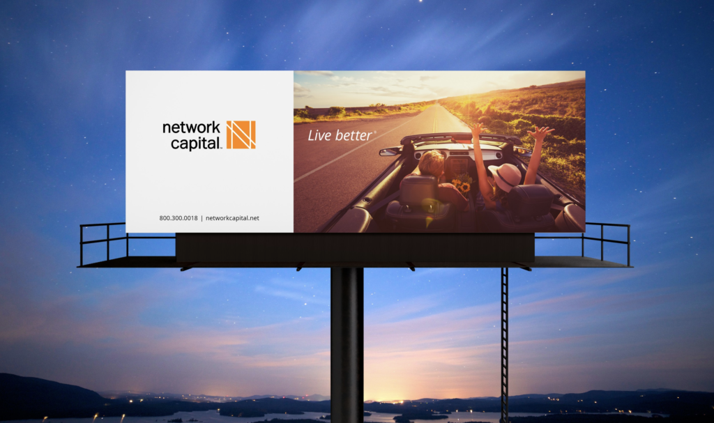
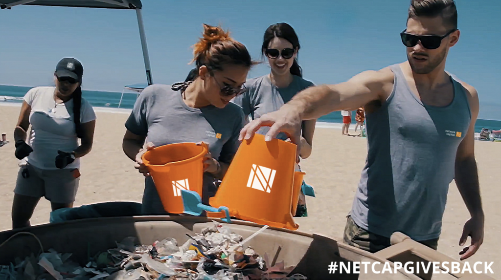
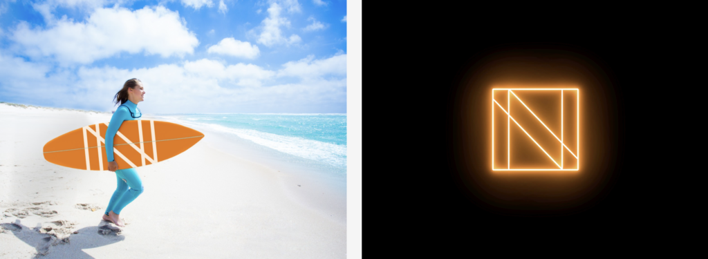
A new logo design for Network Capital, a fintech company providing mortgage lending and servicing to homeowners and homebuyers in 37 states. The new identity highlights the letter N in a bright orange color. Formed by scoring parallel white lines across an orange block, the new symbol is both simple and elegant—giving the brand name weight and distinction. Creative work by renowned brand design firm, Chermayeff & Geismar & Haviv.
-
12 15 21
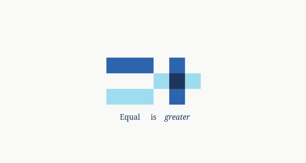
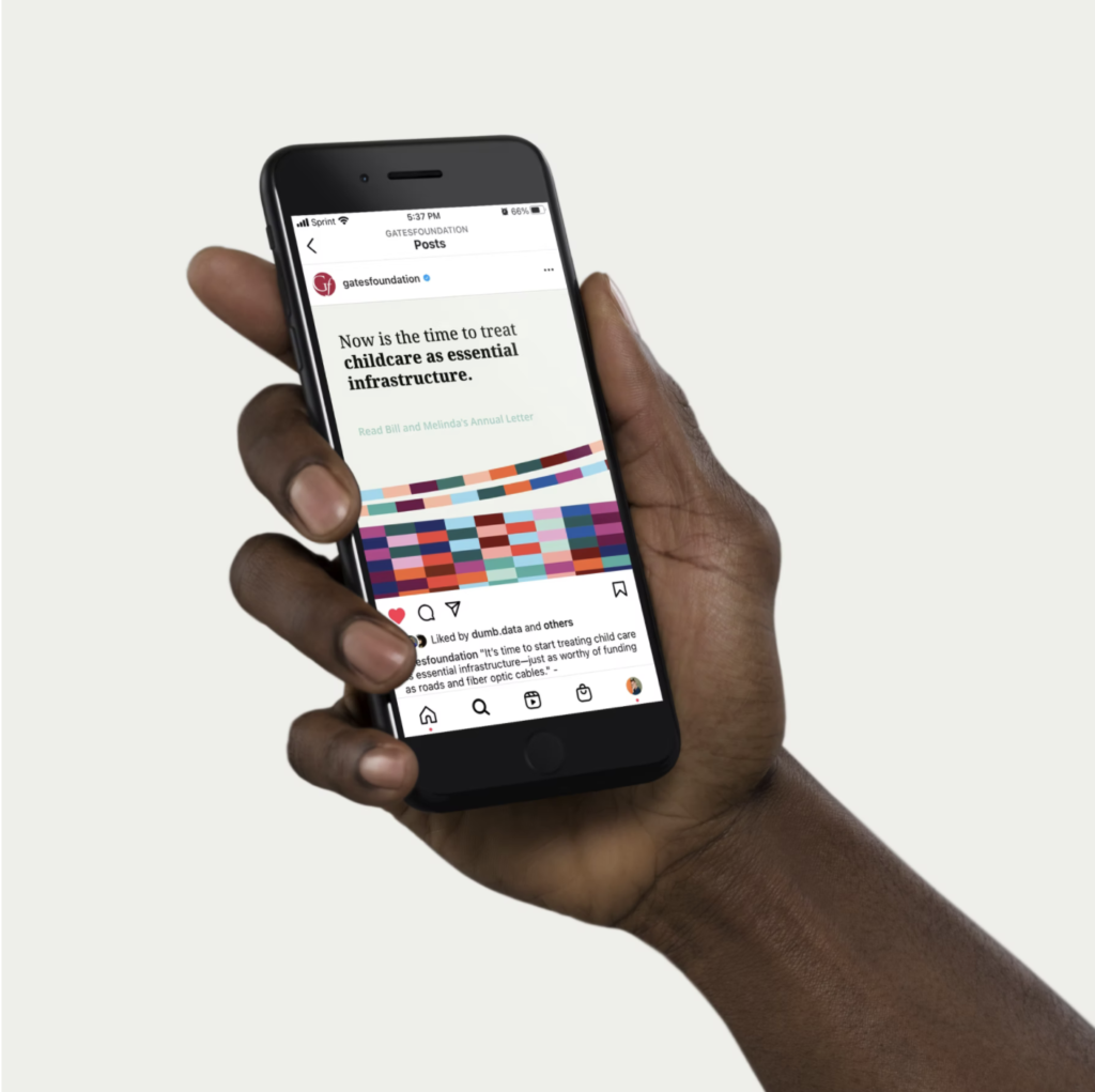
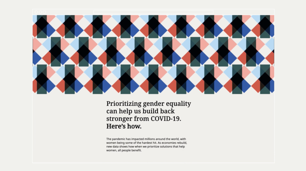
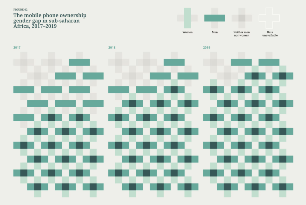
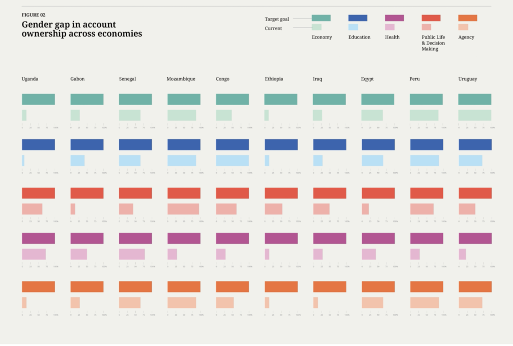
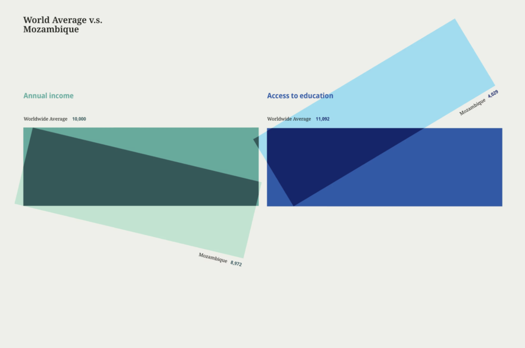
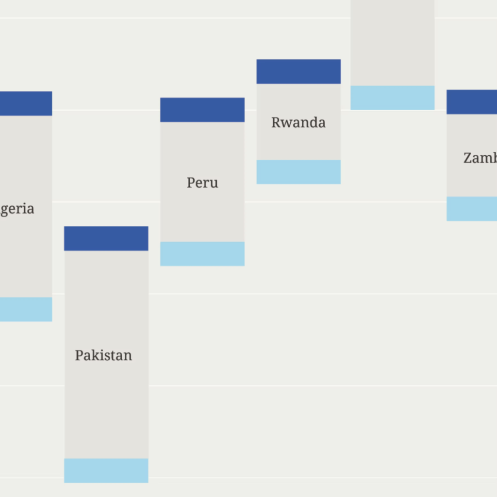
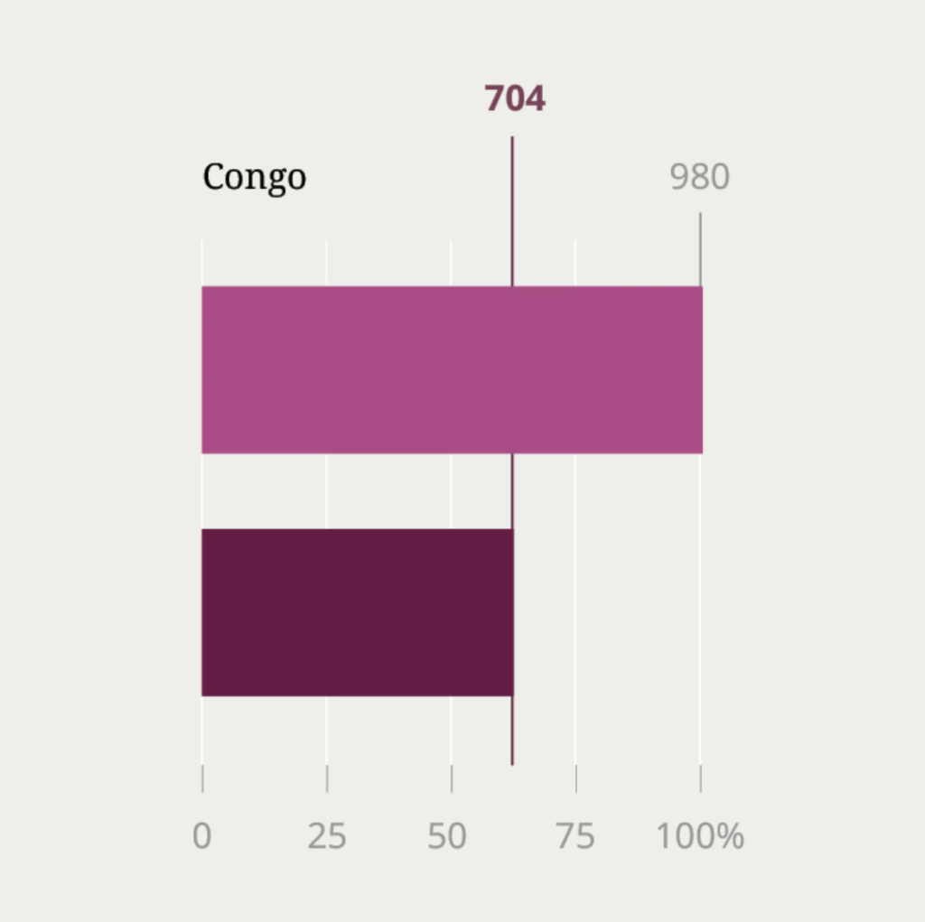
Data visualization system for the Bill & Melinda Gates Foundation created to help tell and support data-driven stories about gender equality. All design layouts and templates are designed from either plus or equal signs, reinforcing the gender equality and progress. Noto, a comprehensive open-source font family with support for over 1,000 languages, is utilized for all online applications. The broad far-reaching project reinforces how data can effectively tell compelling human stories and help target audiences see beyond normally intimidating data presentation. An amazing effort by renowned design consultancy Pentagram (partner, Giorgia Lupi and team). Bill and Melinda should be thrilled.