-
08 07 23
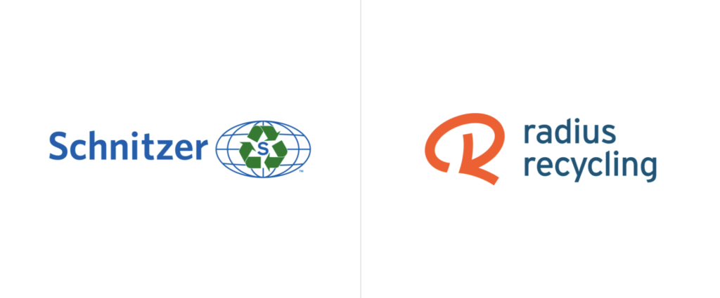
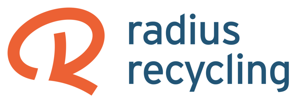
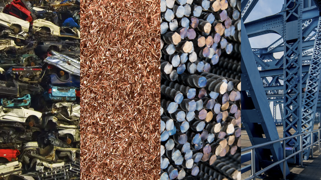
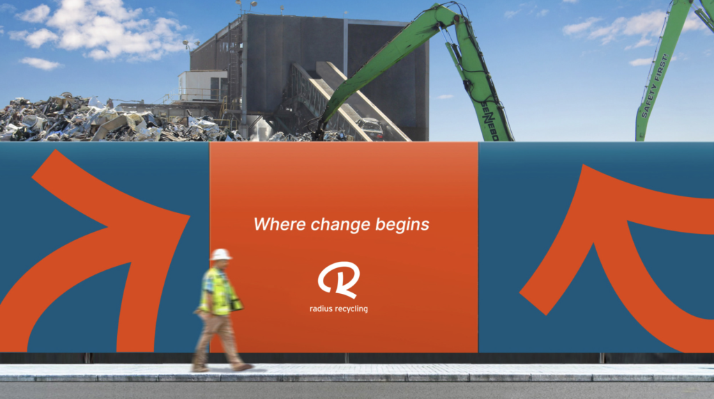
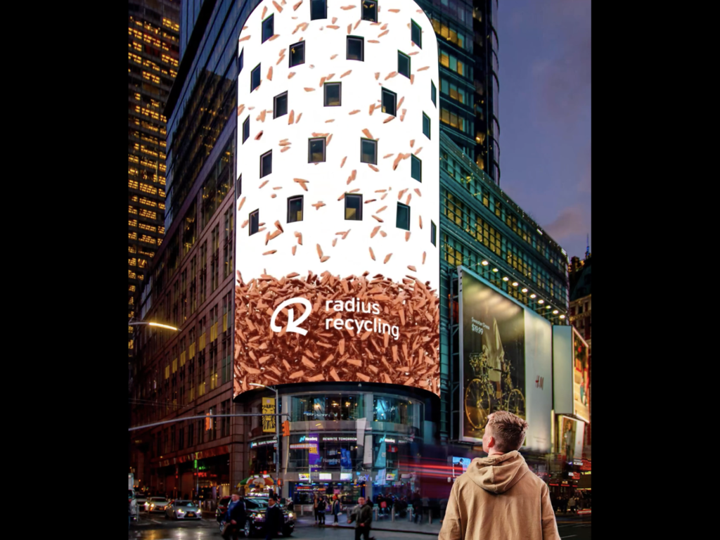
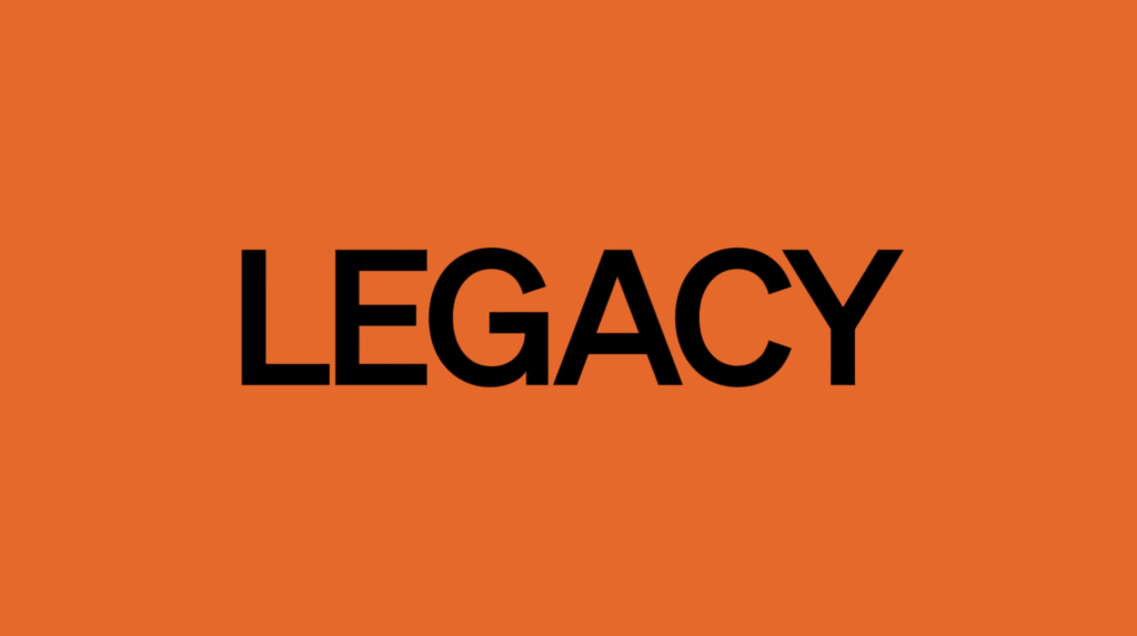
Strategy, name change, brand identity, brand positioning and messaging platforom for metal recycling company (founded in 1906 in Portland, Oregon). Operates facilities located in 25 states, Puerto Rico, and Western Canada. The company also includes 50 stores which sell serviceable used auto parts from salvaged vehicles and receive over 4.1 million annual retail visits. Steel operations produce finished steel products, including rebar, wire rod and other specialty products. A new positioning strategy led to the creation of a new name (Radius Recycling). The name puts the emphasis on the company’s core value proposition as recycling leader. In addition, the “us” in “Radius” brings focus to the company’s committed workforce. We love the vibrant orange arrow which also forms the letter R, evoking transformation, recycling, and renewal in a modern, accessible way. The steel blue and safety orange accents work to help clarify business and the company’s role in the new economy.
-
08 05 23
So, no more Twitter fans, it’s X now. According to Elon Musk and the company, “The X app is the trusted digital town square for everyone.” The app has a new slogan, too: “Blaze your glory!” Many questions arise from this sudden rebranding/abandoning of the iconic internet brand. Read the full story in the New York Times here.
-
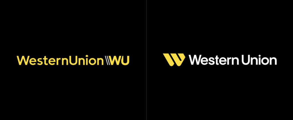
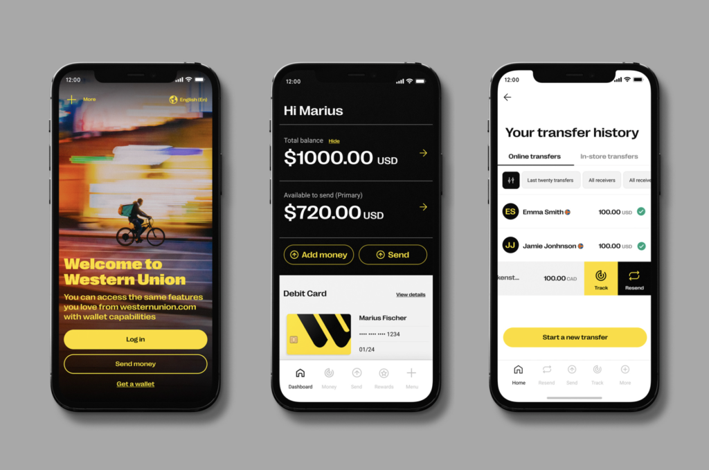
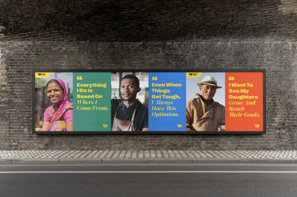
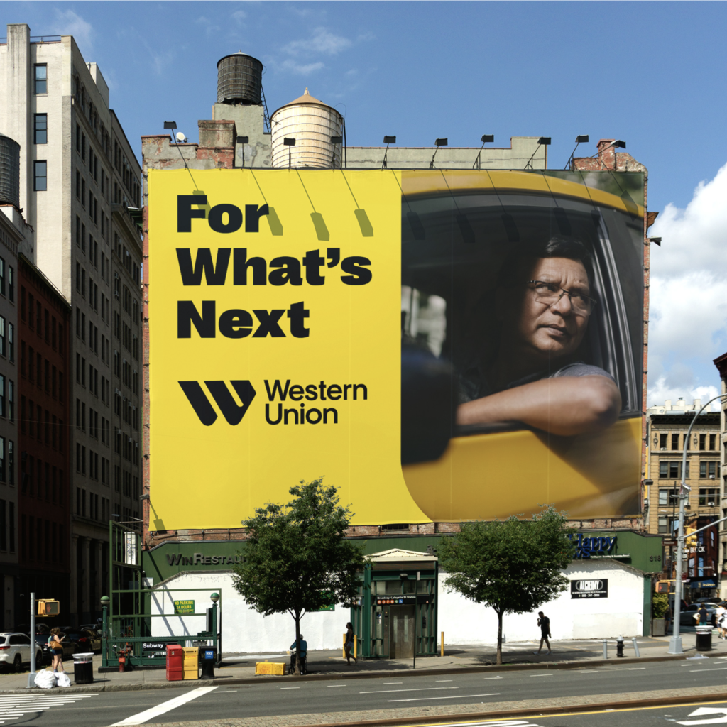
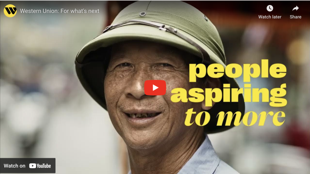
05 20 23
This long-standing company recently embarked on a significant rebranding journey. The comprehensive rebranding maintains the original colors while introducing a fresh, more bold approach to its identity. The reimagined logo, typography, design system, photography usage, and iconography all project a more global, unified, and progress-oriented future vision, while signaling a new era of growth and innovation. A first-rate reimagining by agency Love Street & Company.
-
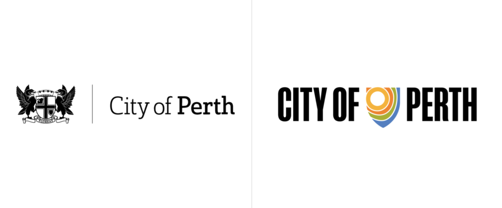
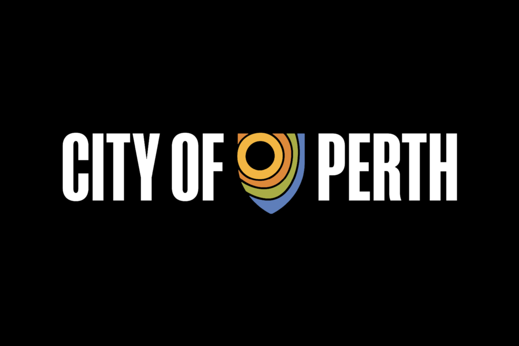
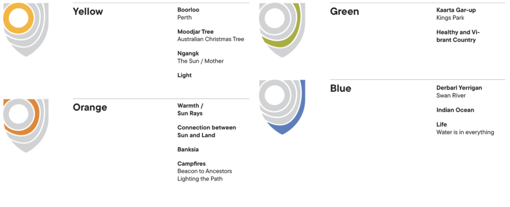
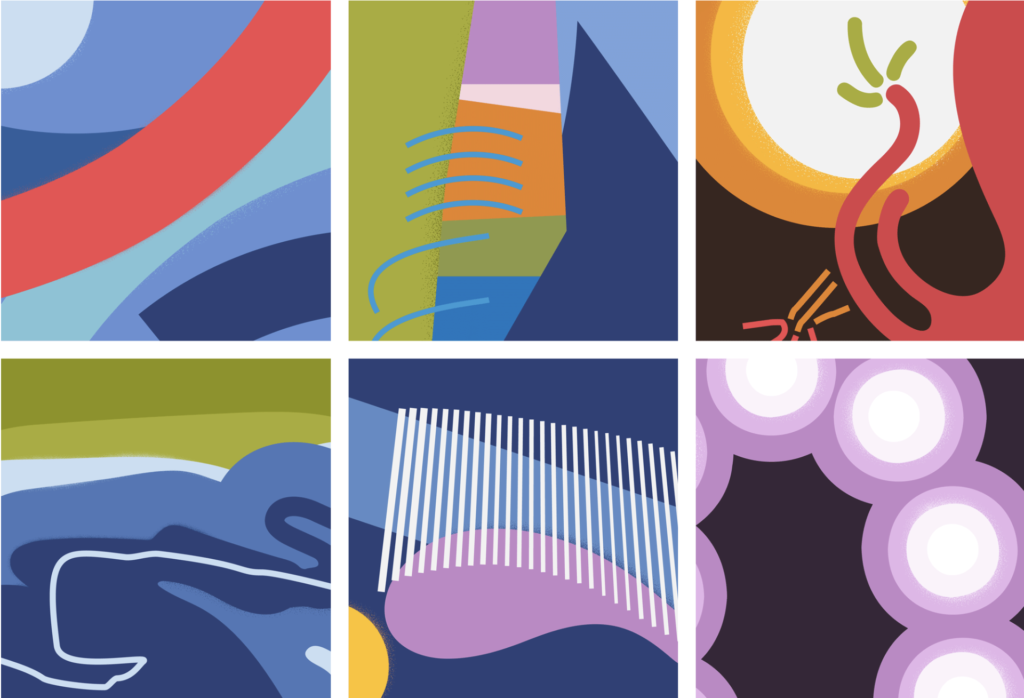
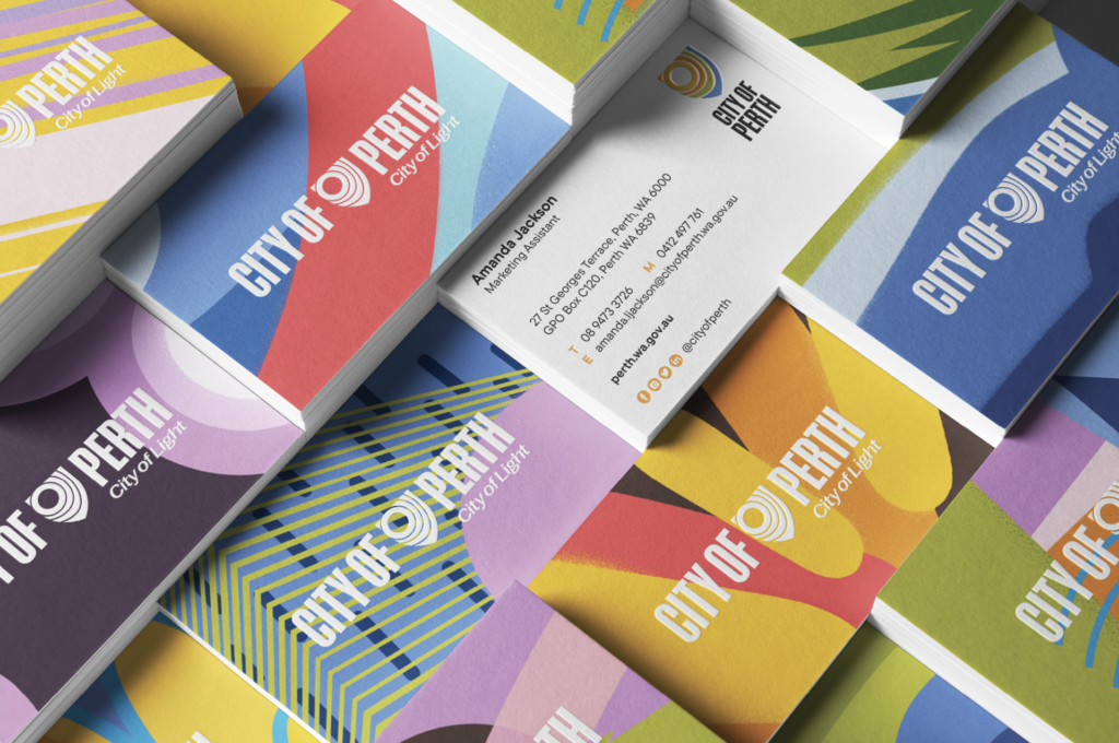
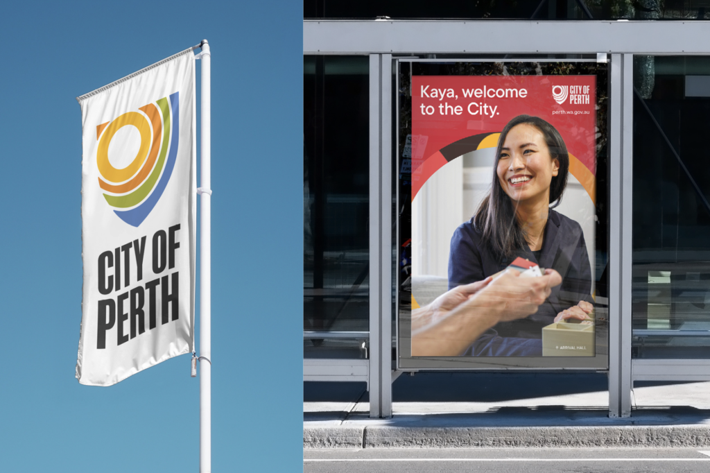
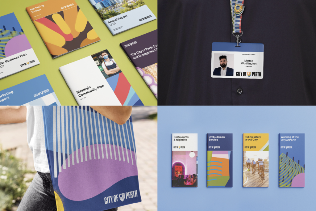
04 24 23
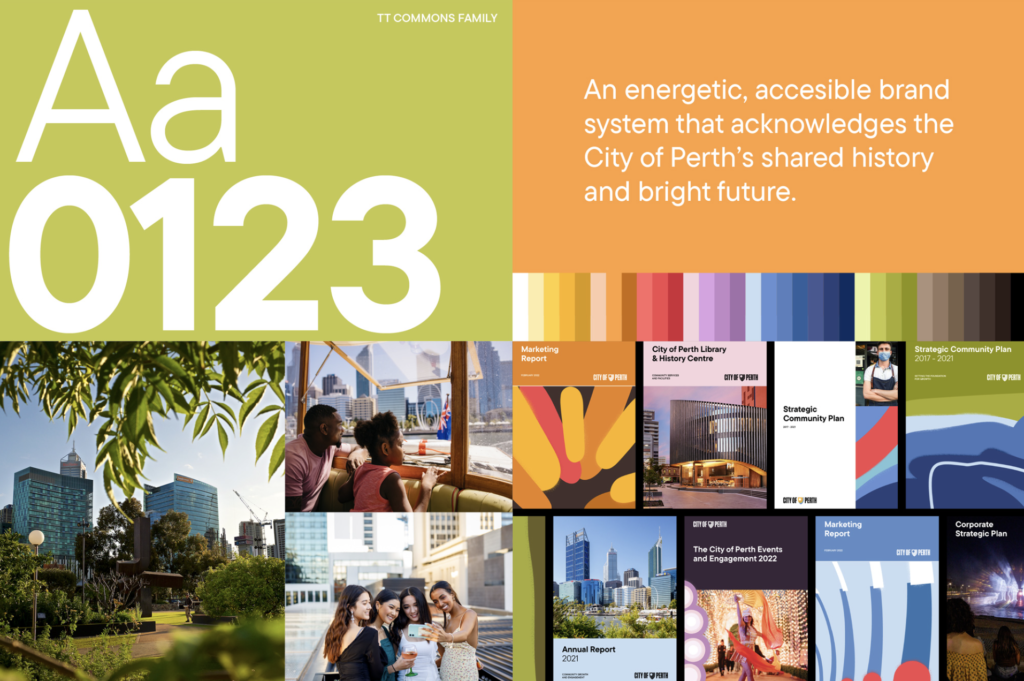
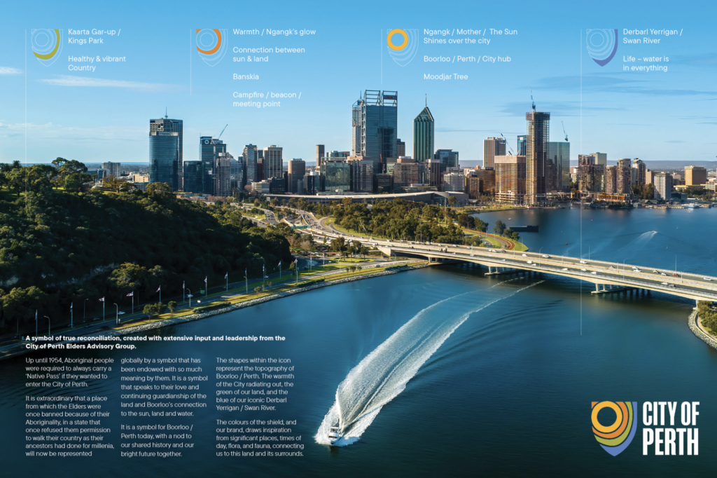
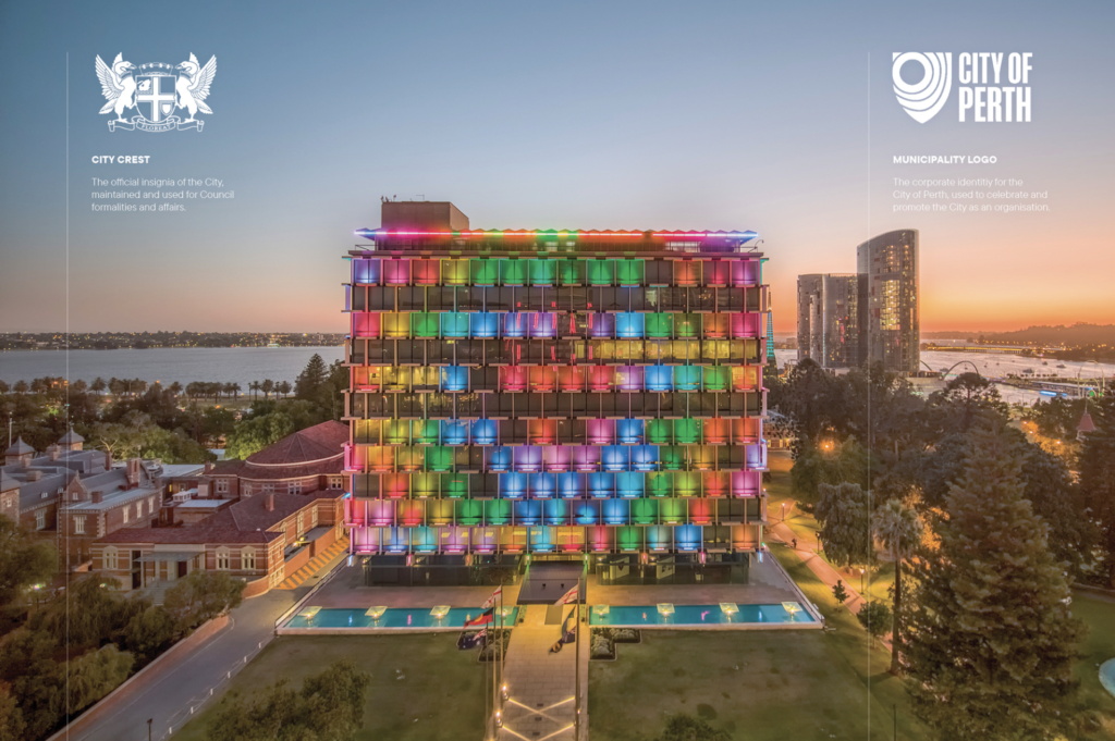
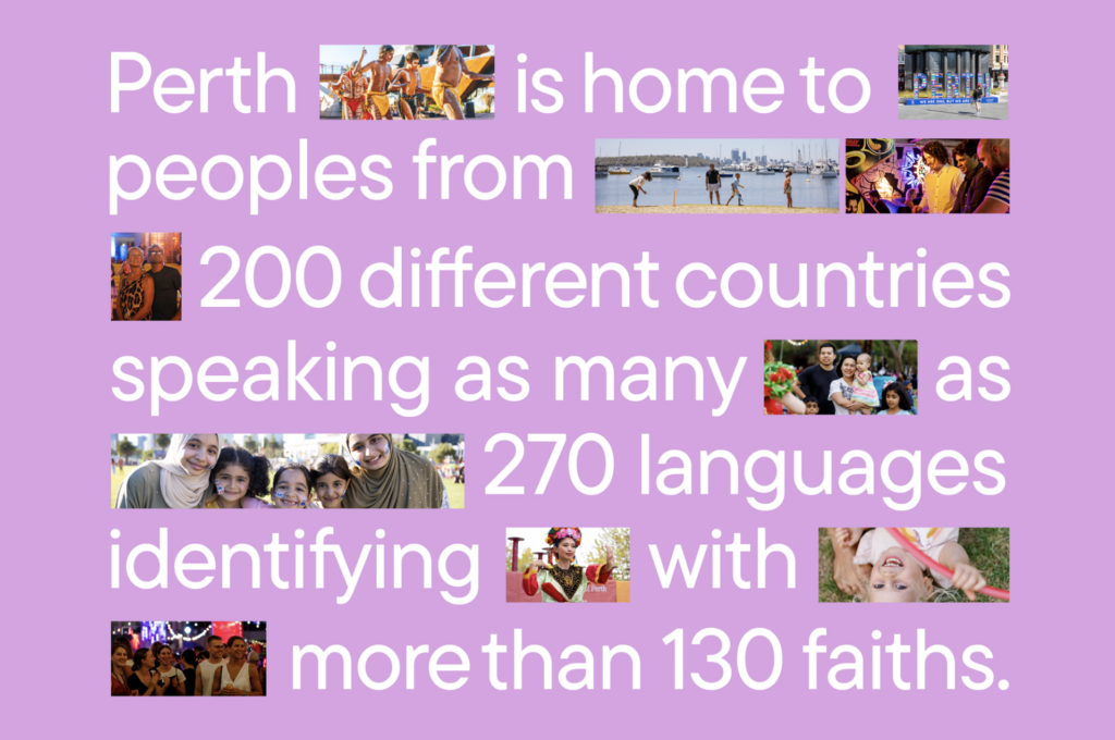
A reimagined brand identity brings a new vitality for West Australia’s capital, including logo and brand identity systems for collateral, graphics and photography. The new identity reflects the city’s Whadjuk Noongar history and joyfully celebrates the city itself, promotes both its primary strengths and new features/capabilities. All features of the new work are both colorful and dynamic, resulting in a fresh new voice for the important Australian city. Block and Nani Creative were enlisted for the new identity.
-
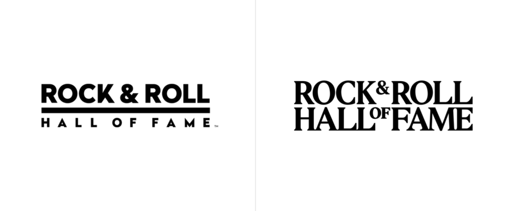
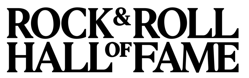
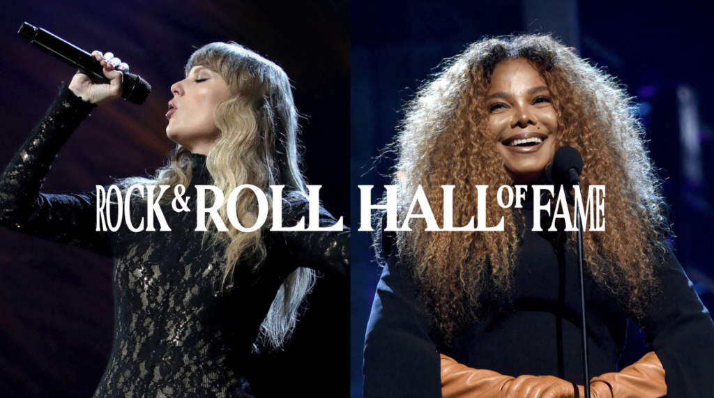
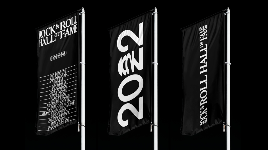
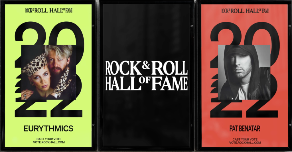
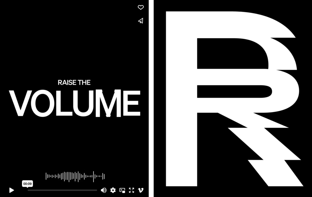
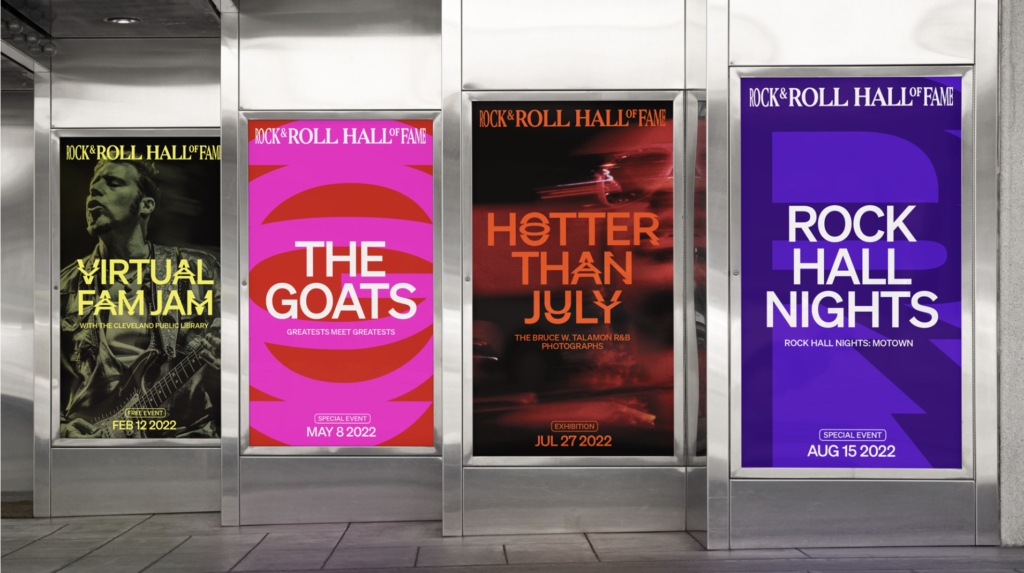
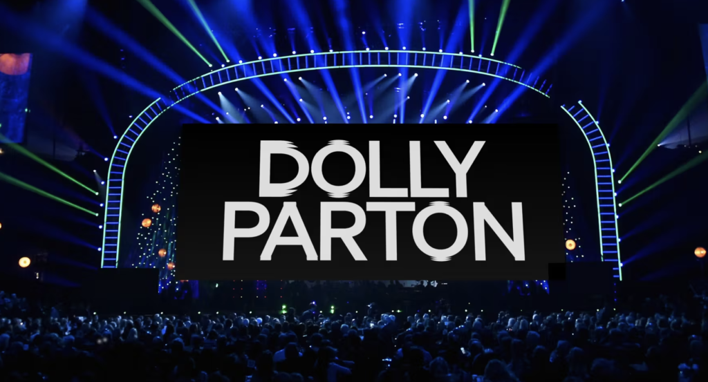
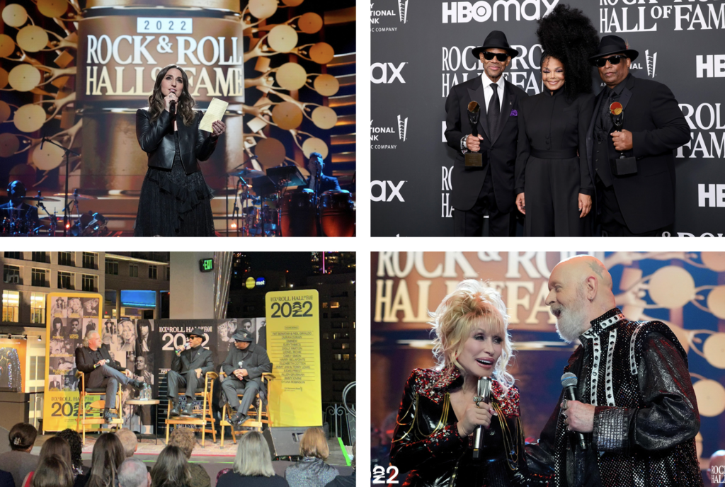
The Rock & Roll Hall of Fame introduces an overdue rebrand to update its image for a broader and younger audience. Strategically, a goal to become more relevant besides its renowned induction ceremony. The ‘Rock & Roll’ spirit has been reimagined with an original, bold, authentic and powerful identity. The new visual identity and shift in messaging works well to infuse a new contemporary point-of-view. The new logo features a custom designed and programmed typeface which reacts to audio cues with its letterforms reacting to sound levels and beats. While the new approach takes giant leaps forward, we do hope it can strive for more surprising moments. Yes, a bit less corporate standards, a little more Rock & Hall.