-
07 30 21
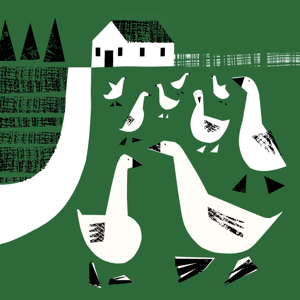
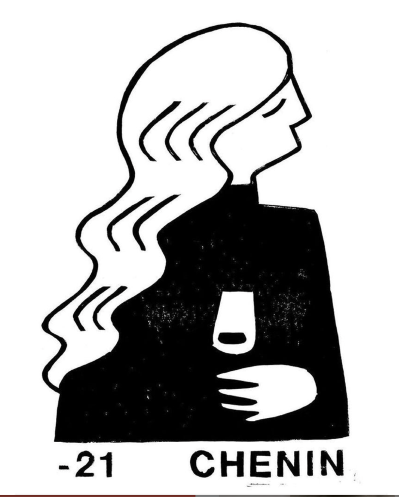
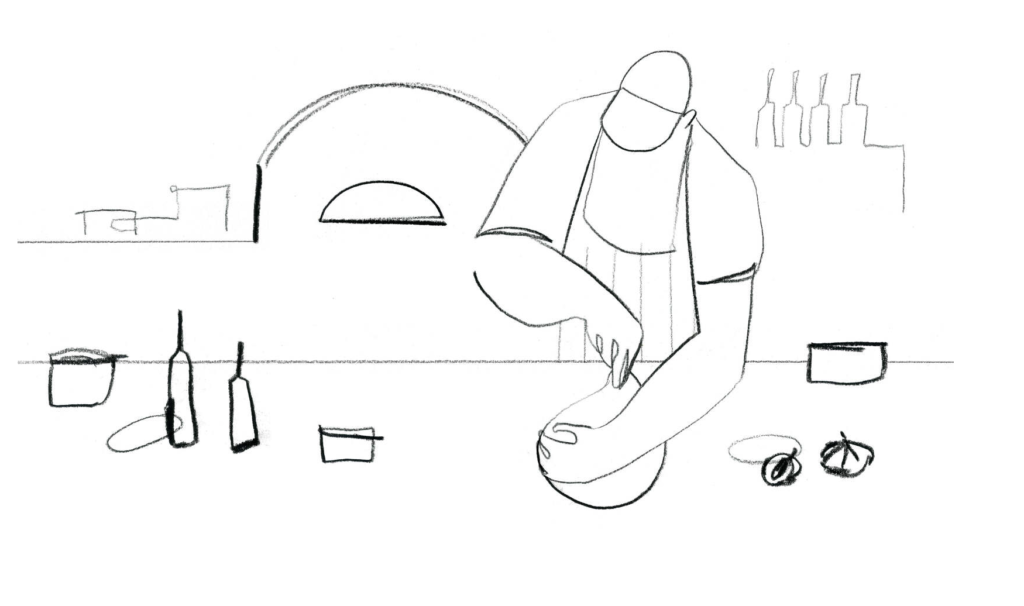
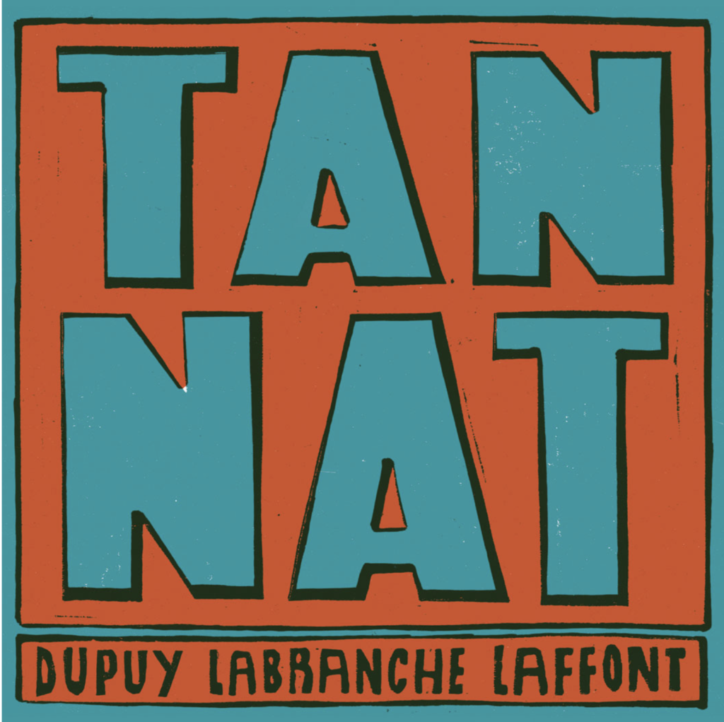
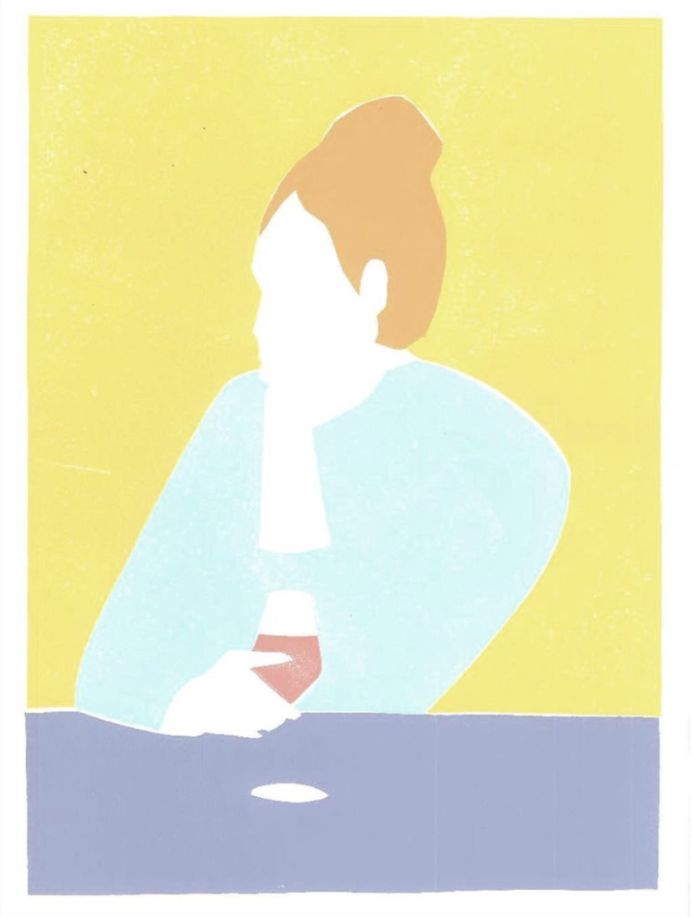
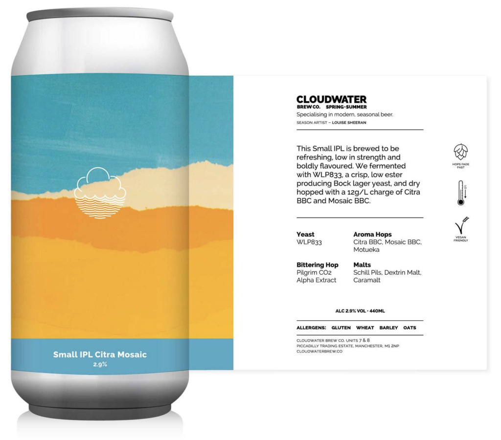
Illustration SPOTTED. Louise Sheeran | artist, designer, printmaker & illustrator. Sheeran, now residing in Clermont-Ferrand, France, has a delightful body of work ranging from looser brush stroke illustrations to more graphic, composed pieces . Clients have included Borough Market, Toast Magazine, Lonely Planet, Noble Rot Magazine, Bloomsbury and Leroy Shoreditch. Diverse range of work, all smart, sophisticated and distinctively impactful. Look forward to an opportunity to work together…
-
07 29 21
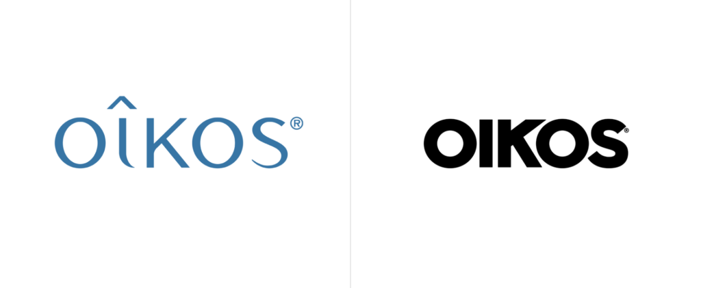
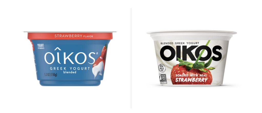
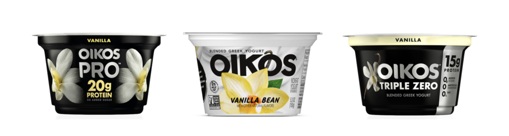
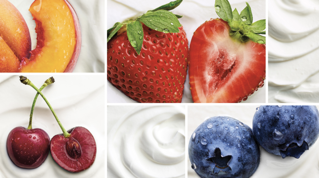
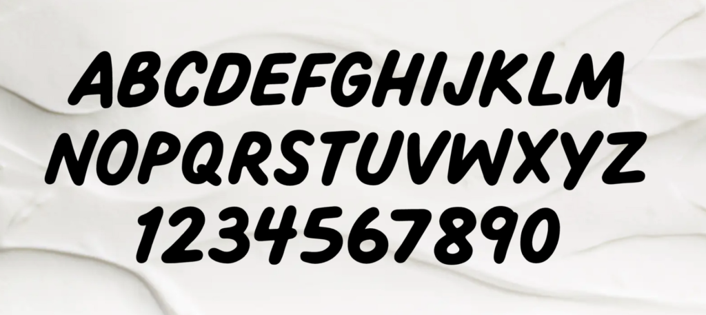
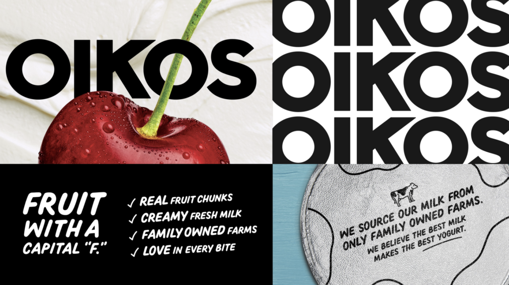
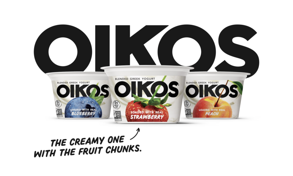
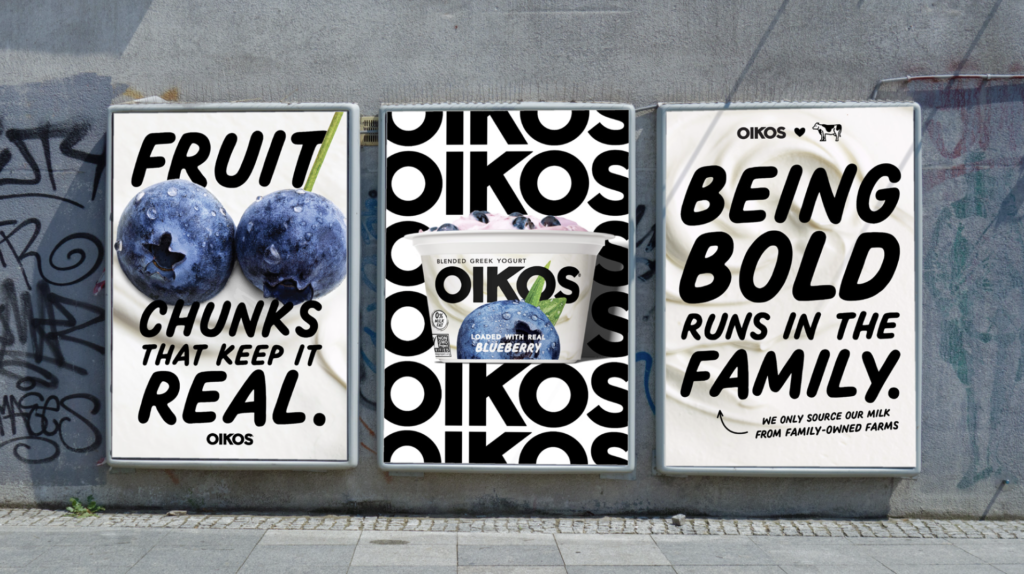
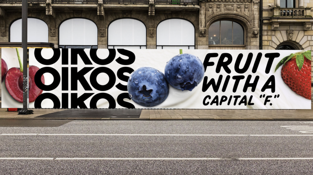
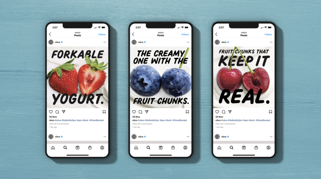
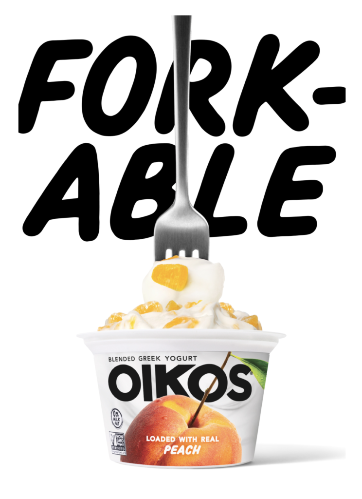
There are a lot of Greek yogurts out there. Recently, Oikos (Danone North America) introduced a new brand identity along with new packaging. New photography featuring ingredients boldly stands out on creamy, wavy yogurt backgrounds. The logo features a stronger sans serif with a softer secondary typeface that balances the bolder elements of the packaging. All are positive changes along with the “Forkable” descriptor and other bolder copy iterations. Definitely more distinctive, younger and energetic which should help to better compete with Chobani and others. Great effort all-around. Grab that Fork! Creative by Danone North America Brand Design and Brooklyn, NY-based Beardwood&Co.
-
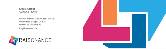
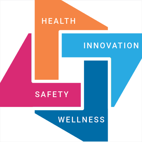
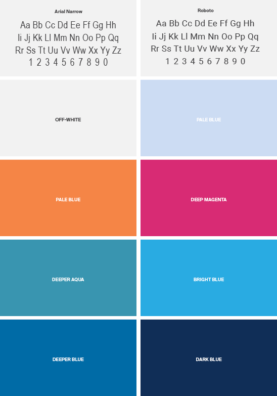
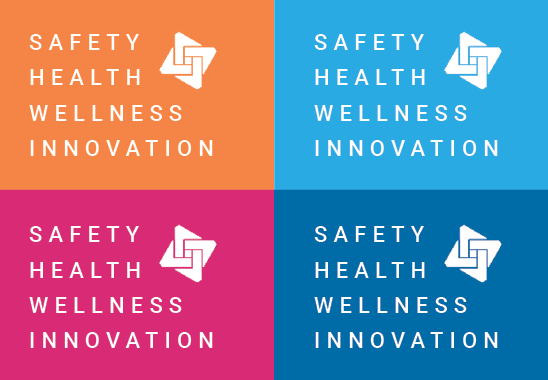
07 24 21
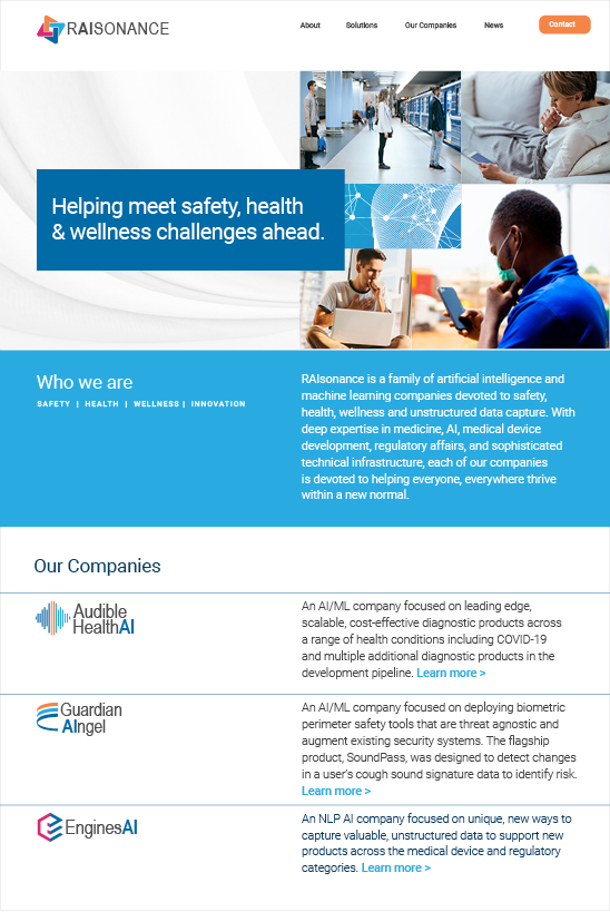
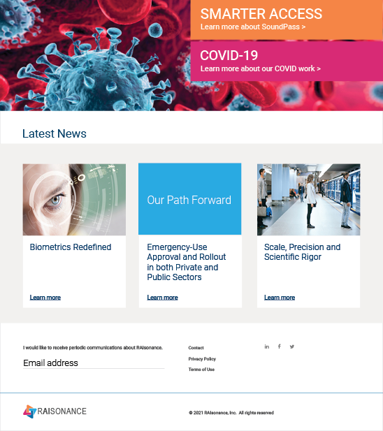
Kellyco@work | RAIsonance (brand identity, digital design, graphic design). Created new brand identity, website, mobile application and diverse marketing initiatives for new group of companies dedicated to providing artificial intelligence/machine learning (AI/ML)-based solutions for the safety, biometrics, digital health, medical diagnostics and big data markets. Developed new design and messaging platform, enabling more effective communication for both product and business development. New identity to represent innovation and company’s strengths in leveraging new technologies to deliver groundbreaking, high-impact and scalable solutions to today’s significant safety, health and wellness challenges. More on this project >
-
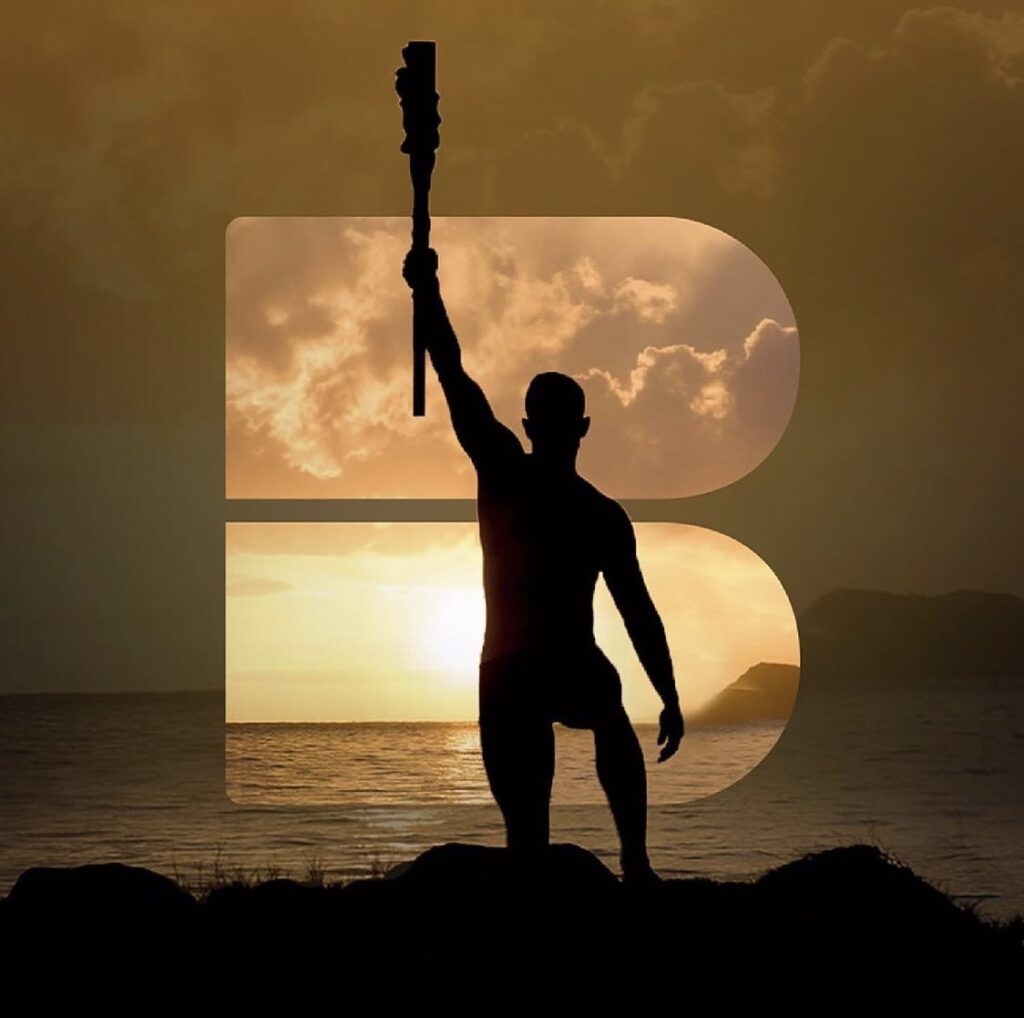
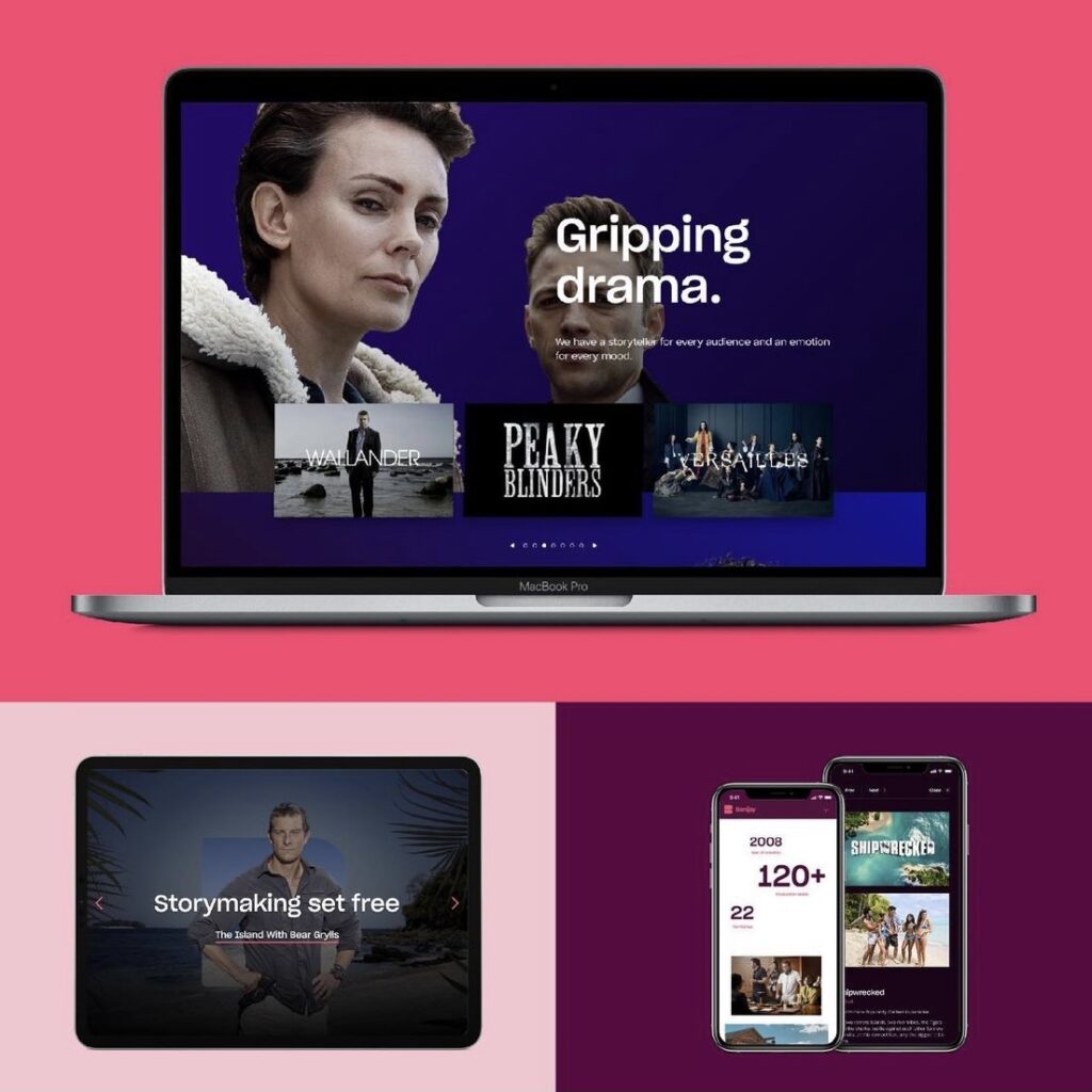
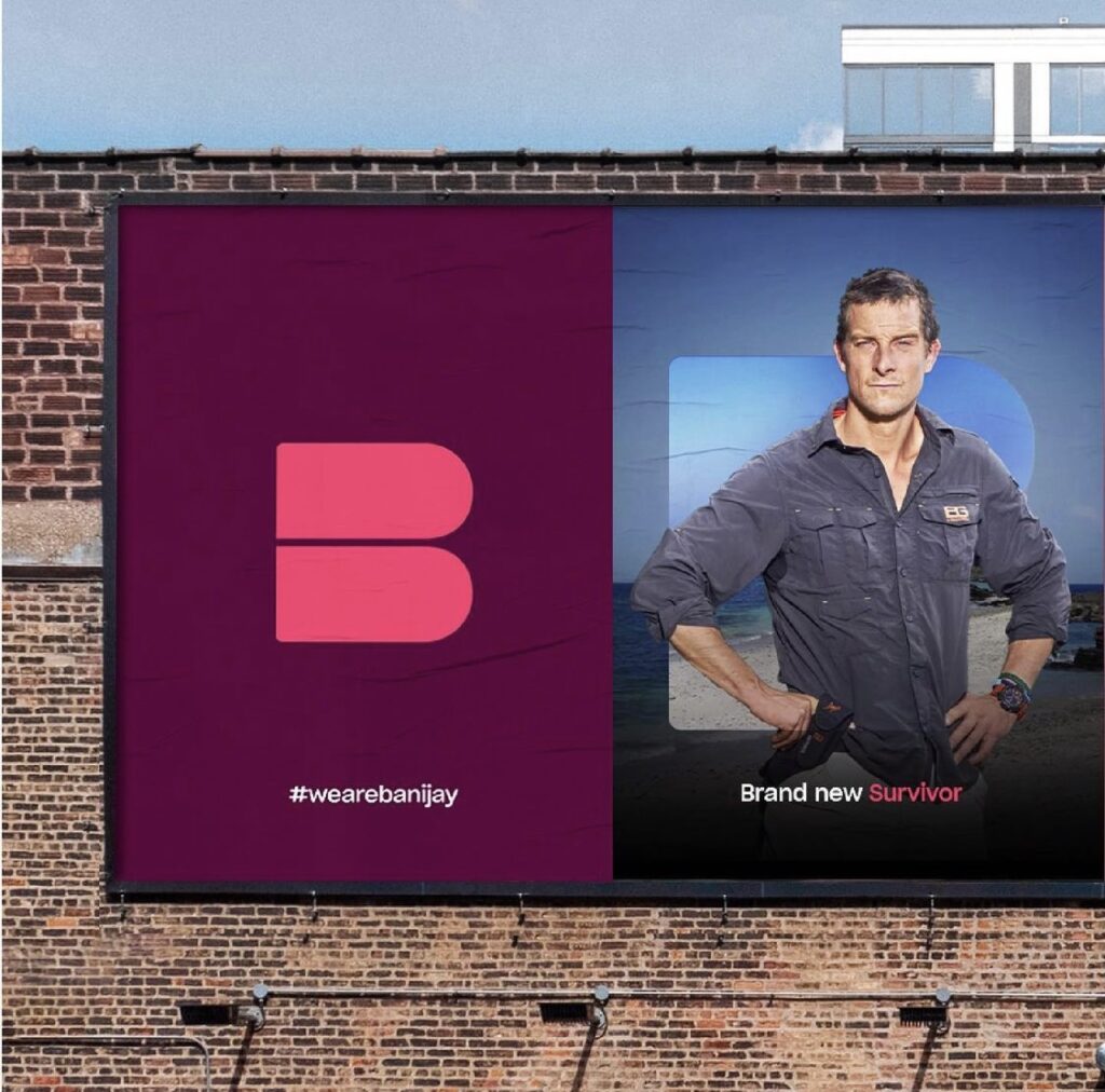
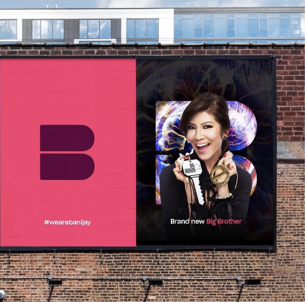
07 14 21
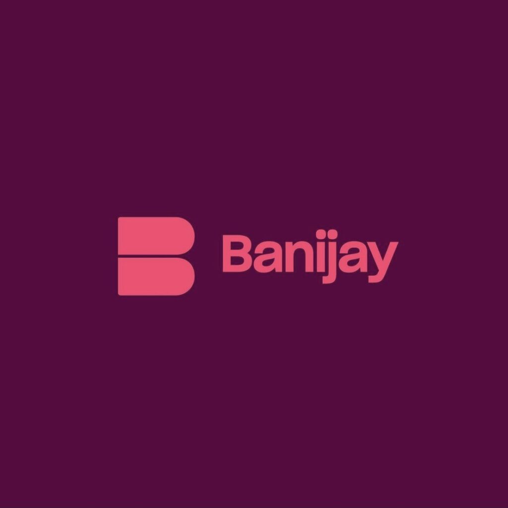
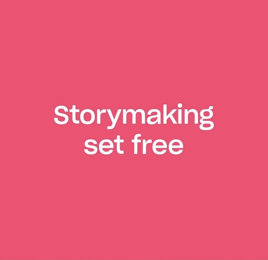
New brand identity for international content and distributor. Simple brand mark and distinctive color palette lays the groundwork for a clean, bold presentation of the company’s strengths and capabilities. Quality storytelling fro this brand all about storymaking. Designed by Moving Brands. Bravo!
-
07 08 21
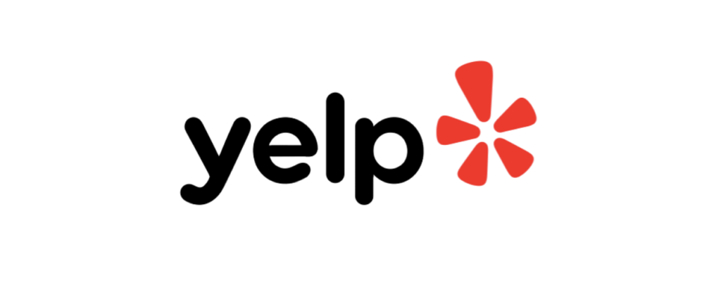
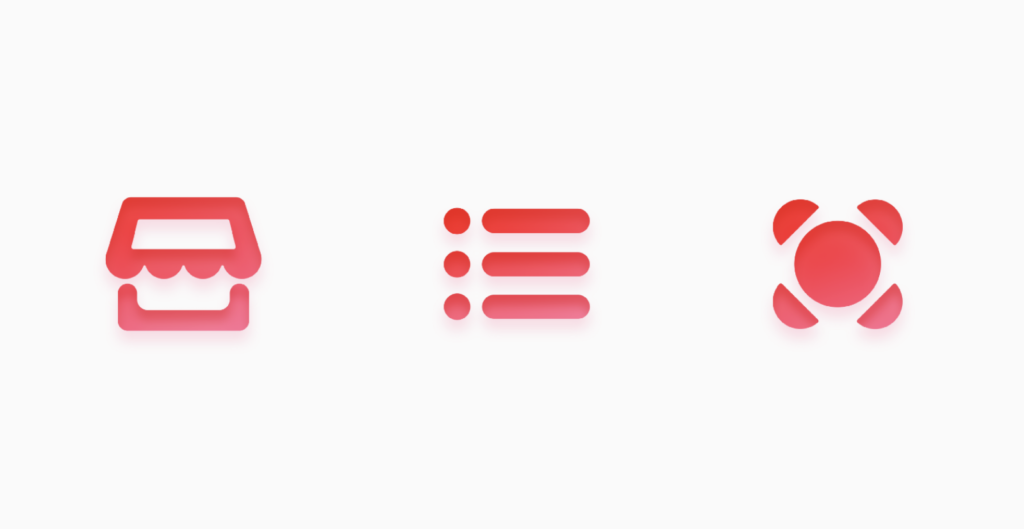
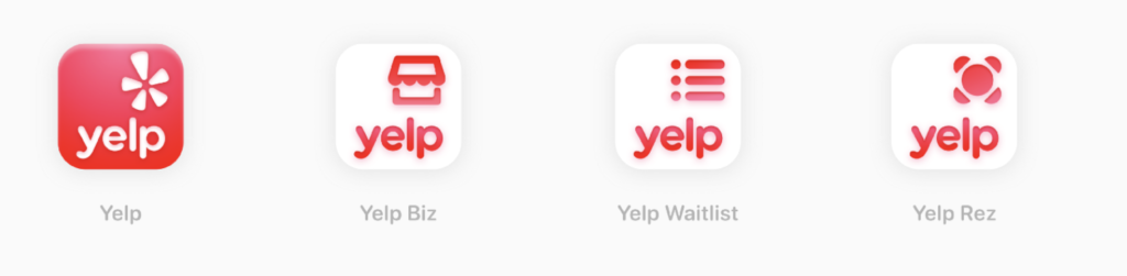
Yelp has just reintroduced a refined logo and set of icons that is intended to sync up with its new strategy of regaining the business and restaurant review market, as well launching services including a diner waitlist that integrates with takeout orders, backend analytics, POS integration and customer profiles. The modifications to the logo are modest, but positive. The new icons clearly serve a purpose in the brand’s new service strategy while also supporting brand consistency. While we have never been big Yelp fans (all those negative comments!), hats off to the brand moving towards a more clearly defined identity.