
07 29 21
brand identity + logo + packaging
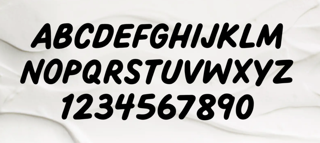
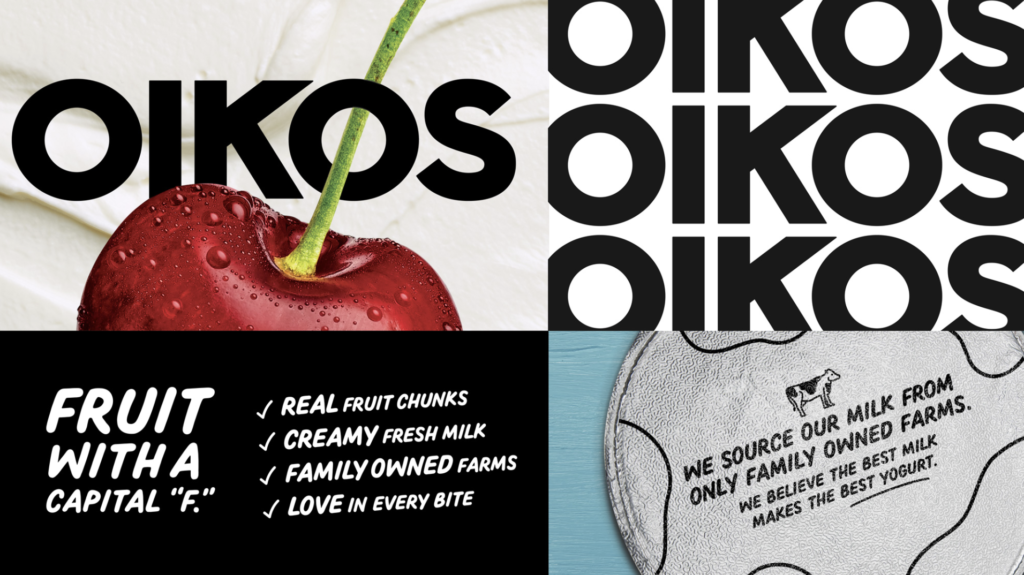
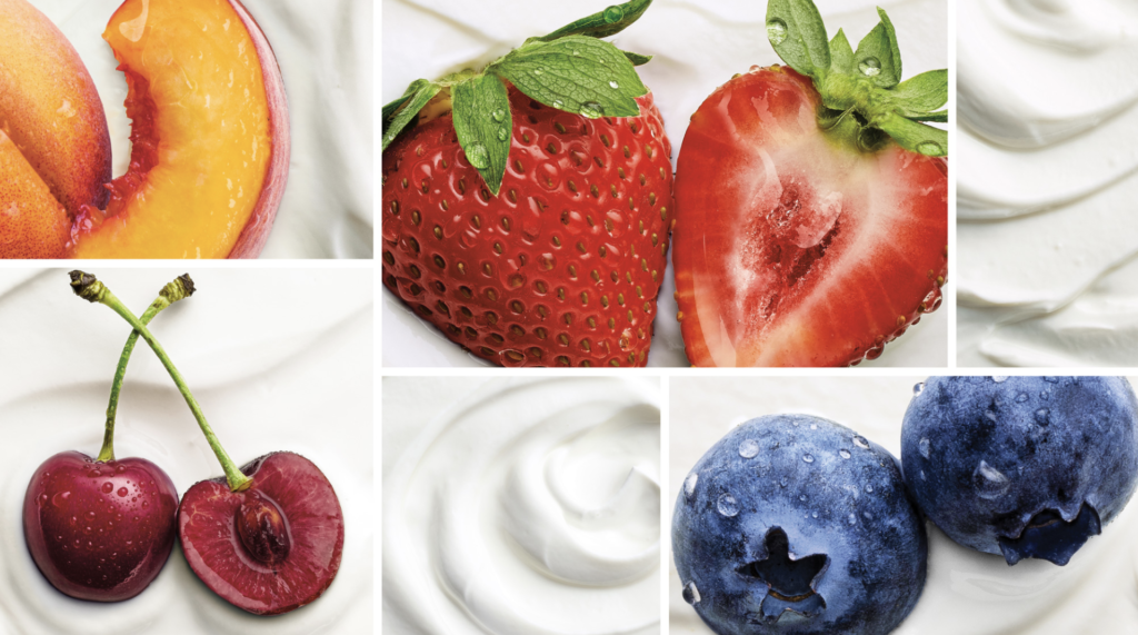
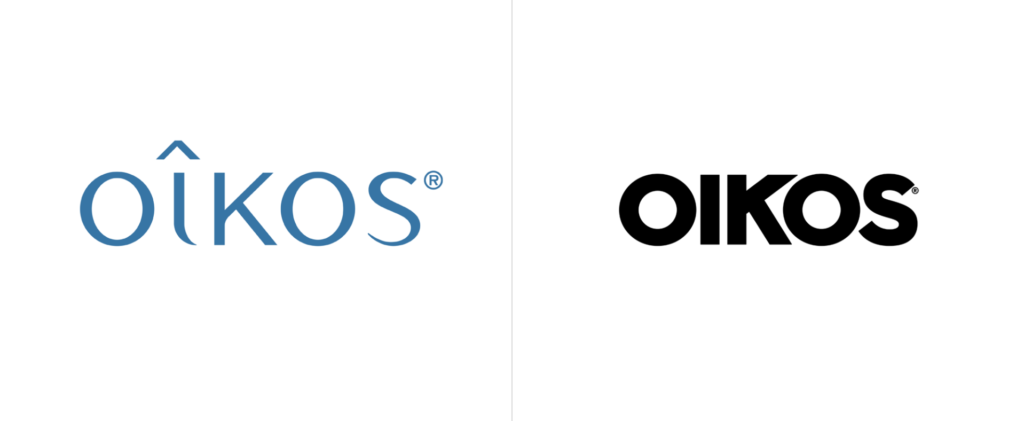
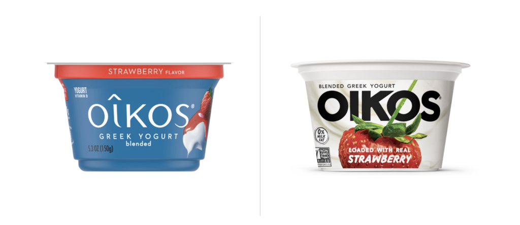
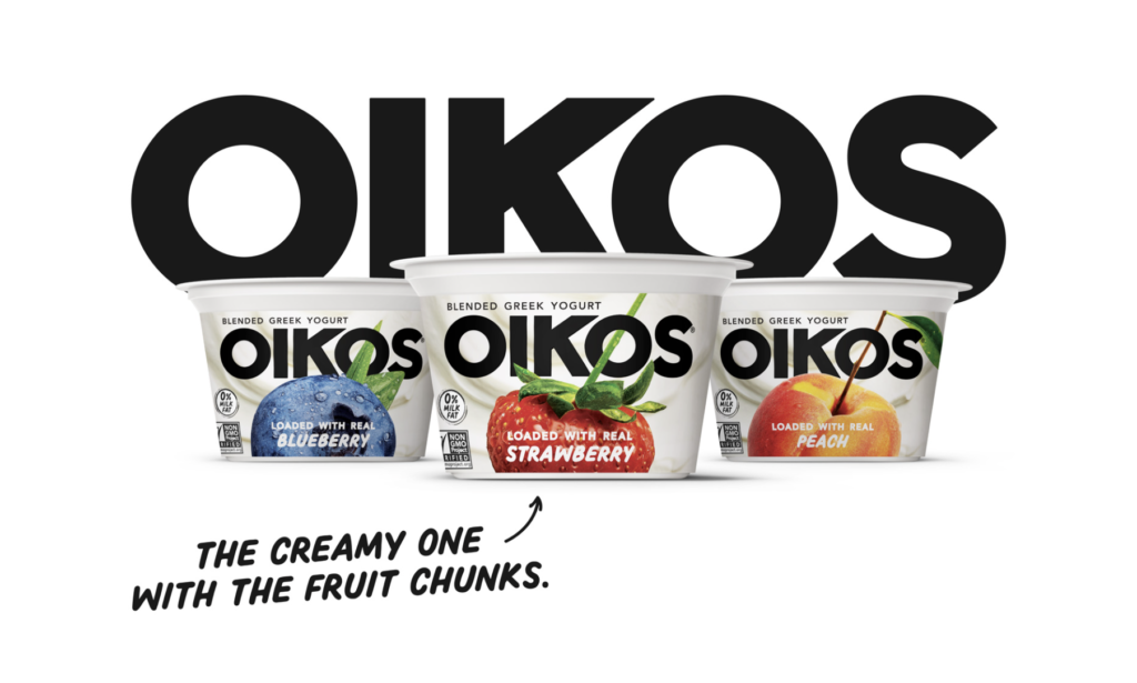
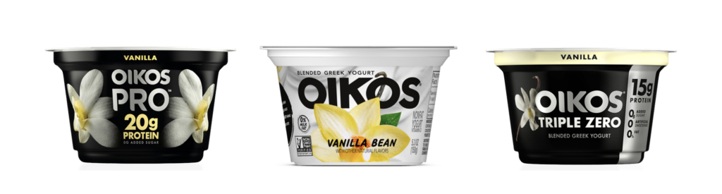
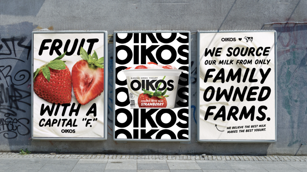
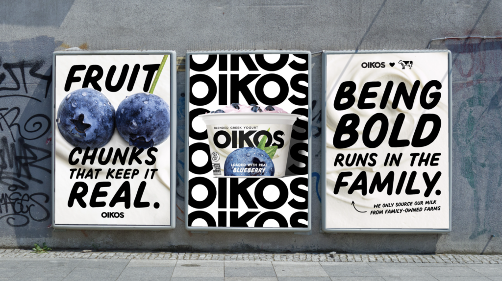
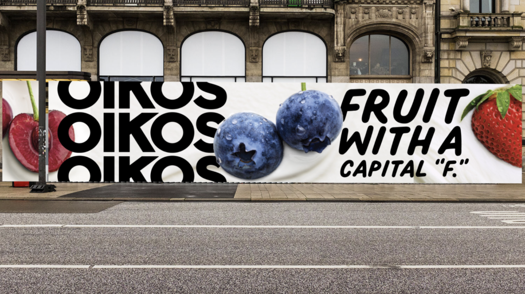
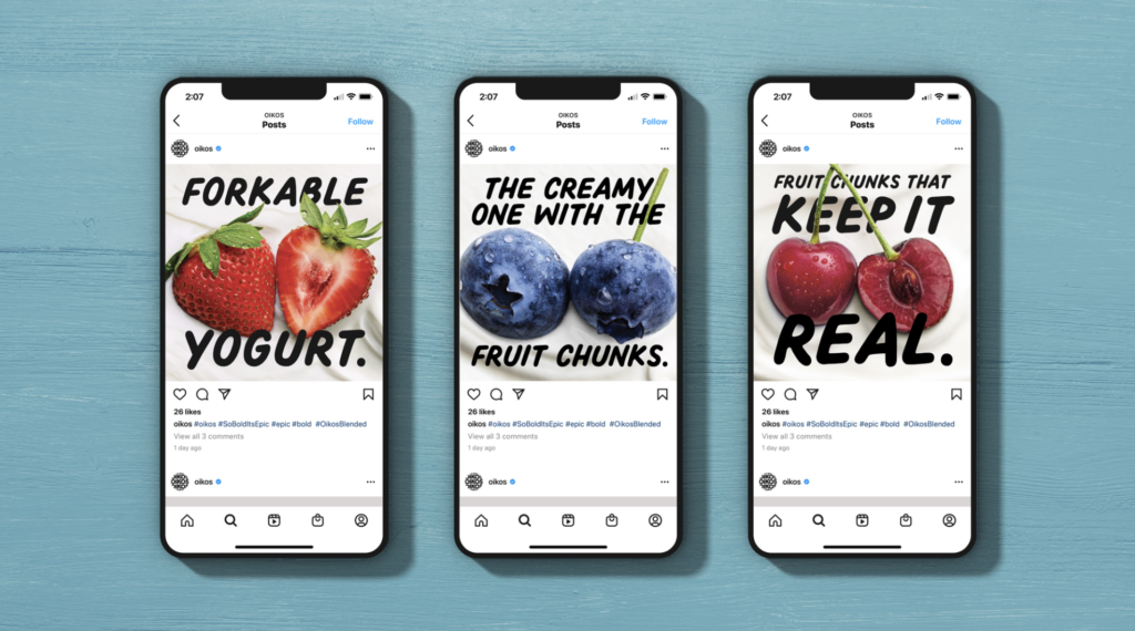
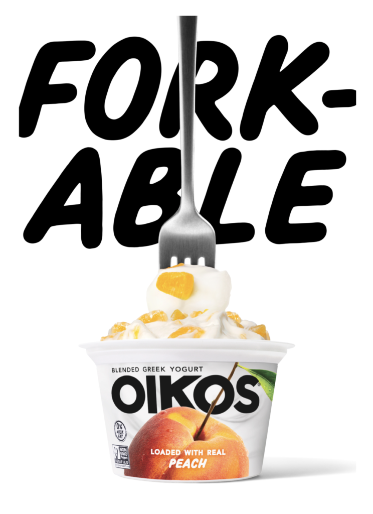
There are a lot of Greek yogurts out there. Recently, Oikos (Danone North America) introduced a new brand identity along with new packaging. New photography featuring ingredients boldly stands out on creamy, wavy yogurt backgrounds. The logo features a stronger sans serif with a softer secondary typeface that balances the bolder elements of the packaging. All are positive changes along with the “Forkable” descriptor and other bolder copy iterations. Definitely more distinctive, younger and energetic which should help to better compete with Chobani and others. Great effort all-around. Grab that Fork! Creative by Danone North America Brand Design and Brooklyn, NY-based Beardwood&Co.


