-
01 09 24
New branding for Wings Card for Abkbank (Turkey) by London office of Pentagram, aimed at wealthy customers with affluent lifestyles The identity was designed for the aspirational, lifestyle-orientated credit card brand to facilitate new positioning into a more upscale market.
Dynamic repeated lines (static and animated) reinforce the logo design and create a unique primary visual asset for the brand. The new color palette of dark turquoise, steel and ivory is less traditional and unique within the financial services sector. Contemporary photography enhances the brand visuals platform further communicating the new progressive positioning and lifestyle approach to customer benefits and experience.
-
12 20 23
The Coterie delivers founders in the tech industry a transformative platform to unlock the full potential of their financial resources. Departing from conventional banking norms, The Coterie stands as a pioneering force, enabling investors to diversify risks, access capital through loans, strategize estate planning, and engineer tax-efficient exits with unprecedented ease. With a laser focus on a niche market primarily comprising millennials boasting assets ranging from $1–10 million, The Coterie taps into the aspirations of individuals often entangled in privately held companies. The Coterie steps in to cater to the self-directed financial planning needs of a generation that demands bespoke solutions.
Brand identity firm, Pentagram undertook a thorough analysis to craft a brand identity that resonates deeply with the target audience. At the heart of this identity lies the iconic “C,” exuding an aura of trust and approachability. Symbolizing exclusivity yet inviting participation, the circular motif with a single gap serves as a visual metaphor for The Coterie’s commitment to fostering an inclusive community of forward-thinkers. Elevating the visual experience to new heights, The Coterie showcases captivating member portraits, meticulously crafted with cutting-edge technology. Each portrait seamlessly transitions from a myriad of chrome spheres to the iconic emblem of The Coterie, encapsulating the essence of our esteemed community.
-
08 31 23
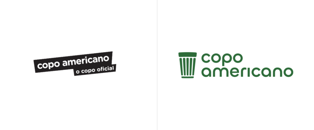
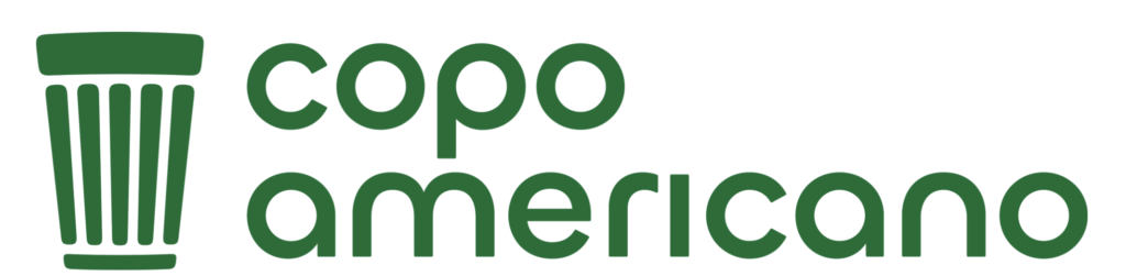
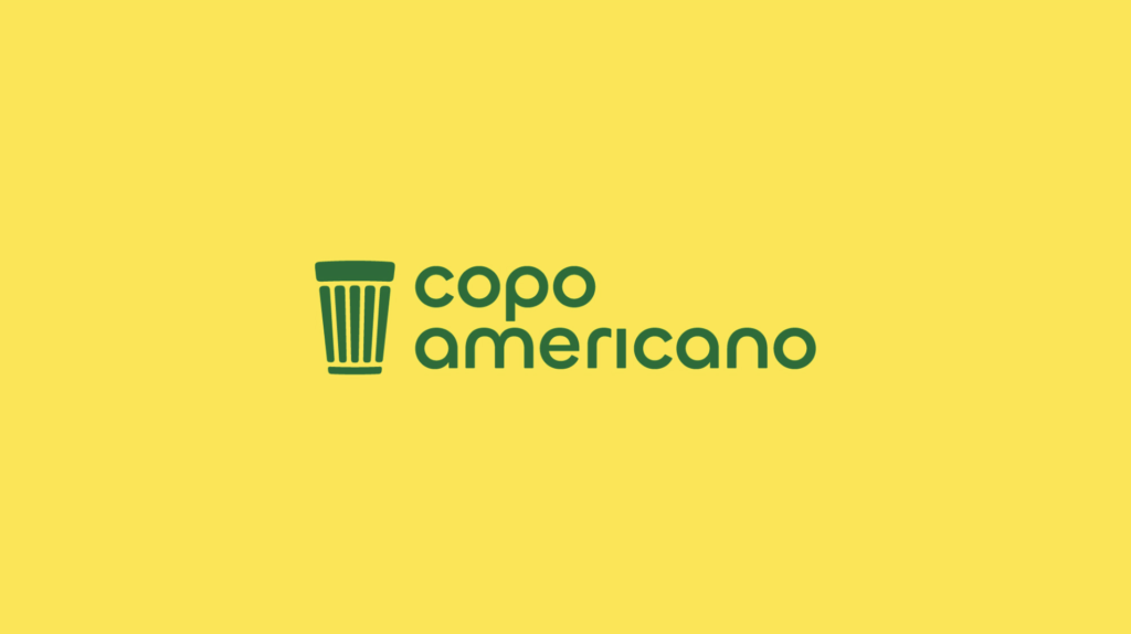
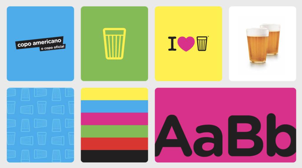
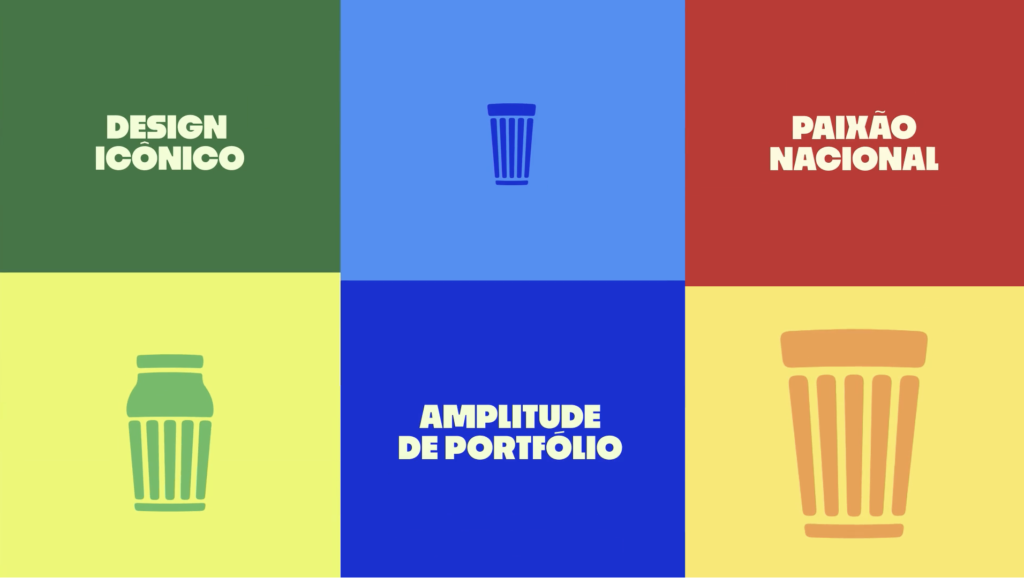
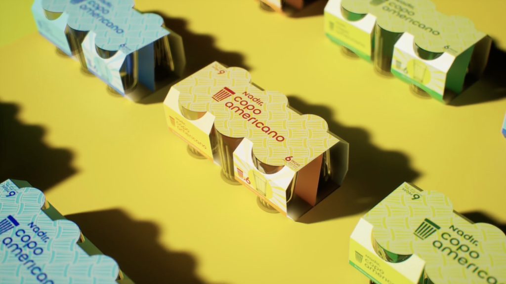
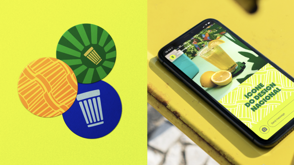
The “Copo Americano” (“American Cup” in Portuguese) produced by São Paulo-based glassware company Nadir. founded by designer Nadir Figueiredo. The glass, produced since 1947, has become an icon of Brazilian culture, with over 6 billion units produced since its creation. It’s used throughout casual restaurants and bars in the country – housing both beer and coffee – and also considered as a standard unit of measure for Brazilian recipes. It has been featured in the MoMA collection in New York as a symbol of Brazilian design.
The rebrand by Futurebrand (São Paulo, Brazil) has appropriately reenergized the brand. The new logo keeps the lowercase approach but removes the rounded ends with a retro-style geometric sans serif. It certainly brings it forward into more modern design standards, but it also manages to hark back to its near 75-year-long history through the geometric and retro typography. The new icon also evolves the previous outlined version by keeping it simple and bold (better for digital applications). Color and supportive graphics are brighter, bolder and clearly Brazilian.
For the iconic Brazilian product, the reimagined identity is a winning mix.
-
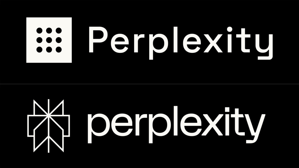
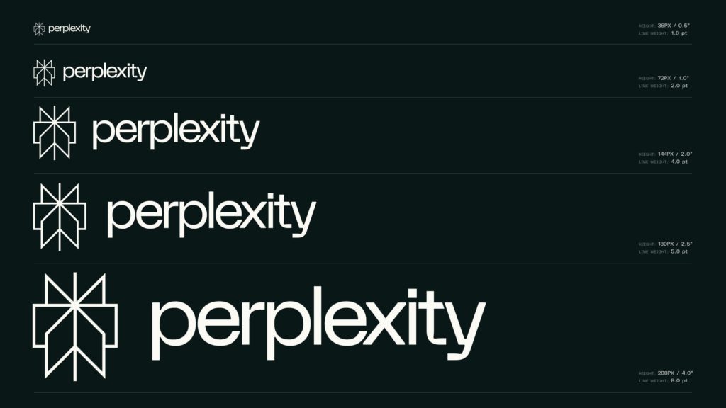
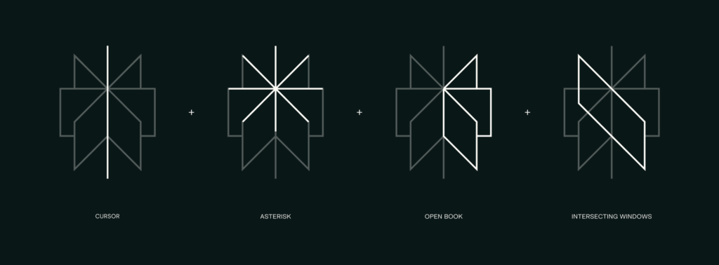
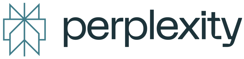
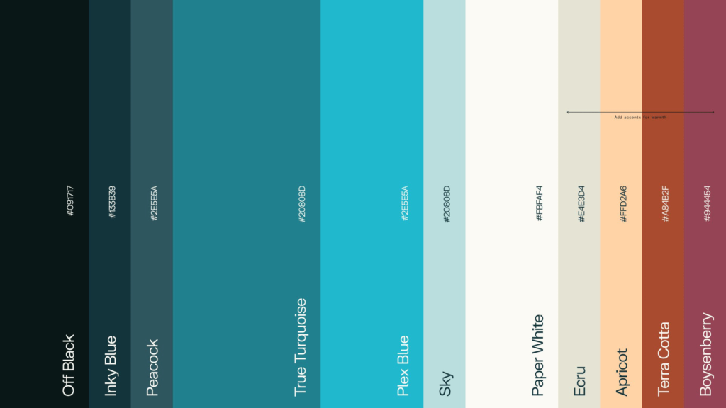
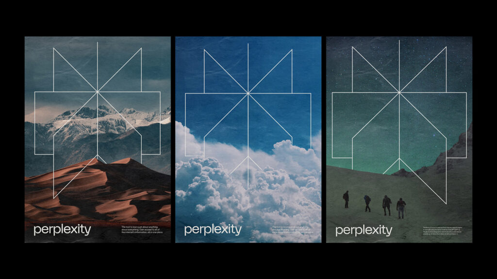
New brand identity for AI-powered chatbot and search tech startup, Perplexity. Smart, well-executed new symbol design and wordmark inspired by frequently-employed asterisk and search requests often submitted in all lowercase. Minimal approach works brilliantly here, reducing a relatively complex technology to simple, flexible, and defining brand identity and visual platform. Bravo to client, agency (Smith & Diction, Philiadelphia) and all who were involved.
-
08 23 23
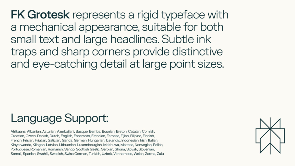
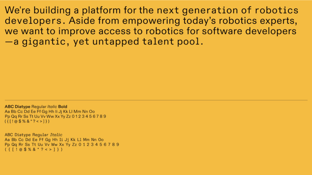
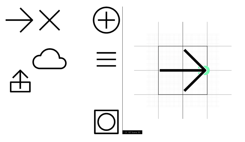
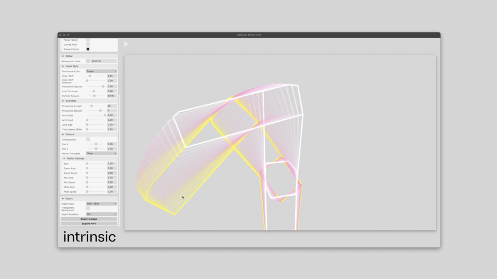
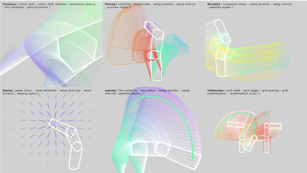
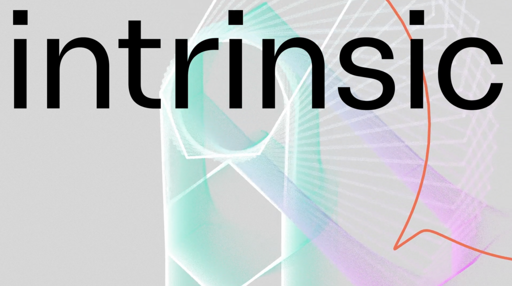
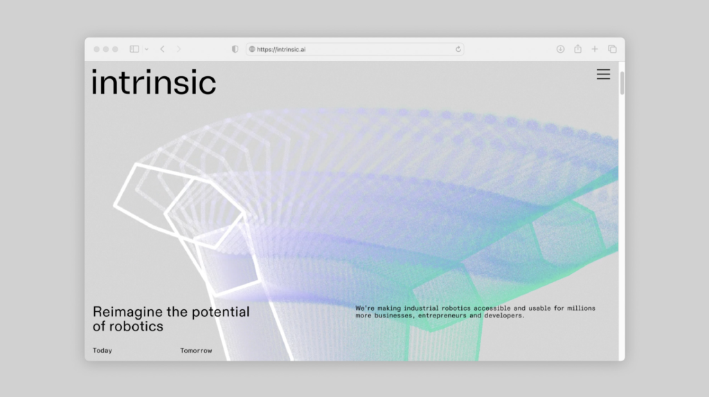
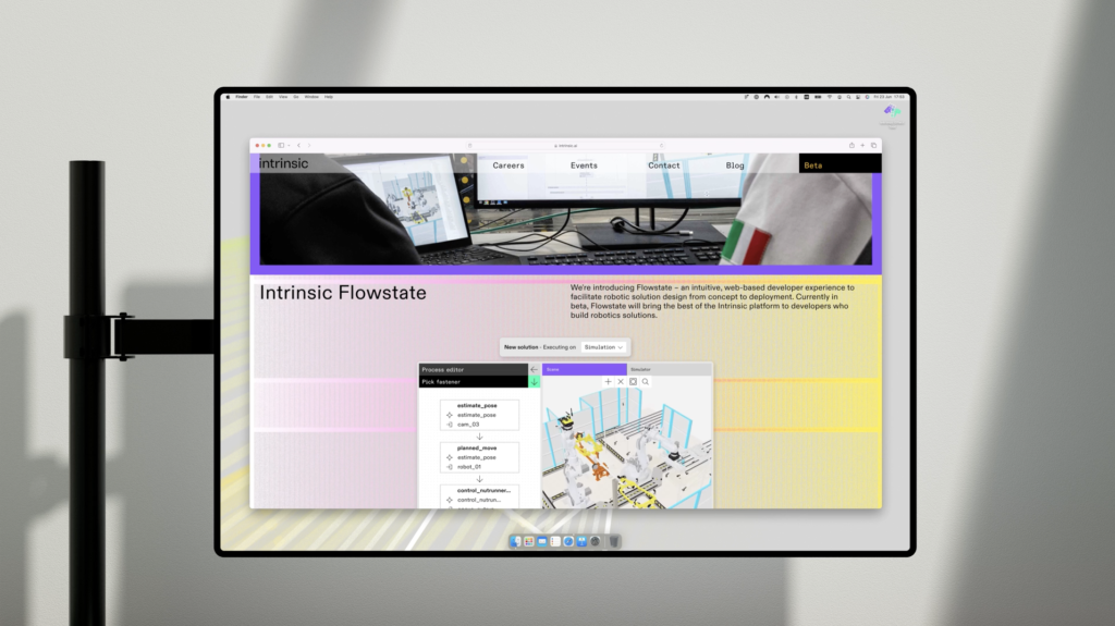
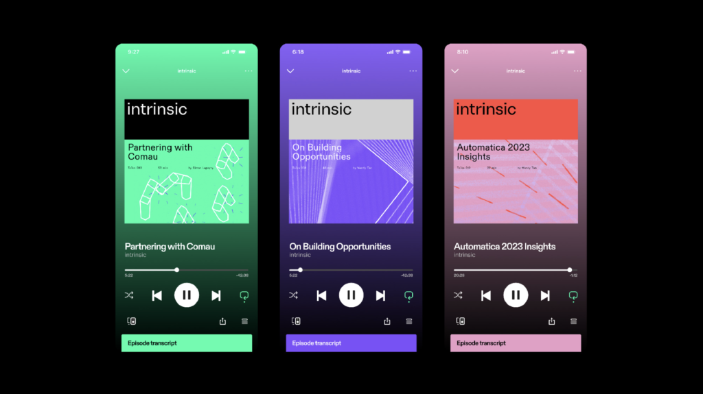
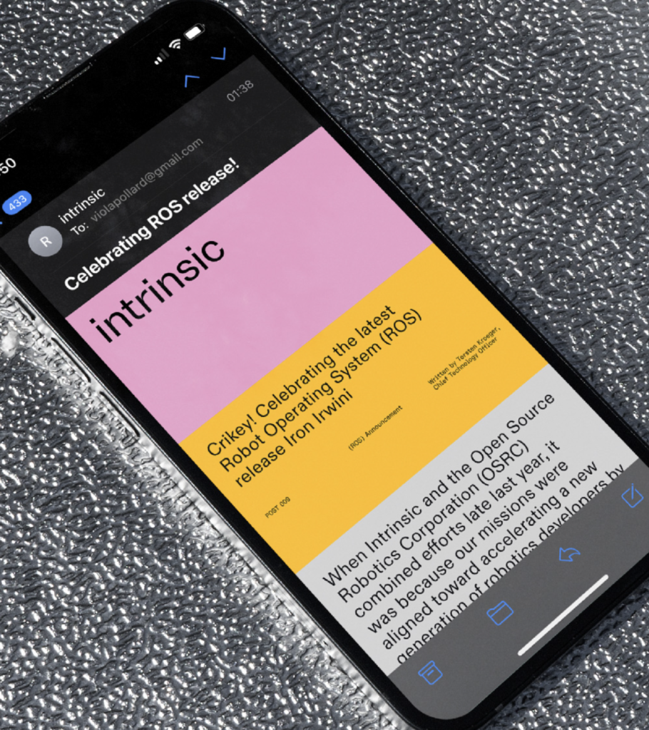
A brand identity for company (graduate of Alphabet’s moonshot project incubator X) that seeks to democratize industrial robotics. A simple wordmark was developed along a series of animated icons that attempt to simplify and organize primary capabilities and site content. Renowned Pentagram (London office) developed the new identity program with Hudson-Powell responsible for building the brand’s platfrom and web-native app.