-
07 10 20
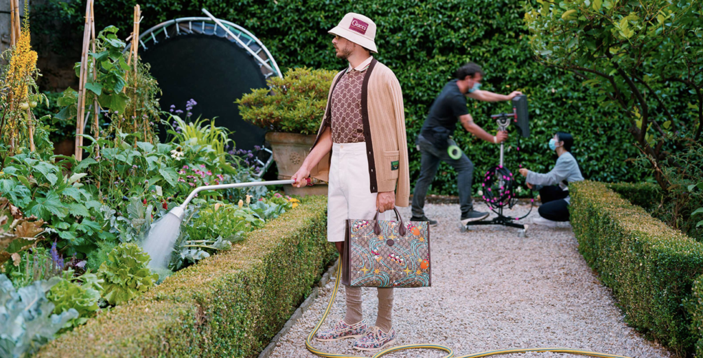
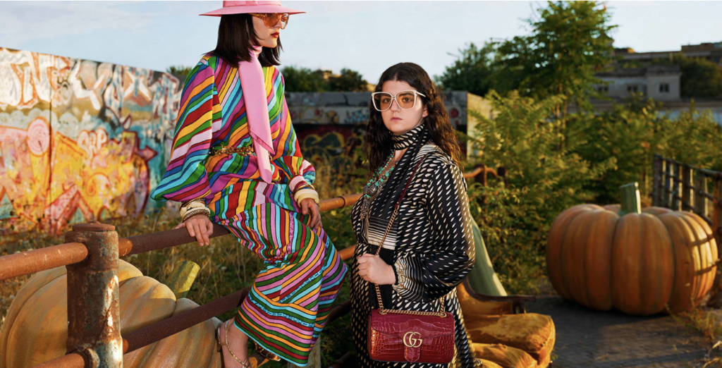
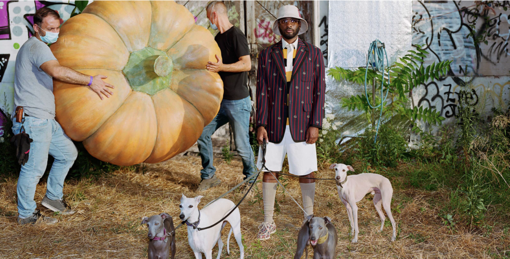
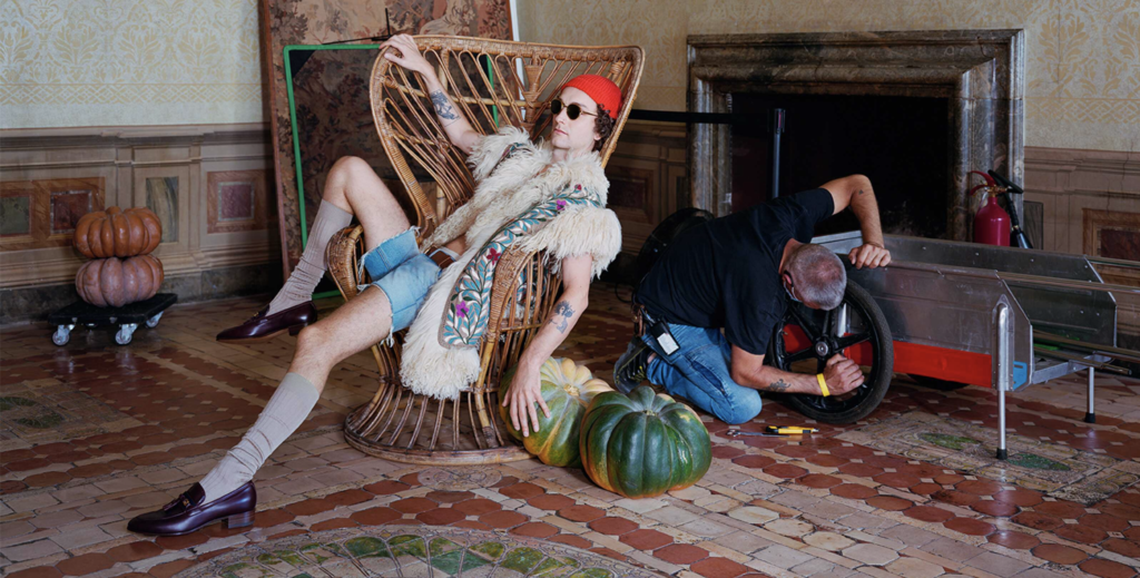
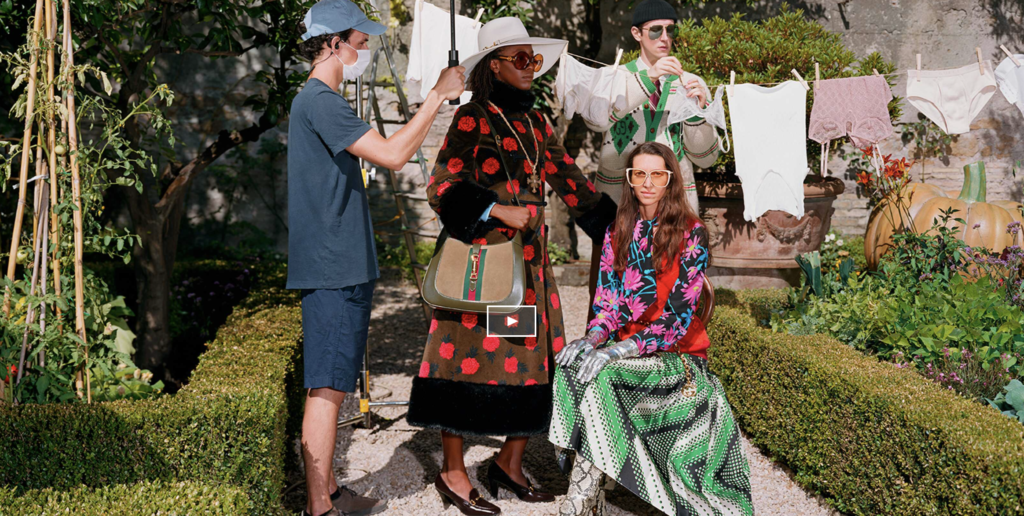
Shot during a twelve-hour live stream in July 2020, Gucci creative director Alessandro Michele revealed what lies behind the making of a (well-financed) fashion ad. Throughout the course of one day, the campaign features the Gucci design team as models wearing pieces from the Epilogue collection. Two Roman locations, Palazzo Sacchetti and graffiti-covered Campo Boario are add to the eclectic, colorful vintage inspired extravaganza. Shot by Alec Soth and filmed by directors Damiano and Fabio D’Innocenzo. Gucci continues to lead the top tier of fashion brands in creative and innovative use of social media channels. Their growth since Michele took over creative duties is definitive proof of a successful luxury brand today. Bellissimo!
-
06 05 20
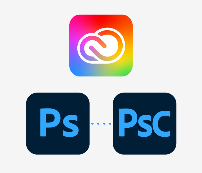
Software manufacturer Adobe introduces a brand identity refresh including icons for many of its applications. Like many brands, Adobe is moving to a simpler approach with an evolved color palette. The primary logo has changed to one-color red logo with the color shifted to a slightly warmer shade. This is the first logo change since 1993. Otherwise, the Creative Cloud logo moves from its current red and white design to a white emblem on a rainbow background. The Photoshop and Lightroom logos have evolve to a borderless rounded corner icon with lighter text. Photoshop Camera application will use three letters, adding an uppercase C to the Ps of the Photoshop logo. Nothing too creative or even noteworthy here, just an evolution in line with so many brands with large online users or customers. All sensible choices…
-
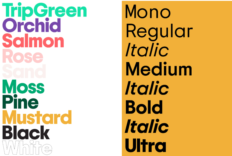
05 23 20
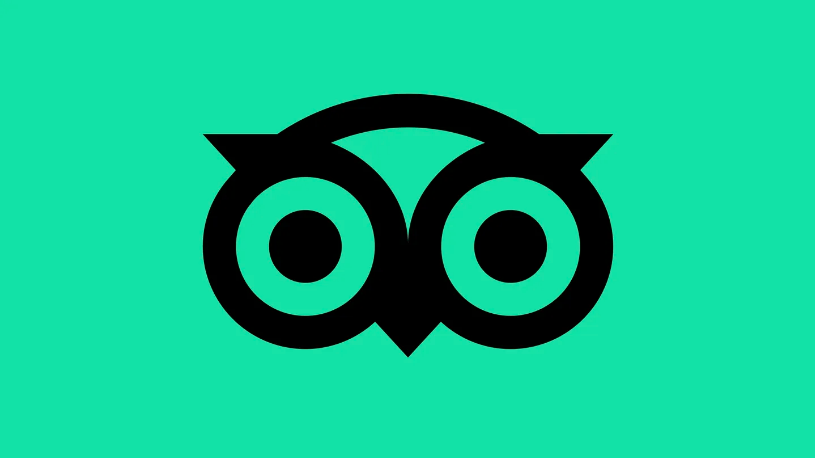
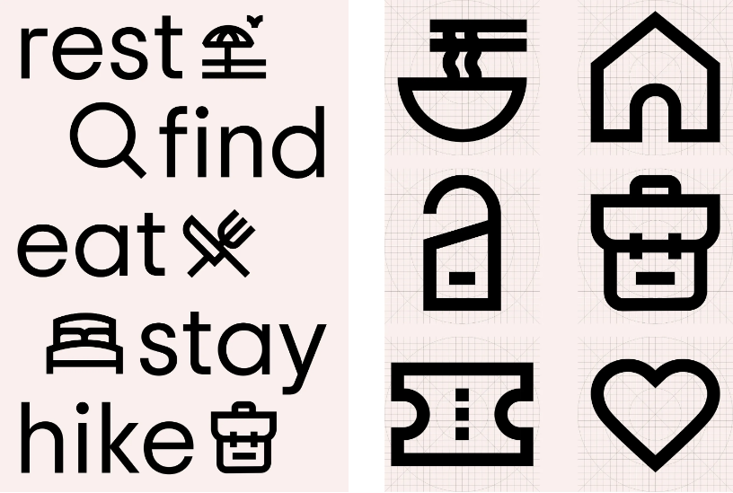
Travel site Tripadvisor is 20 years old and had decided to rebrand. The well-recognized owl symbol has been refreshed with simpler rounder lines. A new custom typeface (Trip Sans), set of icons and refreshed color palette (‘TripGreen’, orchid, salmon, rose, sand, moss, pine and mustard) adds to the more contemporary identity. Another subtle changes is the company is moving from TripAdvisor to Tripadvisor. The company says users recognize and pronounce the brand as a single word after twenty years of business. Mother Design New York led the identity refresh. We applaud the entire effort. Bold, clear and fresh, the brand is wisely positioned for the return of travel. Bon voyage!
-
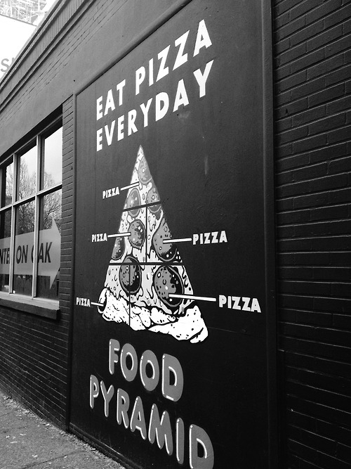
05 20 20
Pizza pyramid
-
05 06 20
Mourning in America, another hard-hitting ad by the Lincoln Project, a group of anti-Trump Republicans, leads most 2020 campaign advertising as most memorable. A remake of Reagan’s 1984 ad in reverse that succeeded in getting under Trump’s skin, prompting a presidential rampage on Twitter. Dems can take a few lessons from these guys. Catch it on social media or in a battleground state near you…