


05 23 20
Wise identity refresh
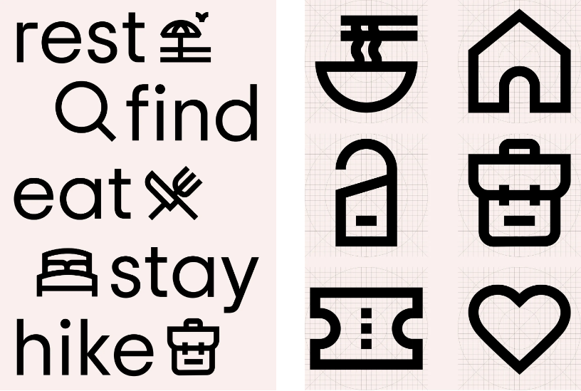
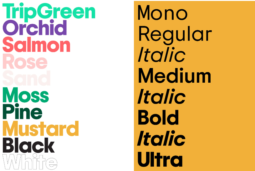
Travel site Tripadvisor is 20 years old and had decided to rebrand. The well-recognized owl symbol has been refreshed with simpler rounder lines. A new custom typeface (Trip Sans), set of icons and refreshed color palette (‘TripGreen’, orchid, salmon, rose, sand, moss, pine and mustard) adds to the more contemporary identity. Another subtle changes is the company is moving from TripAdvisor to Tripadvisor. The company says users recognize and pronounce the brand as a single word after twenty years of business. Mother Design New York led the identity refresh. We applaud the entire effort. Bold, clear and fresh, the brand is wisely positioned for the return of travel. Bon voyage!


