-
05 28 21
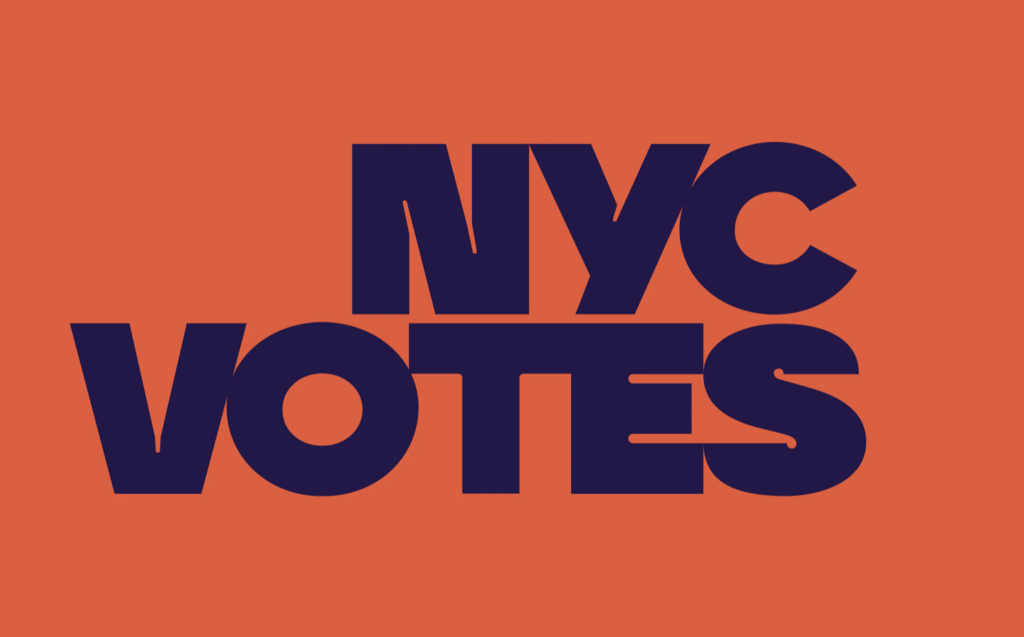
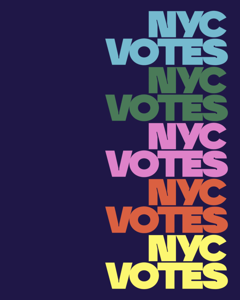
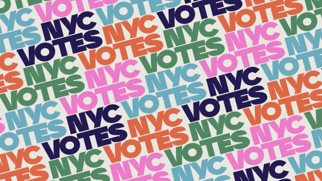
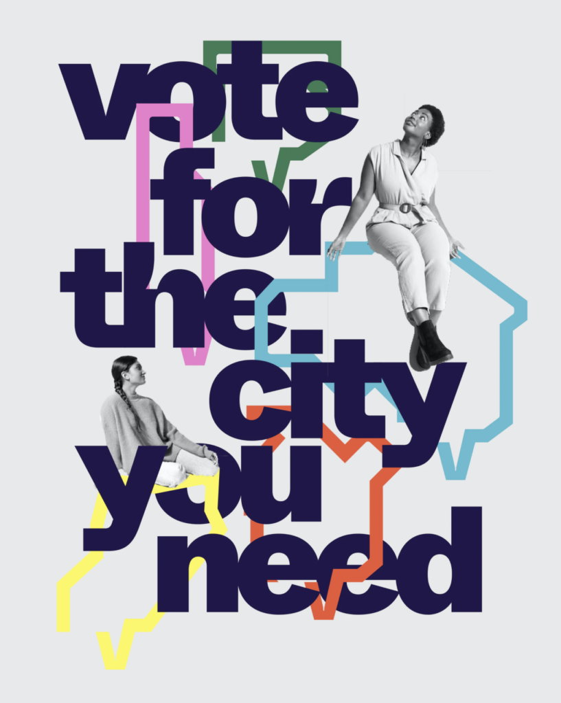
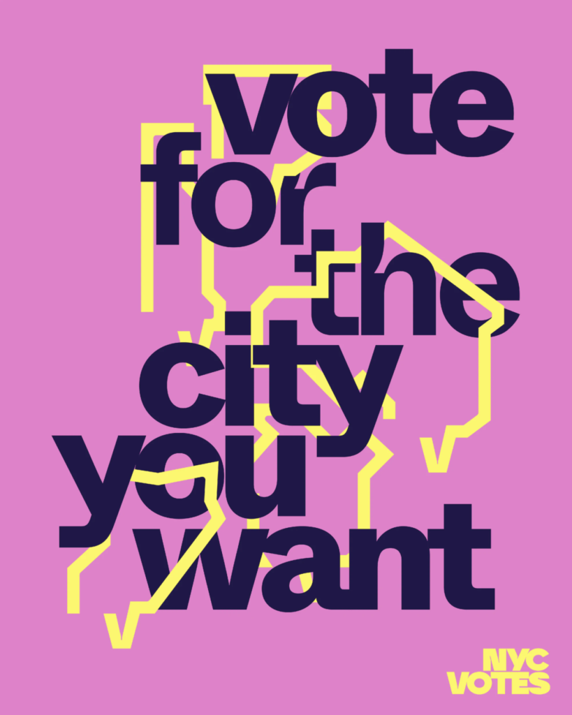
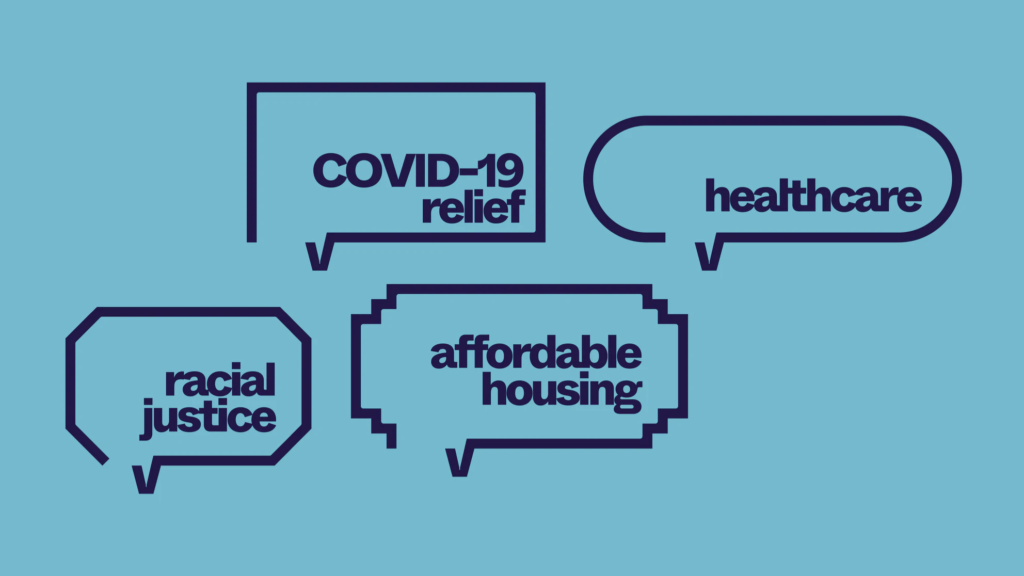
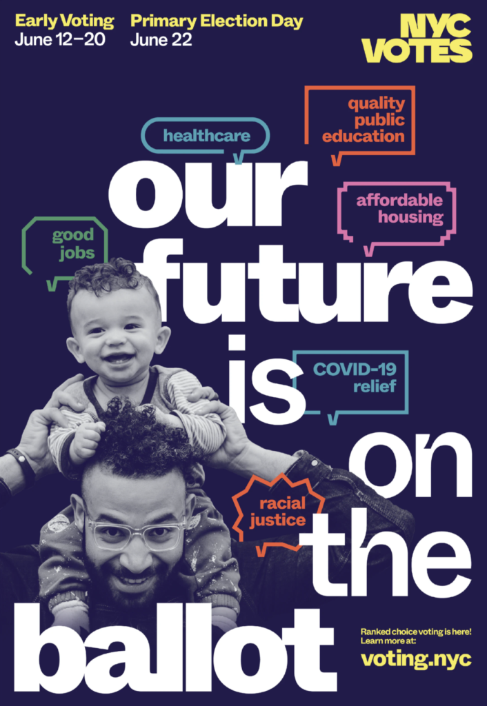
New York’s nonpartisan voting board, NYC Votes has just introduced both a new identity and a distinctive, bold new branding campaign led by Pentagram partner, Eddie Opara. From its new logo to its vibrant color scheme, NYC Votes greets city voters with a modern, bold voice befitting a city post-pandemic. Let’s vote for the city we want!
-
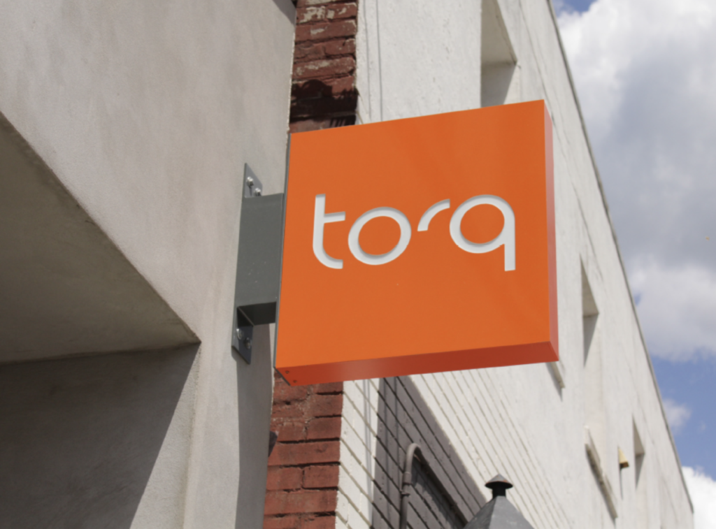
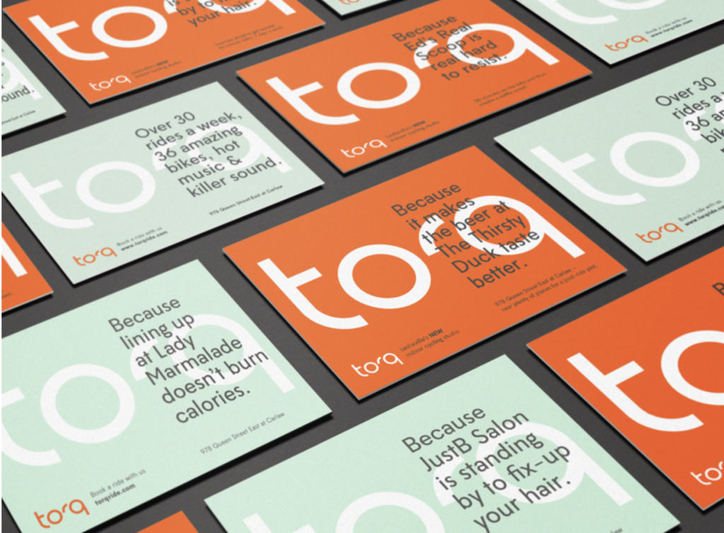
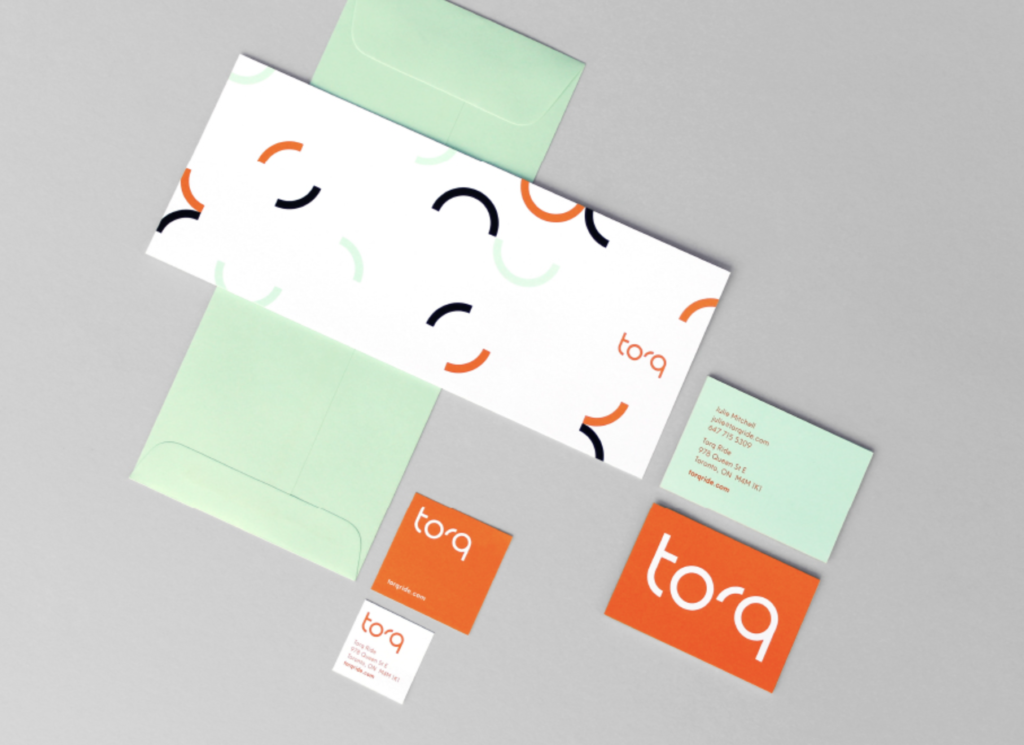
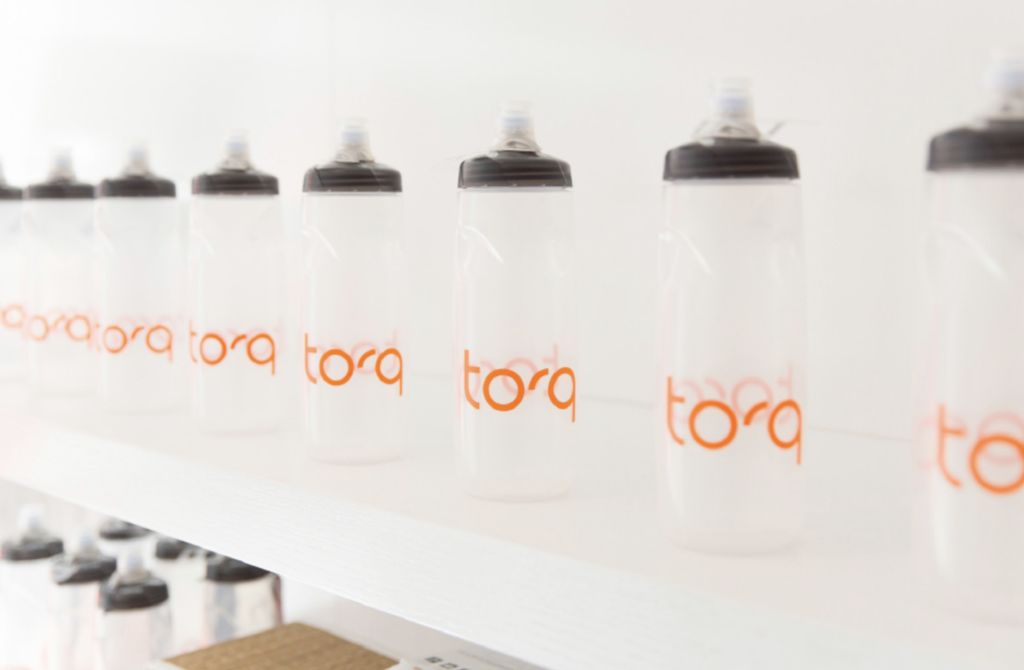
05 14 21
Identity for new fitness brand by Parcel Design. Like both the snappy, lively logotype and fresh color palette. Now, back to the gym!
-
02 05 21
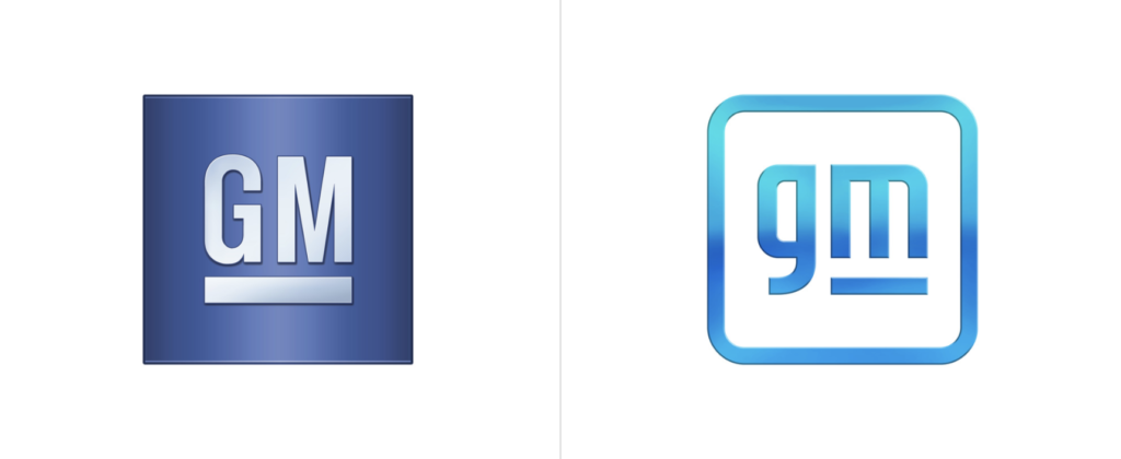
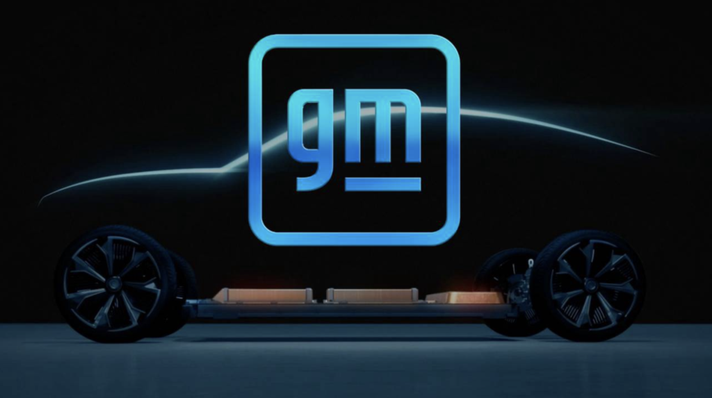
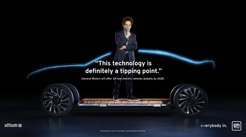
GM follows fellow carmakers Volkswagen, Toyota, BMW, and Nissan in adopting cleaner, more digital-friendly branding in anticipation of a future centered around electric vehicles. The new brand’s redesign features a reversal from white-on-blue to blue-on-white delivers a lightness that may help consumers accept the brand as a more environmentally responsive company. Moving to all lower case as many have done is understandable (more user-friendly/accessible/technology-driven), but seems unconvincing for the once-almighty GM. The underscore has been slimmed down significantly, now positioned only under the “m”. Apparently, the negative space here is meant to suggest or represent an electric plug. The new logo’s rounded corners and blue color scheme including a gradient closely resembles a smartphone app icon. Not a bad thing, certainly. GM is also featuring inspiring influencers who promote change in print, tv and video versions of the ads. They include professional surfer Bethany Hamilton, gamer Erin A. Simon, fitness instructor Cody Rigsby, and author Malcolm Gladwell. All in all, a rationale move by the former largest carmaker in the world. Does it represent a brand or company committed to change and electric vehicles (phasing out internal combustion engines by 2035)? We say it does not. The typography, the colors, the underline and the app-like frame. While we often support the evolution of a brand identity, this one just leaves us cold. Not cold in a techy kind of way, but cold in a bland and undistinguishable way. Remember, the brand represents values and personality. And then there’s Tesla…
-
01 12 21
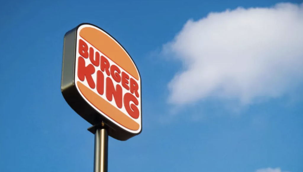
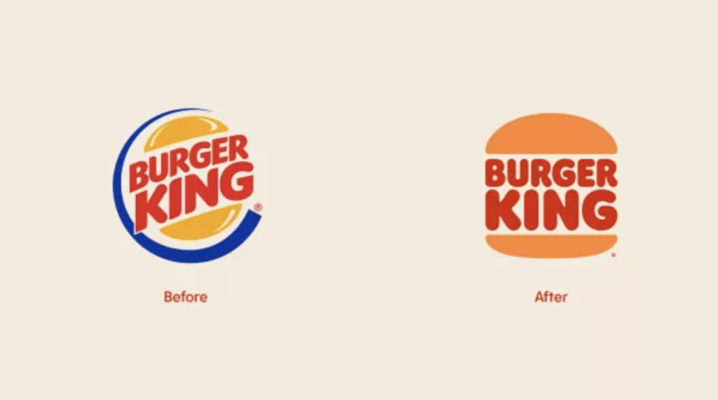
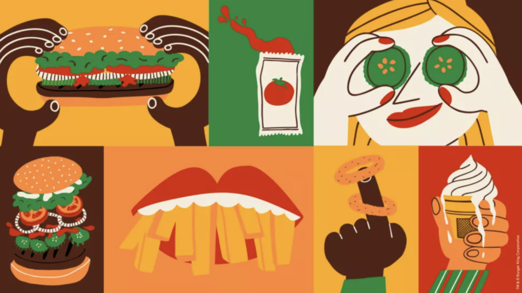
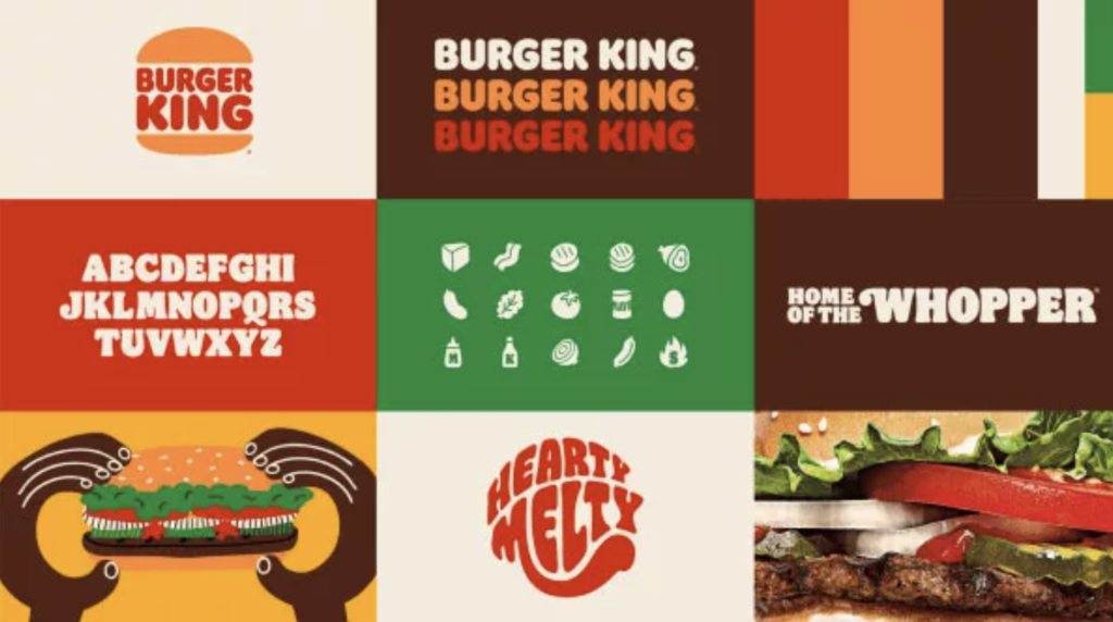
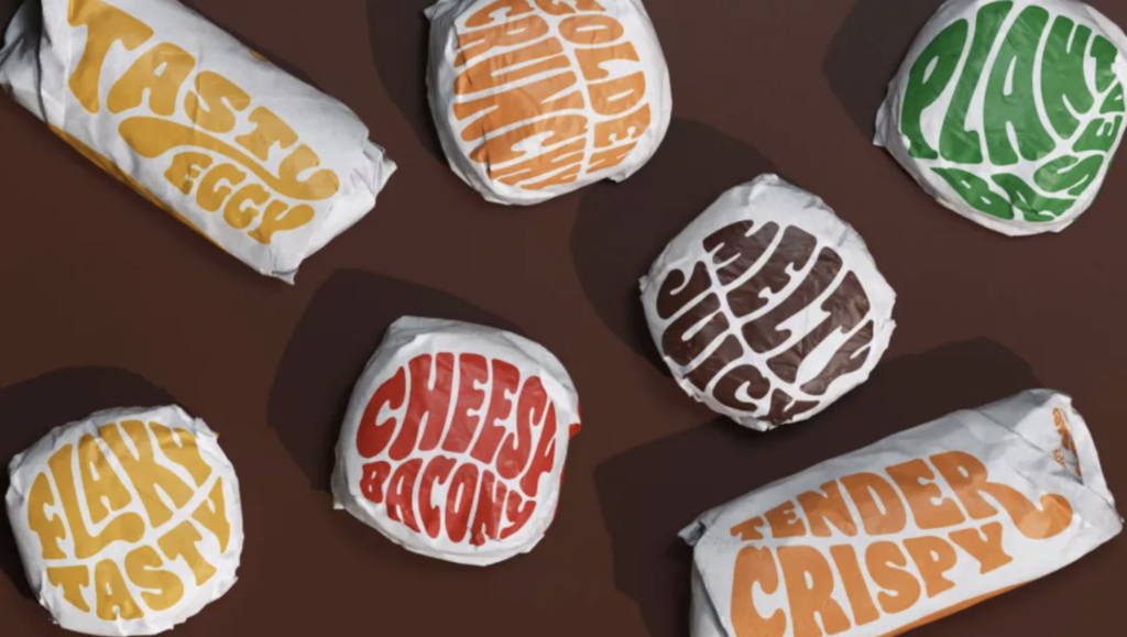
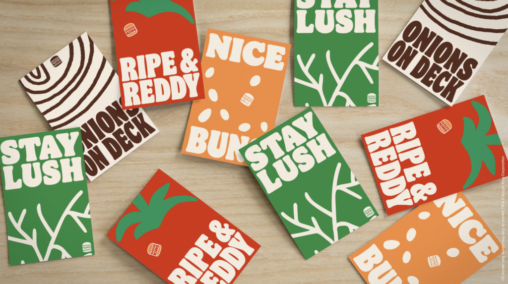
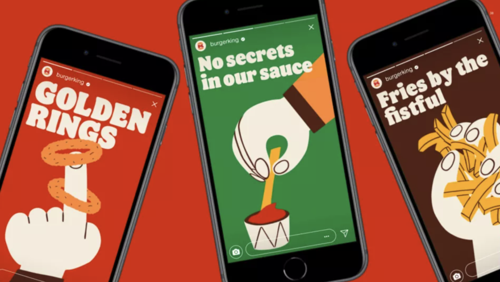
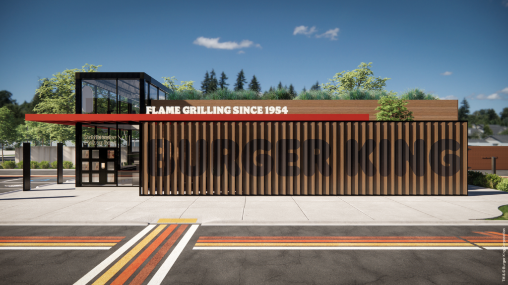
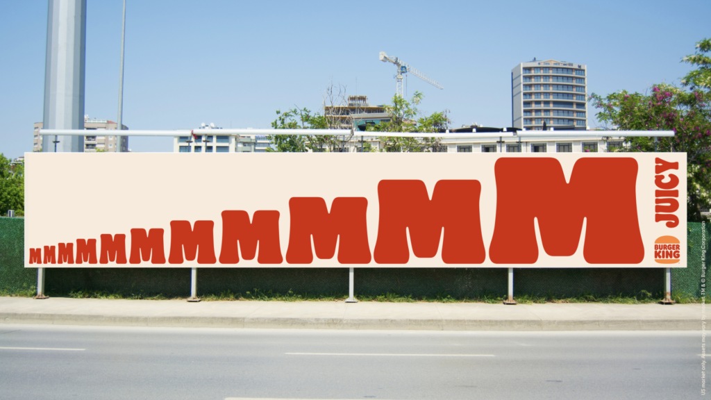
Burger King joins the flat design for the digital age movement. With a major brand refresh (by Jones Knowles Ritchie) recently introduced, the fast food giant embraces its past with a new logo that closely resembles a 1969 iteration and a new brand identity that brings a delightfully fun and robust visual language for broad applications. The new logo is again simply sandwiched between two halves of a bun. A new typeface, Flame, again calls to mind the earlier logo from decades ago, but brings back a cohesive and sense fun that is a welcome and positive change. A new color palette and playful illustration style gives the new visual platform both a fun-lovin’ energy and distinctiveness. Obviously, many big brands are wrestling with the move to flat design and the required simplified brand approach that resonates on smartphones as well as tablets, desktop computers and televisions. Of course, the challenge remain to creative and execute for maximum impact, distinctiveness and ideally, authenticity. We applaud Burger King’s move into the future with a delicious, engaging and fun nod to the past. MMMMMMMMMM! 🍔🍔🍔
-
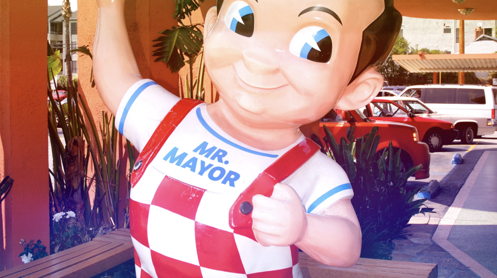
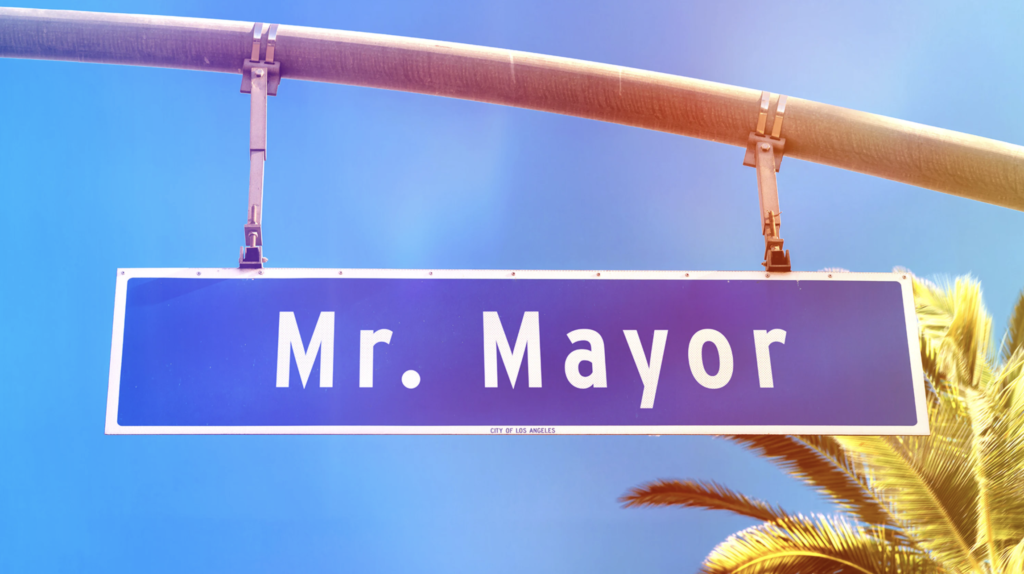
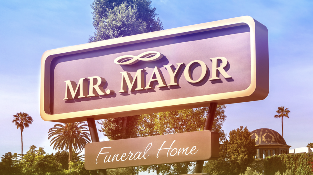
01 08 21
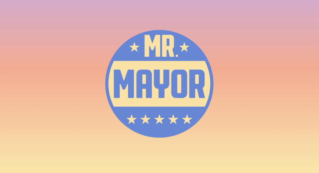
New logo and opening titles by Pentagram for “Mr. Mayor”, a new NBC comedy from Robert Carlock and Tina Fey staring Ted Danson and Holly Hunter. Bright, sunny with a touch of smart humor establishes the new show’s witty political and uniquely west coast point-of-view. We loved the first episode and applaud the oh-so-talented Ms. Fey (and NBC) for enlisting the prolific and design gods of Pentagram Longing for trip to sunny L.A.!