Nissan joins other major automakers and leading corporate brands embracing the two-dimensional or flat identity design. Its new identity has been in development three years since 2017. The brand name remains at the center of the new logo, but is no longer raised or contained in a band. Overall, all elements are thinner with the font refined and letter-spaced, resulting in a more modern feel. The new Nissan identity continues the brand’s guiding message— with a strong, determined belief, you can even penetrate the sun. Animated versions of the logo will be featured online, moving and pulsating against diverse backgrounds. A big improvement from the previous brand identity with a elegance and flexibility well-suited for the future and digital age. Plug it in and let’s hit the road…
Category: Identity
Introducing Biden-Harris
The suspense is finally over. Kamala Harris is Joe Biden’s pick as his running mate. The Democratic ticket officially has a vice president candidate. And of course, a new campaign logo. An in-house team designed the new logo which is an evolution of the Biden logo deployed for the primaries. The new Biden-Harris logo uses the typeface Decimal (Biden’s original logo used the typeface Brother 1816), developed for the campaign by type foundry Hoefler & Co. Decimal, inspired by the typography of vintage watches and clocks, feels simultaneously timeless and forward-looking. It does a good job projecting strength, honesty, dependability and accessibility. Our thoughts are somewhat mixed. On one side, the mark does present a strong sense of partnership—a unified front against the current administration. It does lack any really strong brand message which most would consider a missed opportunity. Perhaps the country wants or needs a straight-forward approach. Let’s see what is in store for the Democratic ticket with critical messaging, advertising and social media. Admittedly, most of our NYC fingers are crossed.
Not your average beer


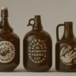
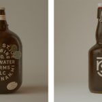
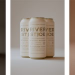
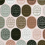
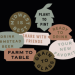
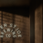
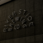

New brand identity for southwest Michigan-based farmstead brewery, River Saint Joe. Design system provides flexibility for a wide range of applications. From packaging to signage, we just love this robust and appealing work. Design by Studio MPLS. Cheers. 🍺🍺🍺
Major rebrand to reflect future vision and growth
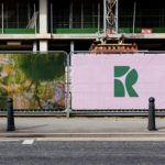

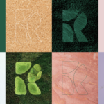
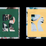
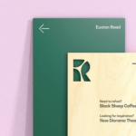
New identity for Regent’s Place, a mixed use business, retail and residential quarter (from 2010) on the north side of Euston Road in the London Borough of Camden. The new symbol represents the three districts — the Knowledge Quarter, Camden and the West End. The new identity, designed by London-base DixonBaxi, looks to capture the area’s future of housing with green space, a deeply rooted sense of community and forward-thinking, sustainable architecture. This contrasts greatly with Regent’s Place’s previous cold corporate identity. The new word mark deploys Bw Gradual for a more elegant and organic feel. The new system brings a new contemporary point-of-view reflecting the brands creative and green ethos. Animation along with reclaimed wood signage, bamboo business cards and soy-based community printing are featured to support the new approach. The entire effort is a huge step forward advancing a more progressive image for this important London neighborhood. We’re sure that it will be embraced by many businesses and residents with open arms. We salute the smart, creative and large scale effort…
Symbol only + flat logo design now trending
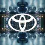

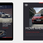
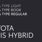
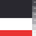
Toyota joins other major car brands by moving to flat logo design. More significantly, it is also removing its word mark from its primary brand identity. The brand refresh by agency The&Partnership for Toyota Europe exclusively, seeks to address digital use where simplified or flat design provides better readability and clarity. A new custom typeface called Toyota Type was also introduced along with a new monochrome color palette featuring a range of grays and an accent red. The new logo design and brand identity system will appear first in Europe with all vehicles still featuring the current logo. Whether the identity will be rolled out globally has not been announced. Certainly, a respectable refresh. We’re curious to see whether the global brand embraces the new European approach.
Simplifying logo + icons for digital applications

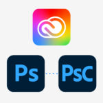

Software manufacturer Adobe introduces a brand identity refresh including icons for many of its applications. Like many brands, Adobe is moving to a simpler approach with an evolved color palette. The primary logo has changed to one-color red logo with the color shifted to a slightly warmer shade. This is the first logo change since 1993. Otherwise, the Creative Cloud logo moves from its current red and white design to a white emblem on a rainbow background. The Photoshop and Lightroom logos have evolve to a borderless rounded corner icon with lighter text. Photoshop Camera application will use three letters, adding an uppercase C to the Ps of the Photoshop logo. Nothing too creative or even noteworthy here, just an evolution in line with so many brands with large online users or customers. All sensible choices…
Wise identity refresh
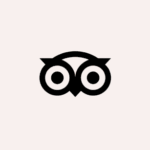


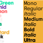
Travel site Tripadvisor is 20 years old and had decided to rebrand. The well-recognized owl symbol has been refreshed with simpler rounder lines. A new custom typeface (Trip Sans), set of icons and refreshed color palette (‘TripGreen’, orchid, salmon, rose, sand, moss, pine and mustard) adds to the more contemporary identity. Another subtle changes is the company is moving from TripAdvisor to Tripadvisor. The company says users recognize and pronounce the brand as a single word after twenty years of business. Mother Design New York led the identity refresh. We applaud the entire effort. Bold, clear and fresh, the brand is wisely positioned for the return of travel. Bon voyage!
Playful can be powerful
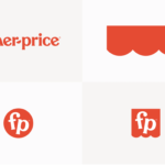
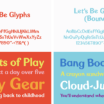
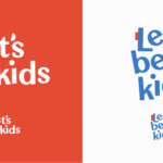
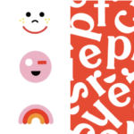


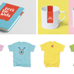
Early this year, Fisher Price has introduced a major rebrand of its identity. The brand worked with renowned design firm, Pentagram for the brand refresh including a modest update of the logo, a custom typeface and a fun set of graphics playing off of the recent unveiled “Let’s be kids” campaign by advertising agency Wieden + Kennedy. The new typeface is called Let’s Be Glyphs and offers straight and “bouncy” versions to allow for managing the amount of playfulness. The word mark update is subtle, with new lower case initials “f” and “p”, and a hyphen that has become a semi-circular “smile”. The new curved graphic also relates to the original “awning” – the scallop-edged shape the word mark sits on, simplified and redrawn for the brand refresh. Two new monograms using the brand initials inside a circle and awning shape (“flag tag”) was designed for flexibility and can include copy, or simply used as a graphic stamp on photography, animations, packaging or store displays, to quickly identify the brand. Once again, Pentagram delivers both a distinctive, smart identity that perfectly captures the personality of this renowned brand. So fun to see, think about and imagine some of the applications or iterations to come. We can all use a little fun…
Yes, the world is (increasingly) flat

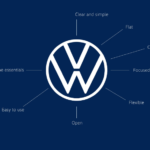
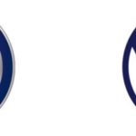


Volkswagen has joined many major brands and introduced its flat design “digital-first” identity. Gone is the dated three-dimensional chrome-effect logo. The new identity was a collaboration between a total of 19 internal teams and 17 external agencies and launches with a line of new electric vehicles. It now displays a flat, two-dimensional design in dark blue. the new mark certainly will be more easily displayed digitally on consumer’s devices as small as a smartwatch and diverse applications. While it is certainly a subtle evolution from the previous identity, execution especially in the digital world, the revamped identity will most likely be a positive thing moving forward. Are you ready for what the future has in store?
Refreshed daddy
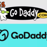
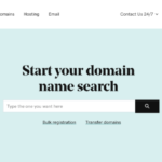
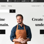
A new and welcome identity refresh for GoDaddy, the web hosting company just debuted. Gone is the bland wordmark which replaced the odd cartoon character and typography. The new brand identity and positioning is both modern and digitally friendly while welcoming a new shift in focusing on users’ experiences and successes. We applaud the significant shift and think if solid service and marketing prevails, it should all bring many new daddy fans.


