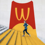
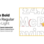
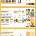
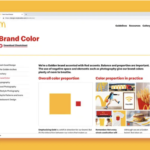
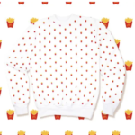
A recent rebranding for the mega global brand McDonald’s was just introduced. Although the logo itself remains unchanged, the scale of the brand refresh is significant and far-reaching. Color usage was dramatically reigned in with a substantial new focus on the “golden arch” yellow. Photography moved to more contemporary, active shots depicting more at home and on-the-go along with more carefully art-directed in restaurant scenerios. Branding firm, Turner Duckworth also introduced a bold, creative use of the renowned Golden Arches. A new set of flat-design icons featuring a range of McDonald’s menu times was also created. Patterns were also developed for both digital applications and branded apparel. Finally, a new typeface, Speedee, was designed, inspired by the Golden Arches and the brand’s wordmark. Intended to streamline the use of multiple fonts, it is friendly, accessible and flexible in all applications, especially digital. We have only praise for this effort. It brings a new vitality to an overly complicated and unmemorable brand identity. Now, let’s get some of those fries!
