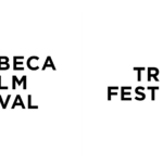

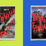
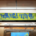
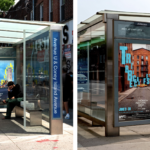
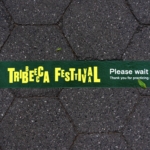
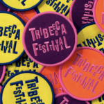
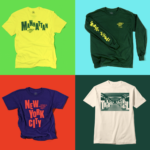
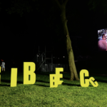
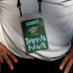
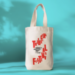
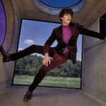
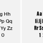
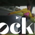
The Tribeca Film Festival launched in 2001, founded by Robert De Niro and Jane Rosenthal, as a means of using the power of film to usher in joy and hope to a city reeling from the devastation of 9/11. Two decades later, as the world-renowned festival honors its 20th anniversary, the organization has undergone brand overhaul in the wake of the COVID-19 pandemic.The widely recognizable existing logo needed updating to reflect its revised name and to celebrate the festival’s 20th anniversary. Since its featured roster have expanded beyond film to include TV, art, comedy, talks, games, podcasts, immersive experiences, virtual programs, and more, the festival was renamed as the more media-inclusive Tribeca Festival. The new comprehensive celebratory rebrand (by Pentagram) features a bold and colorful anniversary logo along with a new bright color palette, dynamic typography (utilizing Druk and Basis Grotesque typefaces) and clever animations. It all screams celebration and is both distinctive and joyful. The new branding is comprehensive covering event graphics, advertising, promotional materials, posters, video and social media. While we continue to struggle through the challenges of the pandemic, the Tribeca Festival continues to entertain, celebrate the arts and give us a good reason to get together and enjoy the show. Bravo!!!
Month: August 2021
Luxury retail re-introduces itself
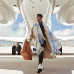
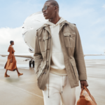
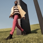
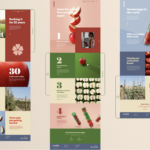
Neiman Marcus has been through a lot including significant team restructuring, refinancing, acquisitions and high-level design partnerships following its emergence from bankruptcy over one year ago. Its new campaign hopes to show the company’s growth and transformation, re-introducing itself to customers in a fresh new light. The new campaign to debut this fall is broad with both still photography and video, all communicating dramatic visual stories around the juxtaposition of customers’ re-emergence to work, life and nature. Digital campaign stories will be shared throughout the season on social media platforms and the retailer’s homepage, in addition to the brand’s own publication, The Book, which will feature a range of exclusive interviews with established brands, designers and creatives. New, exclusive brands are the leading force of the campaign with the retailer hoping to reach existing and new customers with new style perspectives in a dramatically changing world. Like so many things, time will tell. Curious to see if one of the old guards of luxury retail can stake a claim in the new world of fashion. We’ll be watching…
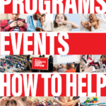
Positioning for anti-poverty initiatives

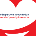
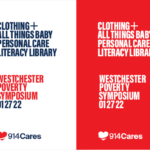
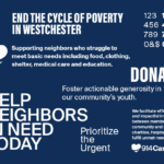
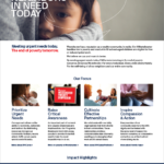
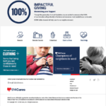
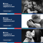
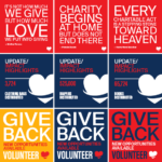
Kellyco@work | 914Cares (brand identity, digital design, social media, graphic design). Created new brand identity, website and social media post library for regional non-profit organization providing assistance to struggling community members. Developed new design and messaging platform, enabling more impactful communication, efficient online fundraising and diverse promotion capabilities. More on this project >
Fruit branding for global growth

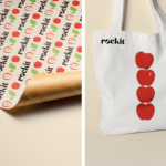

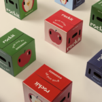
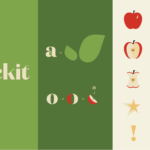
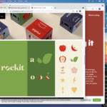

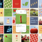
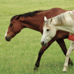
Rockit Global introduces its new branding and a new positioning line, ‘Rockit every day’. Yes, Rockit is a type of apple. They are distributed fresh and prewashed in a convenient tube. The apples are small, snack size, at approx. 1.5x the size of a golf ball. Rockit apples have a sweet flavor, thin skin, a distinctive bright red blush, small core and fantastic crisp crunch. The new branding brings a bolder logo and design platform that delivers a energetic, friendly and healthy attitude and personality. Illustration and animation all are well executed here. All bases seem to be covered (identity, packaging, website, promotion, social media) with the refresh and should help the brand standout in a largely commodified category. Rockit apples targets its primary export territories within Asia, America, Europe and the Middle East. Every Day Goodness (and fruit branding) is a good thing. Creative by Special Group New Zealand. 🍎🍎🍎🍎🍎


