
#ffbdbd (prettycolors)
Month: March 2019
Community + technology


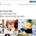
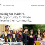
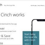
Kellyco@work | CINCH (brand identity, digital, promotion, social media). Designed new brand identity for consumer payment app that brings together residents, locally-owned businesses and local causes to foster meaningful community growth. Site content and design had goal of both reaching targeted consumers, as well as businesses. Tagline was also created following a series of user focus groups on brand perception. Promotion materials, presentations and social media standards were also developed.
McKinsey’s elegant refresh
McKinsey, the global management consulting firm has recently introduced a refreshed brand identity. The renowned consultancy that advises on strategic management to corporations, governments, and other organizations looks to better define its services along with its current philosophy. While most businesses have experienced significant change in the last five years, change for McKinsey has been especially extreme transitioning from big corporate strategic consulting to substantially more work in digital, analytics and design. The firm’s logo itself has not changed drastically (two lines vs. one line). Everything else seems to have either changed dramatically or evolved more subtly. A new approach to photography, data visualization, color palettes, fonts and other graphic elements give the brand an important new fresh point-of-view. A deeper blue is paired with white space to deliver high contrast and dramatic effect. Overall, it is a beautifully-executed, sophisticated refresh that demands attention and instills confidence.


