


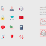

Santander, a leading bank based in Boston, recently introduced a significant rebranding initiative. The longstanding flame symbol have been revisited with a modestly reworked version designed for clarity and diverse applications including digital. New typography is also a welcome change to the bank’s identity. A new sans serif now sits next to the redesigned symbol. A full family of fonts were created for Santander’s marketing efforts. The application of these typefaces across applications delivers much improved consistency while supporting the new logo. Photography standards were reexamined and new emphasizes more active shots projecting both busy lives of customer and an optimistic viewpoint. New color icons add some interest with simple red versions offer flexibility with applications. Overall, this refresh delivers on digital-friendly simplicity as well as a nice evolution toward a more modern, friendly brand presentation. Kudos to the well orchestrated effort…


©2024 Kellyco Marketing. All rights reserved.