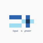

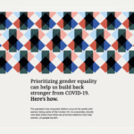
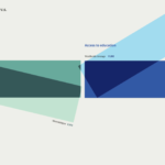
Data visualization system for the Bill & Melinda Gates Foundation created to help tell and support data-driven stories about gender equality. All design layouts and templates are designed from either plus or equal signs, reinforcing the gender equality and progress. Noto, a comprehensive open-source font family with support for over 1,000 languages, is utilized for all online applications. The broad far-reaching project reinforces how data can effectively tell compelling human stories and help target audiences see beyond normally intimidating data presentation. An amazing effort by renowned design consultancy Pentagram (partner, Giorgia Lupi and team). Bill and Melinda should be thrilled.
Category: Data
Wash well
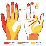
A bit dated, but certainly an effective visual reminder of the critical handwashing critically needed today. Reference: Taylor, L. J., An evaluation of hand washing techniques, NursingTimes, January 1978
Designing for data

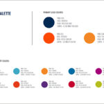
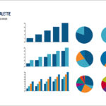

Kellyco@work | CAMPAIGNTRAC (brand identity, digital design and content development). Created identity and website for cloud-based data platform for data marketing firm. Developed both design and marketing content for new data service for agency media and marketing users, enabling prospect development, campaign management, tracking and analysis.
Value smarts

Data, data everywhere

Animated gif representing the new era of computing able to consume the ever growing sea of unstructured data. From the recent IBM Watson Solutions marketing efforts.
Data Visualized
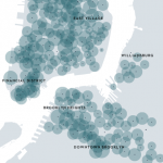
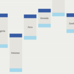
A Month of Citi Bike | The New Yorker. Live data provided by Citi Bike website shows just how successful the bike sharing program has been. The New Yorker mapped out this data by tracking when bikes appeared at different docks at 15 minute intervals over a month’s time. Clear from the map that the program has become an increasingly viable option for work commutes, as well as a great way to explore the city on weekends. Great way to measure Citi Bike’s progress. Gear up for the visual future…
Picture this
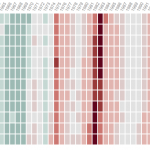
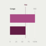
U.S. Unemployment: A Historical View (Wall Street Journal). View of the post-war U.S. economy and unemployment levels. Not difficult to see how significant this Great Recession has been. Sources: Bureau of Labor Statistics; Current Population Survey, May 3, 2013. Nothing like a simple grid and a few pretty colors to show the big picture…
Online mapping takes on new dimensions
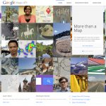
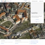
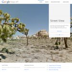

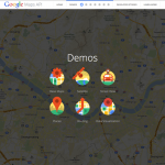


Site SPOTTED. More than a Map: Microsite that showcases the available APIs for Google Maps and the stories of the developers using them. Hats off to Upperquad (San Francisco) for the well articulated and simply presented demos on the site, showing the downright amazing features that any developer can build into websites or apps. “Developer Stories,“ short video profiles shot for the site (on five continents over eight days), give the presentation a very personal and accessible feel for anyone considering using Google’s simply brilliant technology. Think seriously about how to present your capabilities simply and effectively. And while you’re at it, think about integrating some sexy maps…
Making the data digestible

When the Data Struts Its Stuff… In Sunday’s NYT, Natasha Singer looks at the dramatically growing importance of information visualization. While information graphics design has been around for ages, today’s data-driven world brings it right to the forefront of business/marketing communications.


