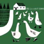


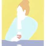
Illustration SPOTTED. Louise Sheeran | artist, designer, printmaker & illustrator. Sheeran, now residing in Clermont-Ferrand, France, has a delightful body of work ranging from looser brush stroke illustrations to more graphic, composed pieces . Clients have included Borough Market, Toast Magazine, Lonely Planet, Noble Rot Magazine, Bloomsbury and Leroy Shoreditch. Diverse range of work, all smart, sophisticated and distinctively impactful. Look forward to an opportunity to work together…
Category: Inspiration
For the love of craft
We recently rediscovered this wonderful film on the history and significance of sign writers in Ireland. Seems especially poignant in these challenging times along with the digital age which has greatly affected physical retail establishments and the way we communicate. Less plastic, more thoughtful design, craftsmanship and pride in one’s work—definitely a good thing.
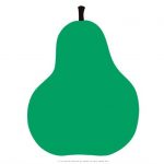
Color Spotted: Bummer Green
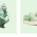
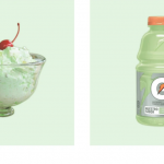
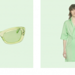
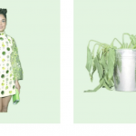


Profile on the reemergence of this darn we say odd color, by Emily Yoshida for SSENSE. Yoshida writes, “In a mystery zone that isn’t quite seafoam, nor neon, nor the cheerfully unnatural glow of terminal green. “Mint green” feels like a euphemism; if it is a mint it’s artificial spearmint, with all the throat-clinging bitterness that entails. It’s technically verde, but it’s the most un-verdant green on the color wheel.” We embrace most colors, but we side with Yoshida on this one. Gucci and Billie Eilish can pull it off for this moment in time, but for the rest of us mortals, it really is either an inexplicable throwback to vintage kitchen bowls, Betty Ford (loved the color!) or one of the bad St. Patrick’s Day hues that just should not show up at all. To each his own, but come on. : (
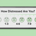
Humor can help

Pizza pyramid
Judi, Judi, Judi
Nothing about branding, marketing or design here. Something just for pure enjoyment, distraction and possibly personal inspiration. British Vogue, as part of their “Ask a Legend” series, invited an incredible range of celebrities to pose their most burning questions to the renowned actor. Who doesn’t love Judi Dench?!? Obviously, it’s been a rough year (with more to come). Get up, stretch, grab another cup of coffee or tea and enjoy these delightful fifteen minutes. Undeniably, good for the soul…
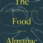
In time it will come
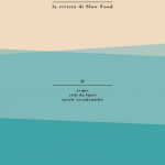
Magazine cover design, Slow.
Nan Goldin Spotted

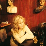


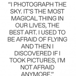

Life as Nan Goldin Knows It, by Thora Siemsen for SSENSE. Interview with the renowned photographer whose work remains intensely personal and always political. Her latest work, the opioid crisis, update on her life and her new passion for the sky and clouds with her new credo: “Seek to persuade all who’ll listen of the wonder and beauty of clouds.”. Nothing less than a fascinating piece on an artist that continues to enthrall us all.
Simple, always welcome
La Pera, 1963. Designed by Enzo Mari for Danese, Italy.
Content matters
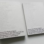

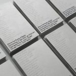


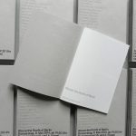

Above the Roofs of Berlin, exhibition catalog design by Neubau.
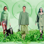
Taking on an entire city’s brand
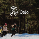
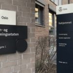

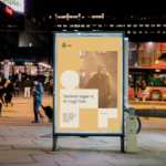
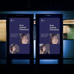
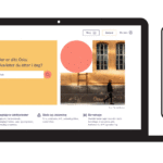
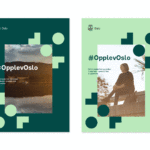


The city of Oslo welcomes a new visual identity with a simplified logo and identity system inspired by the city’s architecture. The comprehensive identity refresh by agency Creuna is intended to better communicate what the city provides to residents and how it works. The city’s logo has been redesigned for the first time since 1924 with a simplified St. Hallvard, the city’s patron saint. The new logo is better suited for small usage and digital use. The overall design system features three basic shapes which were inspired by architectural details found at many of the city’s landmarks like Oslo’s City Hall, the Vigeland Sculpture Park or its industrial Barcode district. Collectively, the shapes cleverly come together to form the word “Oslo”. There is also a new color palette inspired from Oslo’s cityscape, as well as a custom typeface, Oslo Sans. New distinctive illustrations provide another key component to reinforce the overall visual identity and design system. A new set of icons support the new system with a distinctive presence, whether online, in signage or diverse city communications. In short, a smart and beautifully realized identity program. Congratulations to all those involved. We hope to see it all one day soon.


