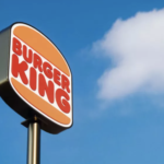

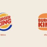


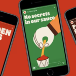
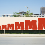
Burger King joins the flat design for the digital age movement. With a major brand refresh (by Jones Knowles Ritchie) recently introduced, the fast food giant embraces its past with a new logo that closely resembles a 1969 iteration and a new brand identity that brings a delightfully fun and robust visual language for broad applications. The new logo is again simply sandwiched between two halves of a bun. A new typeface, Flame, again calls to mind the earlier logo from decades ago, but brings back a cohesive and sense fun that is a welcome and positive change. A new color palette and playful illustration style gives the new visual platform both a fun-lovin’ energy and distinctiveness. Obviously, many big brands are wrestling with the move to flat design and the required simplified brand approach that resonates on smartphones as well as tablets, desktop computers and televisions. Of course, the challenge remain to creative and execute for maximum impact, distinctiveness and ideally, authenticity. We applaud Burger King’s move into the future with a delicious, engaging and fun nod to the past. MMMMMMMMMM! 🍔🍔🍔
Month: January 2021
Brand identity design for the sitcom (and Tina Fey)
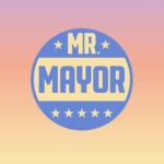

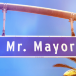
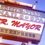
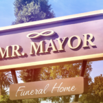
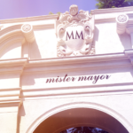
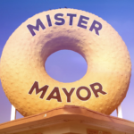
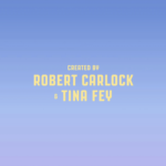
New logo and opening titles by Pentagram for “Mr. Mayor”, a new NBC comedy from Robert Carlock and Tina Fey staring Ted Danson and Holly Hunter. Bright, sunny with a touch of smart humor establishes the new show’s witty political and uniquely west coast point-of-view. We loved the first episode and applaud the oh-so-talented Ms. Fey (and NBC) for enlisting the prolific and design gods of Pentagram Longing for trip to sunny L.A.!


