


Travel site Tripadvisor is 20 years old and had decided to rebrand. The well-recognized owl symbol has been refreshed with simpler rounder lines. A new custom typeface (Trip Sans), set of icons and refreshed color palette (‘TripGreen’, orchid, salmon, rose, sand, moss, pine and mustard) adds to the more contemporary identity. Another subtle changes is the company is moving from TripAdvisor to Tripadvisor. The company says users recognize and pronounce the brand as a single word after twenty years of business. Mother Design New York led the identity refresh. We applaud the entire effort. Bold, clear and fresh, the brand is wisely positioned for the return of travel. Bon voyage!
Month: May 2020
Humor can help

Pizza pyramid
Hard-hitting wins in anti-Trump advertising
Mourning in America, another hard-hitting ad by the Lincoln Project, a group of anti-Trump Republicans, leads most 2020 campaign advertising as most memorable. A remake of Reagan’s 1984 ad in reverse that succeeded in getting under Trump’s skin, prompting a presidential rampage on Twitter. Dems can take a few lessons from these guys. Catch it on social media or in a battleground state near you…
Judi, Judi, Judi
Nothing about branding, marketing or design here. Something just for pure enjoyment, distraction and possibly personal inspiration. British Vogue, as part of their “Ask a Legend” series, invited an incredible range of celebrities to pose their most burning questions to the renowned actor. Who doesn’t love Judi Dench?!? Obviously, it’s been a rough year (with more to come). Get up, stretch, grab another cup of coffee or tea and enjoy these delightful fifteen minutes. Undeniably, good for the soul…
In time it will come
Magazine cover design, Slow.
Playful can be powerful
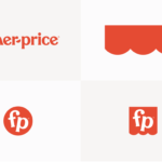
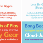
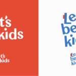
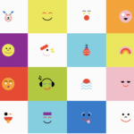
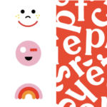
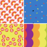

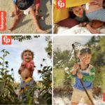
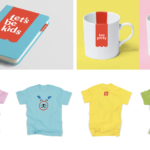
Early this year, Fisher Price has introduced a major rebrand of its identity. The brand worked with renowned design firm, Pentagram for the brand refresh including a modest update of the logo, a custom typeface and a fun set of graphics playing off of the recent unveiled “Let’s be kids” campaign by advertising agency Wieden + Kennedy. The new typeface is called Let’s Be Glyphs and offers straight and “bouncy” versions to allow for managing the amount of playfulness. The word mark update is subtle, with new lower case initials “f” and “p”, and a hyphen that has become a semi-circular “smile”. The new curved graphic also relates to the original “awning” – the scallop-edged shape the word mark sits on, simplified and redrawn for the brand refresh. Two new monograms using the brand initials inside a circle and awning shape (“flag tag”) was designed for flexibility and can include copy, or simply used as a graphic stamp on photography, animations, packaging or store displays, to quickly identify the brand. Once again, Pentagram delivers both a distinctive, smart identity that perfectly captures the personality of this renowned brand. So fun to see, think about and imagine some of the applications or iterations to come. We can all use a little fun…


