

Playful can be powerful
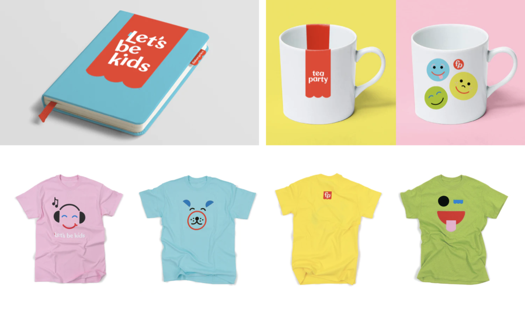
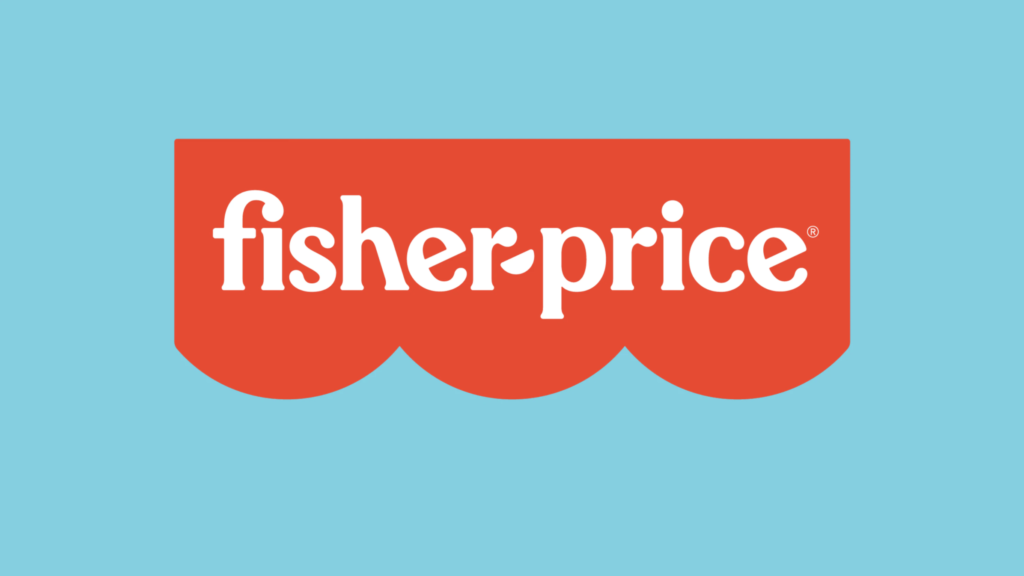
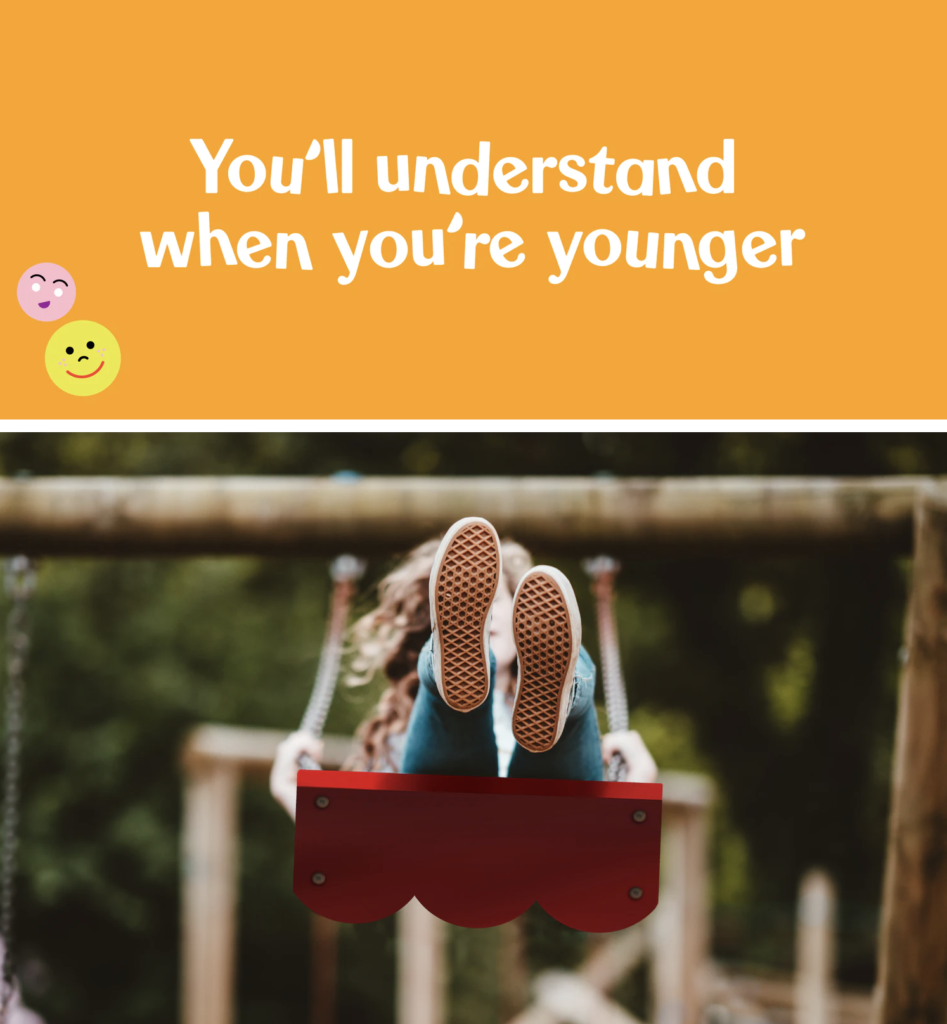
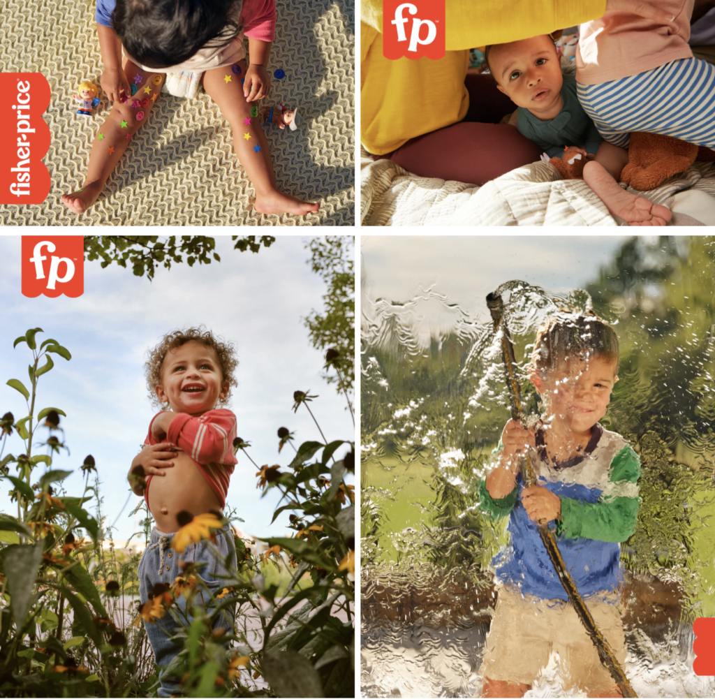
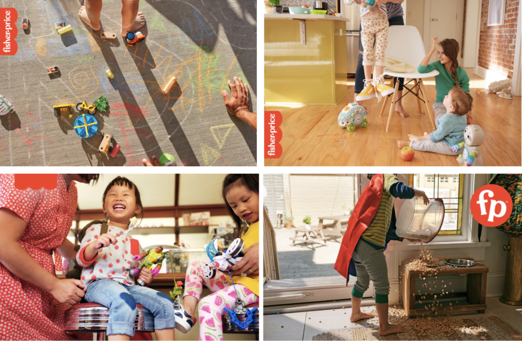
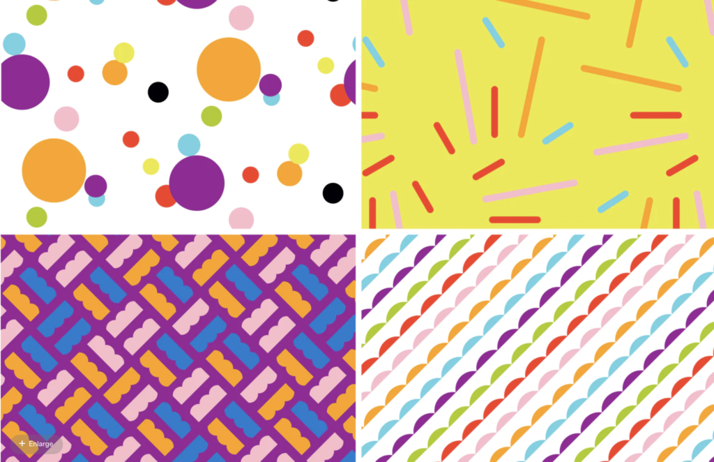
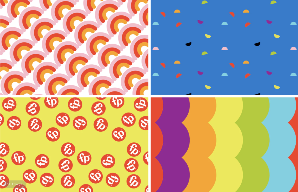
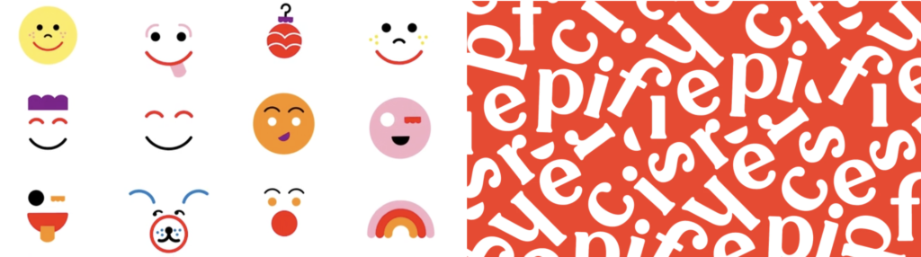
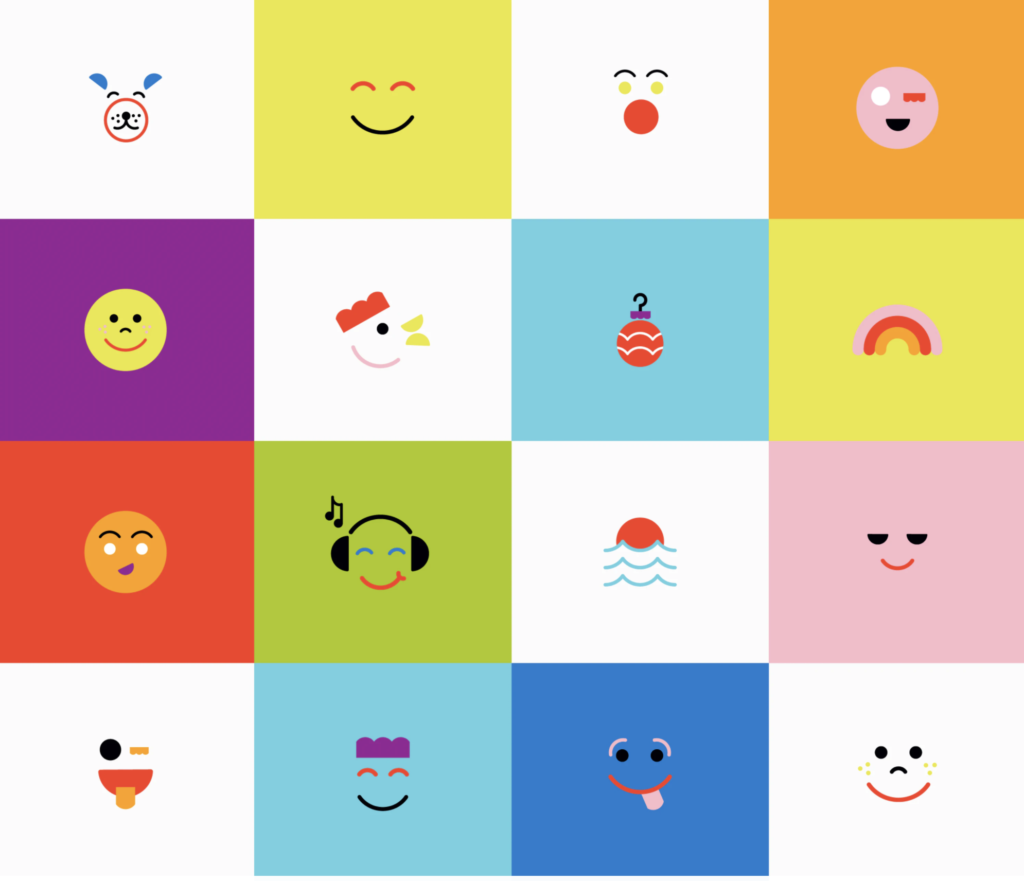
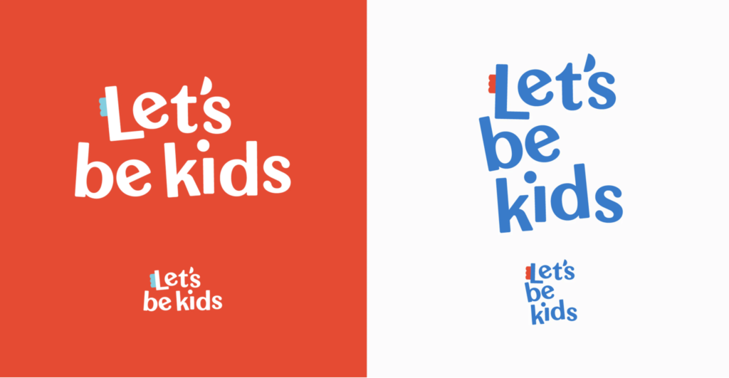
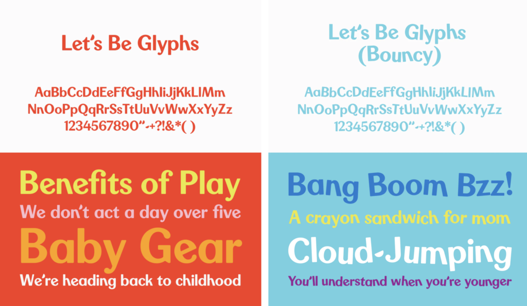
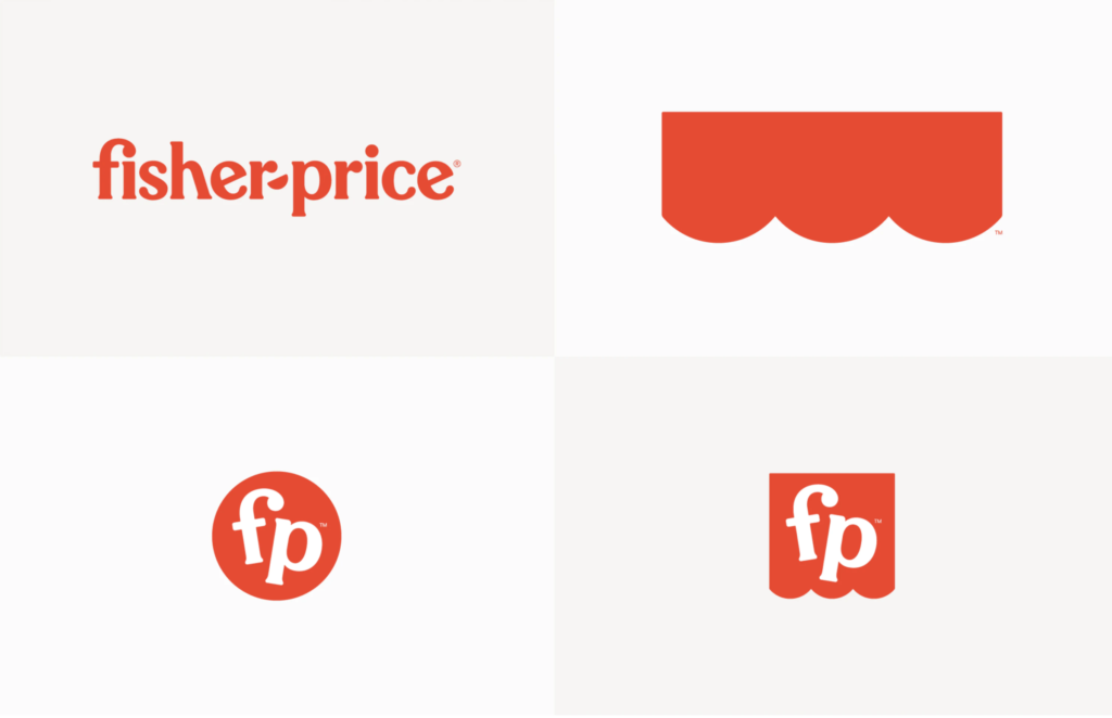
Early this year, Fisher Price has introduced a major rebrand of its identity. The brand worked with renowned design firm, Pentagram for the brand refresh including a modest update of the logo, a custom typeface and a fun set of graphics playing off of the recent unveiled “Let’s be kids” campaign by advertising agency Wieden + Kennedy. The new typeface is called Let’s Be Glyphs and offers straight and “bouncy” versions to allow for managing the amount of playfulness. The word mark update is subtle, with new lower case initials “f” and “p”, and a hyphen that has become a semi-circular “smile”. The new curved graphic also relates to the original “awning” – the scallop-edged shape the word mark sits on, simplified and redrawn for the brand refresh. Two new monograms using the brand initials inside a circle and awning shape (“flag tag”) was designed for flexibility and can include copy, or simply used as a graphic stamp on photography, animations, packaging or store displays, to quickly identify the brand. Once again, Pentagram delivers both a distinctive, smart identity that perfectly captures the personality of this renowned brand. So fun to see, think about and imagine some of the applications or iterations to come. We can all use a little fun…


