


Kellyco@work | AMERICAN EXPRESS GLOBAL BUSINESS TRAVEL (identity). Designed identity for communications and promotional program for renowned financial services and travel company. Program’s focus was to drive loyalty and reinforce to travelers why they should continue to book through American Express. Program also sought to reinforce the company’s market and thought leadership position in the industry across both the service and transactional side of travel, as well as research, consulting and meeting planning services. Applications included print, social media and public relations.
Month: August 2018
Rouge tomate

#c13e47 (prettycolors)
Typography that makes the difference


“Life is Better in Board Shorts” advertising campaign for Billabong by Mattson Creative.
Abstraction can deliver just enough intrigue
Poster design for School of Visual Arts Russia Rising exhibition.
Friendly can lead the way


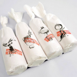
Brand identity and packaging design by Javier Jabalera.
Concept supports the brand
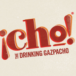
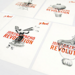
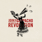
Brand identity and packaging design for ¡Cho!, a range of on-the-go drinking Gazpacho made from organic fruit and vegetables sourced and bottled in Adalucia. Designed by Blast.
Typography rules
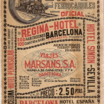
Spanish Railways timetable guide, 1929. Lovin’ the old-school typography.
Clean, warm with a pop of color
-

- test caption


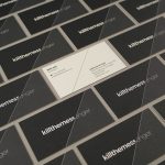
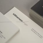
Brand Identity, responsive web design for Killthemess/enger by TRÜF.
Boldly contemporary
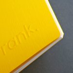


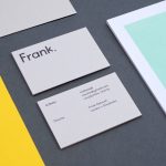


Brand identity for Frank, a high-end digital retouching agency with bases in both London and Stockholm. Created by Midday Studio.
Image leads the way
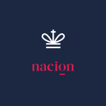
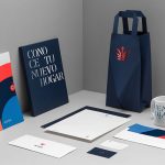
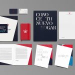
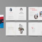


Brand identity system for Nación, a multi-purpose real-estate development project located in Monterrey, Mexico. Created by Anagrama.


