


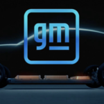

GM follows fellow carmakers Volkswagen, Toyota, BMW, and Nissan in adopting cleaner, more digital-friendly branding in anticipation of a future centered around electric vehicles. The new brand’s redesign features a reversal from white-on-blue to blue-on-white delivers a lightness that may help consumers accept the brand as a more environmentally responsive company. Moving to all lower case as many have done is understandable (more user-friendly/accessible/technology-driven), but seems unconvincing for the once-almighty GM. The underscore has been slimmed down significantly, now positioned only under the “m”. Apparently, the negative space here is meant to suggest or represent an electric plug. The new logo’s rounded corners and blue color scheme including a gradient closely resembles a smartphone app icon. Not a bad thing, certainly. GM is also featuring inspiring influencers who promote change in print, tv and video versions of the ads. They include professional surfer Bethany Hamilton, gamer Erin A. Simon, fitness instructor Cody Rigsby, and author Malcolm Gladwell. All in all, a rationale move by the former largest carmaker in the world. Does it represent a brand or company committed to change and electric vehicles (phasing out internal combustion engines by 2035)? We say it does not. The typography, the colors, the underline and the app-like frame. While we often support the evolution of a brand identity, this one just leaves us cold. Not cold in a techy kind of way, but cold in a bland and undistinguishable way. Remember, the brand represents values and personality. And then there’s Tesla…


©2024 Kellyco Marketing. All rights reserved.