
“Meet the world” campaign for Grande Reportagem a Portuguese news magazine.
Month: April 2015
Rebranding an American classic
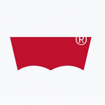
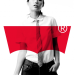
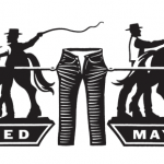
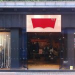
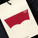
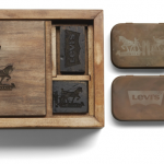
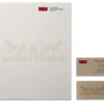
Levi’s recently moved to a centralized global business model. With that came the need to revisit the company’s visual identity, celebrate its rich heritage while positioning the brand for the future. Turner Duckworth (London, San Francisco) cleverly reworked the iconic “batwing” mark, removed the name, adding a cropped ® found on the brand’s iconic red tab (Levi’s mark of authenticity). All brand elements were redesigned including the ‘two horse’ symbol, leather patch and retail store branding. Stay tuned to see the new approach rolled out including brand advertising and digital. Following the fairly recent Starbucks rebranding (dropping its name from the identity as well), are we moving towards the bold, quick visual for mega, well-known brands? Look what you started Nike…
Subject: bunny
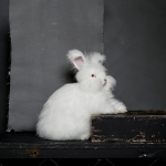
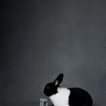
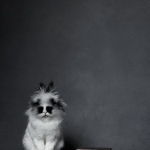
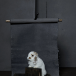
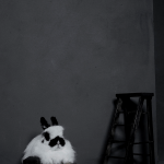
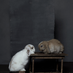
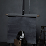
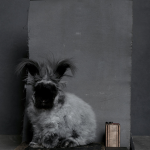
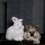
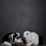
Portraits of the Bunny Hop Video Stars, photographed by Noah and Daniel, Vogue.
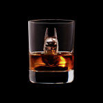


Ice, ice, baby… 3D-printed ice cubes for Suntory whiskey. Campaign by agency TBWAHakuhodo. Pretty darn cool. Cheers!
Impressively cool

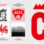

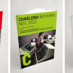
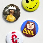
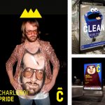
Identity for Charleroi, Belgium. Designed by Pam et Jenny, Brussels. Simply delightful design…


