Nissan joins other major automakers and leading corporate brands embracing the two-dimensional or flat identity design. Its new identity has been in development three years since 2017. The brand name remains at the center of the new logo, but is no longer raised or contained in a band. Overall, all elements are thinner with the font refined and letter-spaced, resulting in a more modern feel. The new Nissan identity continues the brand’s guiding message— with a strong, determined belief, you can even penetrate the sun. Animated versions of the logo will be featured online, moving and pulsating against diverse backgrounds. A big improvement from the previous brand identity with a elegance and flexibility well-suited for the future and digital age. Plug it in and let’s hit the road…
Month: August 2020
Color Spotted: Bummer Green
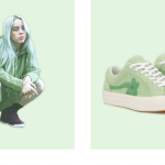
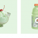
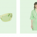
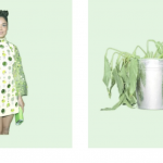


Profile on the reemergence of this darn we say odd color, by Emily Yoshida for SSENSE. Yoshida writes, “In a mystery zone that isn’t quite seafoam, nor neon, nor the cheerfully unnatural glow of terminal green. “Mint green” feels like a euphemism; if it is a mint it’s artificial spearmint, with all the throat-clinging bitterness that entails. It’s technically verde, but it’s the most un-verdant green on the color wheel.” We embrace most colors, but we side with Yoshida on this one. Gucci and Billie Eilish can pull it off for this moment in time, but for the rest of us mortals, it really is either an inexplicable throwback to vintage kitchen bowls, Betty Ford (loved the color!) or one of the bad St. Patrick’s Day hues that just should not show up at all. To each his own, but come on. : (
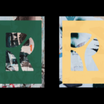
Typography for the win

Guido Guidi, Fosso Ghaiaia, Italie, 1971
Introducing Biden-Harris
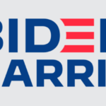
The suspense is finally over. Kamala Harris is Joe Biden’s pick as his running mate. The Democratic ticket officially has a vice president candidate. And of course, a new campaign logo. An in-house team designed the new logo which is an evolution of the Biden logo deployed for the primaries. The new Biden-Harris logo uses the typeface Decimal (Biden’s original logo used the typeface Brother 1816), developed for the campaign by type foundry Hoefler & Co. Decimal, inspired by the typography of vintage watches and clocks, feels simultaneously timeless and forward-looking. It does a good job projecting strength, honesty, dependability and accessibility. Our thoughts are somewhat mixed. On one side, the mark does present a strong sense of partnership—a unified front against the current administration. It does lack any really strong brand message which most would consider a missed opportunity. Perhaps the country wants or needs a straight-forward approach. Let’s see what is in store for the Democratic ticket with critical messaging, advertising and social media. Admittedly, most of our NYC fingers are crossed.
Not your average beer


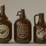
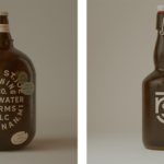
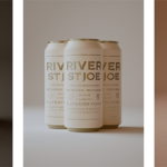
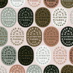
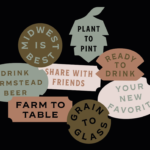
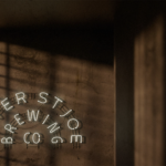
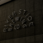

New brand identity for southwest Michigan-based farmstead brewery, River Saint Joe. Design system provides flexibility for a wide range of applications. From packaging to signage, we just love this robust and appealing work. Design by Studio MPLS. Cheers. 🍺🍺🍺
Major rebrand to reflect future vision and growth
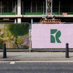

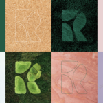
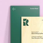
New identity for Regent’s Place, a mixed use business, retail and residential quarter (from 2010) on the north side of Euston Road in the London Borough of Camden. The new symbol represents the three districts — the Knowledge Quarter, Camden and the West End. The new identity, designed by London-base DixonBaxi, looks to capture the area’s future of housing with green space, a deeply rooted sense of community and forward-thinking, sustainable architecture. This contrasts greatly with Regent’s Place’s previous cold corporate identity. The new word mark deploys Bw Gradual for a more elegant and organic feel. The new system brings a new contemporary point-of-view reflecting the brands creative and green ethos. Animation along with reclaimed wood signage, bamboo business cards and soy-based community printing are featured to support the new approach. The entire effort is a huge step forward advancing a more progressive image for this important London neighborhood. We’re sure that it will be embraced by many businesses and residents with open arms. We salute the smart, creative and large scale effort…


