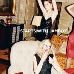
Gadget specialists Jawbone have just revealed a compact version of the Jambox (Mini Jambox), a portable Bluetooth speaker that pairs with your favorite mobile device. Definitely high quality/cool design in a range of patterns and bright colors. Famed fashion and fine art photographer Juergen Teller shot the ad campaign apparently after seeing the product in person. The photographs are the perfect wrapper for the design-driven technology company. Intriguing with a healthy dose of signature Teller cool that will keep young (and not so young) music lovers interested and hopefully, buying. Brilliantly brandtastic…
Month: January 2017
Don’t forget outdoor
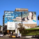

Starts with Jambox billboards. Outdoor advertising still packs a punch for branding efforts.
Go bold with visual impact
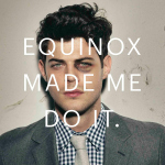
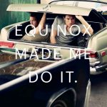
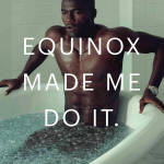
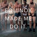
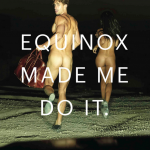
Get fit and find a little trouble… Controversial photographer Terry Richardson is out and Widen + Kennedy takes over the health club Equinox’s latest advertising campaign. Shot by photographer Robert Wyatt, the campaign’s overall message boldly attempts to claim that the club gives its members the confidence to get fit and breakout of their comfort zone. This translates into a slightly less overtly sexual imagery (definitely shades of gray here) for the more ambiguously suggestive. The message becomes more about promoting confidence and new adventures along with some very high-end fashion accessories. So along the way, getting ripped at the gym might lead to a black eye or finding yourself with your very good looking buddy in the trunk of a luxury Mercedes. According to the club, “Grounded in the idea of high performance living, we aim to provide our members with a holistic approach to health, and push them to seek higher goals, disrupt preconceived notions and break boundaries.” Yeah, the marketing world has fully embraced the concept of disruption. Not sure one can really call this disruption but, if it gets you to the gym, it’s all good.
Less is more
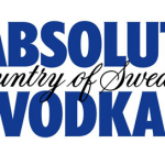
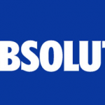
Swedish vodka maker Absolut has unveiled its new logo, dropping the words “Vodka” and “Country of Sweden” for a minimalist look. The new logo features a bolder typeface and the word “Absolut” followed by a period, which will form the company’s new master identity. Anna Kamjou, Global Director of Design Strategy at The Absolut Company, said “The brand has become so iconic that we no longer needed the full three-line logo to convey ourselves. By removing ‘Country of Sweden’, and ‘Vodka’, we’re putting the focus on the most important part of the brand–Absolut. The word itself not only means the perfect, the complete, and the ultimate, but it also means the open-ended, infinite and indefinite.” Not surprising as the world of marketers move to shorter, more concise identity programs. Seems particularly fine for a well established liquor brand. And yes, as with most things Swedish (or Scandinavian in general), less is more…
Spotlight on young talent


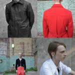

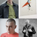


Design SPOTTED. Gosha Rubchinskiy | artist & clothing designer. Gosha Rubchinskiy is young, self–educated and inspired by Russian youth subculture and the skate-boarding scene. After working as a stylist, he created his own street wear label in 2008. Gosha Rubchinskiy AW 2013 is now available (shown above) at Dover Street Market. Remarkable in its own right, but again, kudos to Rei Kawakubo & the folks at CdG for encouraging young talent. Nurturing is a good thing…


