
Less is more
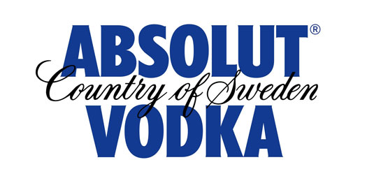
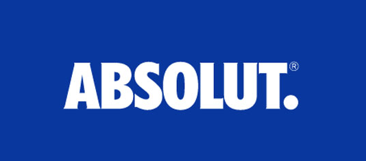
Swedish vodka maker Absolut has unveiled its new logo, dropping the words “Vodka” and “Country of Sweden” for a minimalist look. The new logo features a bolder typeface and the word “Absolut” followed by a period, which will form the company’s new master identity. Anna Kamjou, Global Director of Design Strategy at The Absolut Company, said “The brand has become so iconic that we no longer needed the full three-line logo to convey ourselves. By removing ‘Country of Sweden’, and ‘Vodka’, we’re putting the focus on the most important part of the brand–Absolut. The word itself not only means the perfect, the complete, and the ultimate, but it also means the open-ended, infinite and indefinite.” Not surprising as the world of marketers move to shorter, more concise identity programs. Seems particularly fine for a well established liquor brand. And yes, as with most things Swedish (or Scandinavian in general), less is more…


