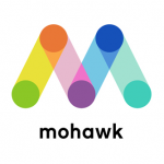
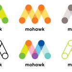
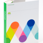
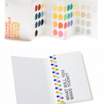
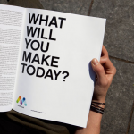
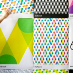
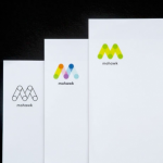
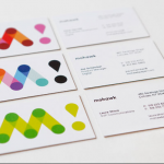
“M” as in Mohawk. Famed designer, Michael Bierut and his Pentagram team delivers an extraordinary rebranding for the paper giant, Mohawk. With the “M” as the primary identity element, Bierut brilliantly brings together paper and printing while alluding to the digital world, connection and communication. Love both the multiple color variations of the core logo as well as the bright and clever patterns (for diverse packaging and communication use). Reminiscent of some classic Paul Rand work, this is branding in all of its big budget glory…
Month: April 2016
Make it personal
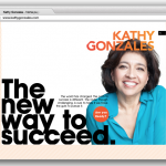
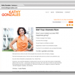
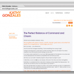

Kellyco@work | KATHY GONZALES (identity, social media, website design & development). Designed identity and website for career and life coach. Site included client’s philosophy, capabilities, testimonials and blog. Standards for social media posts also created.
Saluting the architect and a masterpiece
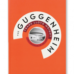
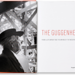
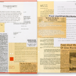
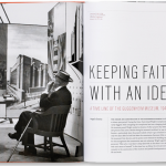
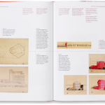
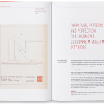
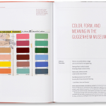
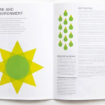
The Guggenheim: Frank Lloyd Wright and the Making of the Modern Museum is the definitive chronicle of the creation of the iconic building, the final project of its renowned architect. Designed by Pentagram’s Abbott Miller. A beautifully realized publication…
Hello, Sweden speaking
A remarkable tourism advertising campaign debuted this month that allowed anyone, anywhere in the world, to call a phone number in Sweden and talk directly and immediately to a random Swede. Brilliant concept. Extraordinary execution. Creative by WPP agency Ingo Stockholm. We’re calling…
Nature superimposed


Product photography of Gucci Tian Collection, Spring 2016. Plants, insects and birds artistically take over the iconic GG motif in a lineup of bags, shoes and silks.
Refresh for renowned institution
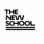
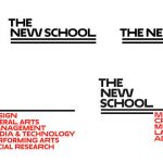
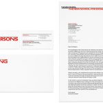
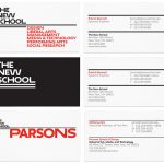
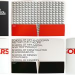
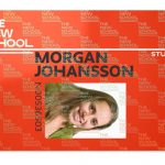
Reimagined identity for The New School (New York) that utilizes a custom font in three different widths. Designed by Paula Scher for Pentagram. Dig the overall tone and flexibility…


