
04 23 16
Connect the dots
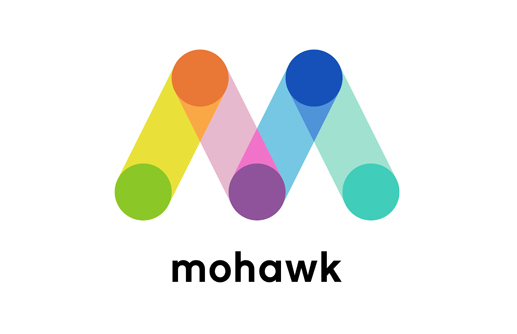
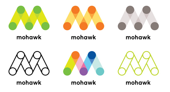
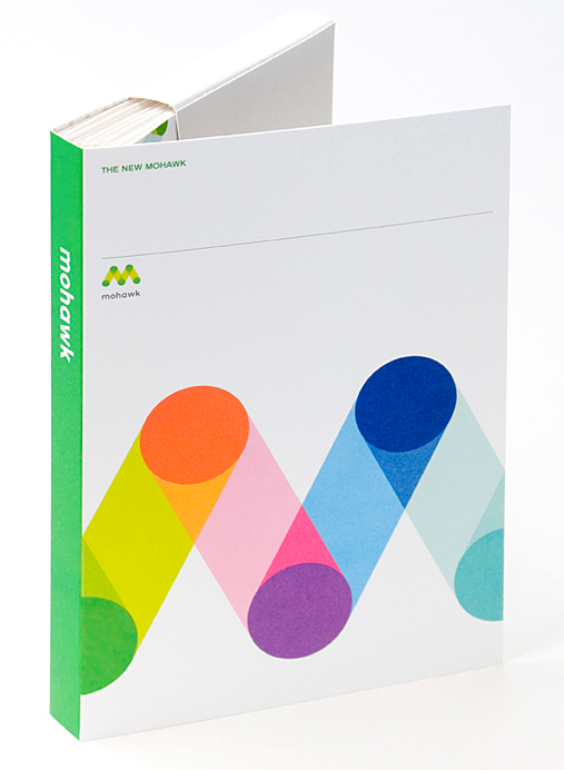
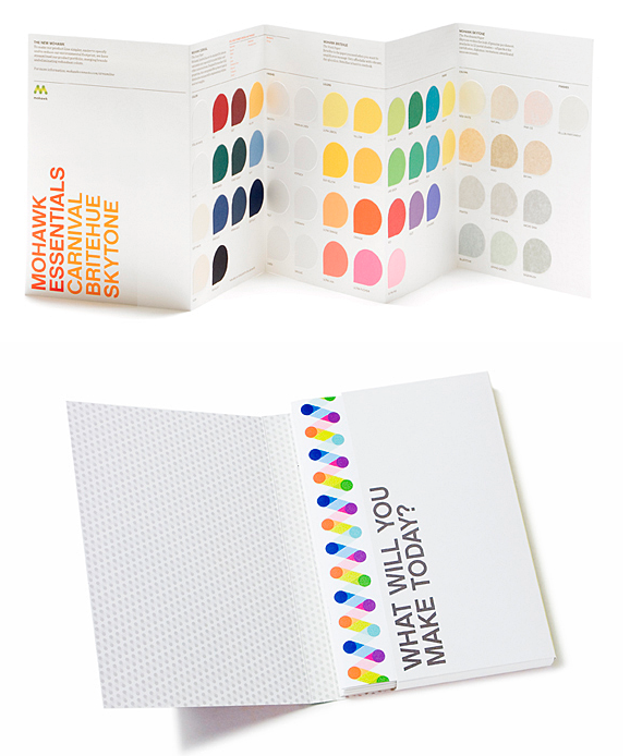
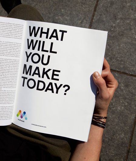
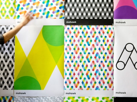
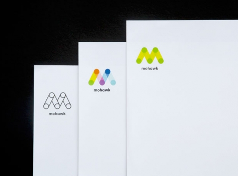
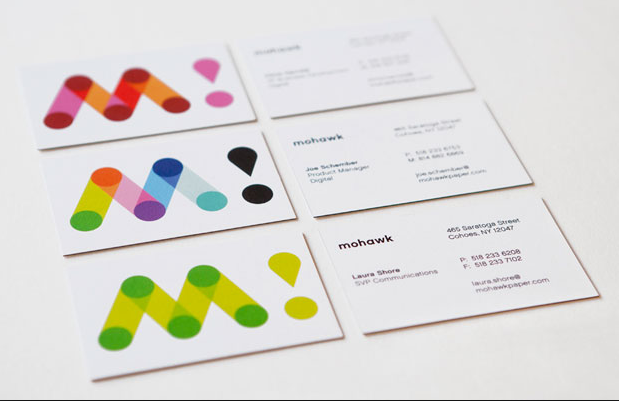
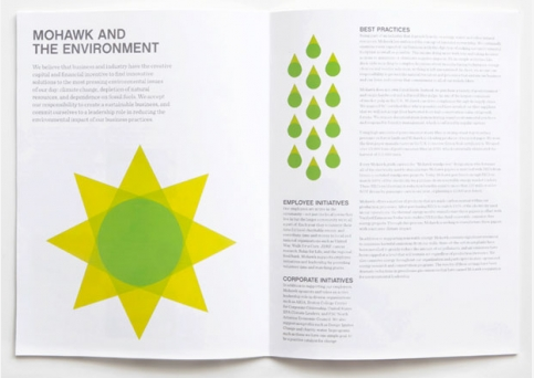
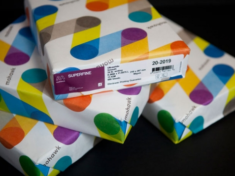
“M” as in Mohawk. Famed designer, Michael Bierut and his Pentagram team delivers an extraordinary rebranding for the paper giant, Mohawk. With the “M” as the primary identity element, Bierut brilliantly brings together paper and printing while alluding to the digital world, connection and communication. Love both the multiple color variations of the core logo as well as the bright and clever patterns (for diverse packaging and communication use). Reminiscent of some classic Paul Rand work, this is branding in all of its big budget glory…


