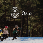
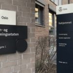

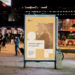
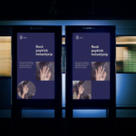


The city of Oslo welcomes a new visual identity with a simplified logo and identity system inspired by the city’s architecture. The comprehensive identity refresh by agency Creuna is intended to better communicate what the city provides to residents and how it works. The city’s logo has been redesigned for the first time since 1924 with a simplified St. Hallvard, the city’s patron saint. The new logo is better suited for small usage and digital use. The overall design system features three basic shapes which were inspired by architectural details found at many of the city’s landmarks like Oslo’s City Hall, the Vigeland Sculpture Park or its industrial Barcode district. Collectively, the shapes cleverly come together to form the word “Oslo”. There is also a new color palette inspired from Oslo’s cityscape, as well as a custom typeface, Oslo Sans. New distinctive illustrations provide another key component to reinforce the overall visual identity and design system. A new set of icons support the new system with a distinctive presence, whether online, in signage or diverse city communications. In short, a smart and beautifully realized identity program. Congratulations to all those involved. We hope to see it all one day soon.
Month: May 2019
Celebrating magazines’ finest


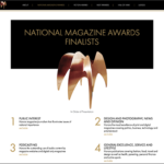
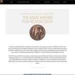
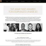
Kellyco@work | ASME Ellie Awards (digital, content development). Website design for National Magazine Awards (Ellies) for the American Society of Magazine Editors (ASME). Site included award finalists and was dynamically updated during annual event to highlight winners. Also included the ASME Award for Fiction 2019, the ASME Next Awards for Journalists Under 30, and Hall of Fame winners. Site was also designed to accommodate paid sponsorship as needed.
Identity matters


Brand identities by Massimo Vignelli.
Essentially black & white
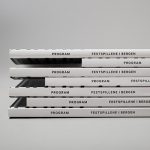

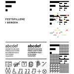
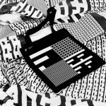


Visual Identity for Bergen International Festival, an annual international music and cultural festival in Bergen, Norway. Designed by Creative Endre Berentzen and Eric Amaral Rohter.


