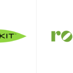

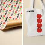

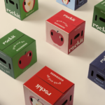
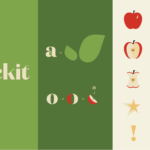
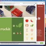
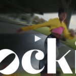
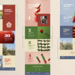

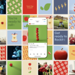
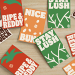
Rockit Global introduces its new branding and a new positioning line, ‘Rockit every day’. Yes, Rockit is a type of apple. They are distributed fresh and prewashed in a convenient tube. The apples are small, snack size, at approx. 1.5x the size of a golf ball. Rockit apples have a sweet flavor, thin skin, a distinctive bright red blush, small core and fantastic crisp crunch. The new branding brings a bolder logo and design platform that delivers a energetic, friendly and healthy attitude and personality. Illustration and animation all are well executed here. All bases seem to be covered (identity, packaging, website, promotion, social media) with the refresh and should help the brand standout in a largely commodified category. Rockit apples targets its primary export territories within Asia, America, Europe and the Middle East. Every Day Goodness (and fruit branding) is a good thing. Creative by Special Group New Zealand. 🍎🍎🍎🍎🍎
Category: Graphic Design
Innovation for safety, health & wellness
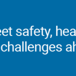
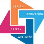
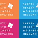


Kellyco@work | RAIsonance (brand identity, digital design, graphic design). Created new brand identity, website, mobile application and diverse marketing initiatives for new group of companies dedicated to providing artificial intelligence/machine learning (AI/ML)-based solutions for the safety, biometrics, digital health, medical diagnostics and big data markets. Developed new design and messaging platform, enabling more effective communication for both product and business development. New identity to represent innovation and company’s strengths in leveraging new technologies to deliver groundbreaking, high-impact and scalable solutions to today’s significant safety, health and wellness challenges. More on this project >
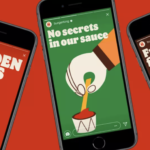
Packaging storytelling


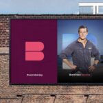
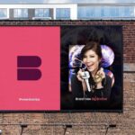
New brand identity for international content and distributor. Simple brand mark and distinctive color palette lays the groundwork for a clean, bold presentation of the company’s strengths and capabilities. Quality storytelling fro this brand all about storymaking. Designed by Moving Brands. Bravo!
Refinement is a good thing


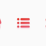
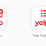
Yelp has just reintroduced a refined logo and set of icons that is intended to sync up with its new strategy of regaining the business and restaurant review market, as well launching services including a diner waitlist that integrates with takeout orders, backend analytics, POS integration and customer profiles. The modifications to the logo are modest, but positive. The new icons clearly serve a purpose in the brand’s new service strategy while also supporting brand consistency. While we have never been big Yelp fans (all those negative comments!), hats off to the brand moving towards a more clearly defined identity.
Active + Connected


Identity for new fitness brand by Parcel Design. Like both the snappy, lively logotype and fresh color palette. Now, back to the gym!
Retro influence + flat design
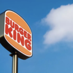

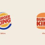
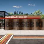
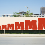
Burger King joins the flat design for the digital age movement. With a major brand refresh (by Jones Knowles Ritchie) recently introduced, the fast food giant embraces its past with a new logo that closely resembles a 1969 iteration and a new brand identity that brings a delightfully fun and robust visual language for broad applications. The new logo is again simply sandwiched between two halves of a bun. A new typeface, Flame, again calls to mind the earlier logo from decades ago, but brings back a cohesive and sense fun that is a welcome and positive change. A new color palette and playful illustration style gives the new visual platform both a fun-lovin’ energy and distinctiveness. Obviously, many big brands are wrestling with the move to flat design and the required simplified brand approach that resonates on smartphones as well as tablets, desktop computers and televisions. Of course, the challenge remain to creative and execute for maximum impact, distinctiveness and ideally, authenticity. We applaud Burger King’s move into the future with a delicious, engaging and fun nod to the past. MMMMMMMMMM! 🍔🍔🍔
Encouraging behavior for the greater good
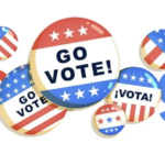
Today, Google has replaced their homepage logo with a signature brand “doogle” that informs people exactly how to vote. The new modified logo depicts a variety of traditional pin buttons encouraging you to “Go Vote” in Tuesday’s election. Clicking the artwork brings you to a “#election2020” tool providing all of the important dates and deadlines for your state, along with guidelines on voter eligibility. All of the information in Google’s tool comes courtesy of the website HowTo.vote, maintained by Democracy Works, “a nonpartisan, nonprofit organization dedicated to changing the status quo.” Although we have never been big fans of the aesthetic of these Google adapted logos, the company should be applauded for its nonpartisan effort here. Hopefully, given the search giant’s massive reach, the impact will be noteworthy. We hope everyone either has voted already or will vote in the next few days. And please, encourage love ones and others in your circle to do the same.
Mask up NYC


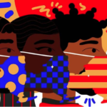
New York has managed to keep the COVID-19 curve flat since June with coronavirus infections below one percent. The New York MTA (Metropolitan Transit Authority) just introduced a new campaign titled “The State of Respect”, a series of striking posters featuring city transit users wearing masks. The campaign was created by agency Conquistadors employing a dozen artists from all over the world, including New York, Sydney, Rotterdam, Amsterdam and Buenos Aires. The campaign accompanies the start of a citywide fine initiative ($50) for all public transport customers who refuse to wear a mask. R-e-s-p-e-c-t…
For the love of craft
We recently rediscovered this wonderful film on the history and significance of sign writers in Ireland. Seems especially poignant in these challenging times along with the digital age which has greatly affected physical retail establishments and the way we communicate. Less plastic, more thoughtful design, craftsmanship and pride in one’s work—definitely a good thing.
Color Spotted: Bummer Green
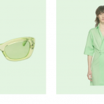
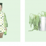


Profile on the reemergence of this darn we say odd color, by Emily Yoshida for SSENSE. Yoshida writes, “In a mystery zone that isn’t quite seafoam, nor neon, nor the cheerfully unnatural glow of terminal green. “Mint green” feels like a euphemism; if it is a mint it’s artificial spearmint, with all the throat-clinging bitterness that entails. It’s technically verde, but it’s the most un-verdant green on the color wheel.” We embrace most colors, but we side with Yoshida on this one. Gucci and Billie Eilish can pull it off for this moment in time, but for the rest of us mortals, it really is either an inexplicable throwback to vintage kitchen bowls, Betty Ford (loved the color!) or one of the bad St. Patrick’s Day hues that just should not show up at all. To each his own, but come on. : (


