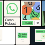
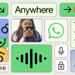
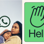
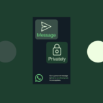
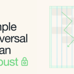
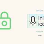
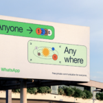
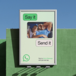
New design for WhatsApp which further blurs the line between product experience and marketing. Overall concept is “forward”, aspiring to deliver a more accessible robust experience for WhatsApp’s 2 billion+ users. A new extensive color palette is employed across different touchpoints, complementing the brand’s primary color, WhatsApp green. Dark mode settings are also effectively addressed. The primary graphic element, graphic modules housing messaging and content become flexible blocks for a broad range of storytelling. Classic Helvetica Neue is used as the primary font which provides clarity and a very clean modern aesthetic. The use of a thin black stroke around the rounder-corner boxes that house all of the content is both functional with different backgrounds, as well as a design-forward device.. Design firm, Koto has successfully delivered a needed reimagined app design for the Meta (Facebook) product. Bravo on all accounts.
Category: Identity
Wieden + Kennedy, Not
Creative agency Wieden+Kennedy London has just launched a standalone branding and design firm, NOT Wieden+Kennedy to offer a faster option for clients responding to branding challenges.
With a team of designers, creative technologists, motion designers, 3D artists, brand strategists and writers, NOT W+K is slated to work with collaborators inside and outside the agency’s global network. The department is headed up by award-winning branding and design creative director Adam Rix, whose 20 years’ worth of experience has seen him work with clients including Nike, Dr Martens, BBC, Manchester City Football Club and the British Fashion Council. The dynamic graphic element (static or animated) in the identity does the spinoff justice. Not quite as sure about naming the group “not”, which straddles too cute and negative for the branding/advertising giant.
New brand identity for big media

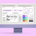
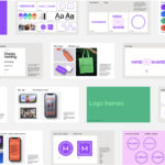
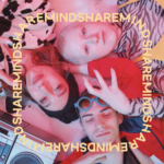
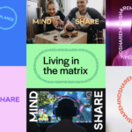
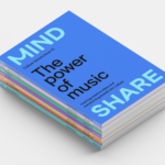
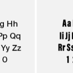
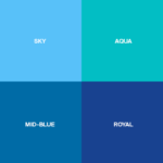
New brand identity for media agency. Mindshare, a global media agency network was established in late 90’s through the merger of the media groups of both JWT and Ogilvy & Mather. Mindshare partners with some of the world’s biggest companies. It positions itself as authentically data- and technology-enabled. The new logo is a sans serif wordmark where some of the letterforms that would normally be straight have been rounded into friendlier curved lines. The identity’s color palette is bright and accessible while suggesting knowledge and technology. Overall, a modern, almost-hip new brand identity for the mega agency group that should serve them well with its big ticket clients. The new identity was created by London, UK-based NB. No reinventing the wheel here but a solid refresh.
New logo design for fintech company

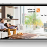
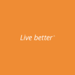


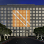
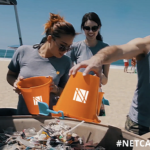
A new logo design for Network Capital, a fintech company providing mortgage lending and servicing to homeowners and homebuyers in 37 states. The new identity highlights the letter N in a bright orange color. Formed by scoring parallel white lines across an orange block, the new symbol is both simple and elegant—giving the brand name weight and distinction. Creative work by renowned brand design firm, Chermayeff & Geismar & Haviv.
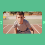
Google Workspace invests in its design language
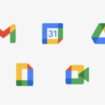
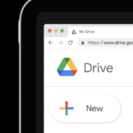
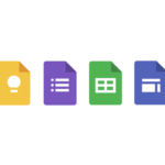
The search giant introduces a redesigned icon set and design language for its more integrated Workspace while retaining the identity and accessibility of existing products. Design and supporting animations show users transparent layers that overlap and extend from one app to the next, better representing an integrated experience and collaboration. All creative by brand consultancy, Wolff Ollins. Simply, beautifully designed and executed.
Celebratory rebrand, hope and joy
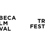

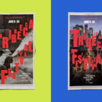
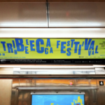
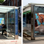
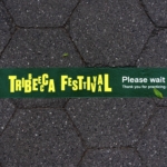
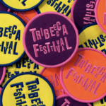
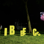
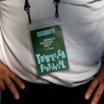
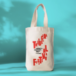
The Tribeca Film Festival launched in 2001, founded by Robert De Niro and Jane Rosenthal, as a means of using the power of film to usher in joy and hope to a city reeling from the devastation of 9/11. Two decades later, as the world-renowned festival honors its 20th anniversary, the organization has undergone brand overhaul in the wake of the COVID-19 pandemic.The widely recognizable existing logo needed updating to reflect its revised name and to celebrate the festival’s 20th anniversary. Since its featured roster have expanded beyond film to include TV, art, comedy, talks, games, podcasts, immersive experiences, virtual programs, and more, the festival was renamed as the more media-inclusive Tribeca Festival. The new comprehensive celebratory rebrand (by Pentagram) features a bold and colorful anniversary logo along with a new bright color palette, dynamic typography (utilizing Druk and Basis Grotesque typefaces) and clever animations. It all screams celebration and is both distinctive and joyful. The new branding is comprehensive covering event graphics, advertising, promotional materials, posters, video and social media. While we continue to struggle through the challenges of the pandemic, the Tribeca Festival continues to entertain, celebrate the arts and give us a good reason to get together and enjoy the show. Bravo!!!
Positioning for anti-poverty initiatives
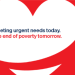
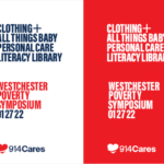
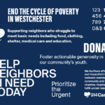
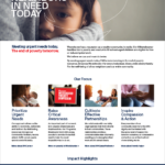
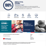
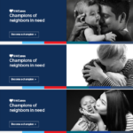
Kellyco@work | 914Cares (brand identity, digital design, social media, graphic design). Created new brand identity, website and social media post library for regional non-profit organization providing assistance to struggling community members. Developed new design and messaging platform, enabling more impactful communication, efficient online fundraising and diverse promotion capabilities. More on this project >
Fruit branding for global growth
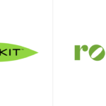

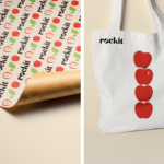

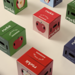
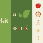
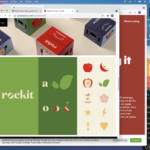
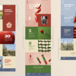

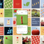
Rockit Global introduces its new branding and a new positioning line, ‘Rockit every day’. Yes, Rockit is a type of apple. They are distributed fresh and prewashed in a convenient tube. The apples are small, snack size, at approx. 1.5x the size of a golf ball. Rockit apples have a sweet flavor, thin skin, a distinctive bright red blush, small core and fantastic crisp crunch. The new branding brings a bolder logo and design platform that delivers a energetic, friendly and healthy attitude and personality. Illustration and animation all are well executed here. All bases seem to be covered (identity, packaging, website, promotion, social media) with the refresh and should help the brand standout in a largely commodified category. Rockit apples targets its primary export territories within Asia, America, Europe and the Middle East. Every Day Goodness (and fruit branding) is a good thing. Creative by Special Group New Zealand. 🍎🍎🍎🍎🍎
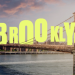
brand identity + logo + packaging
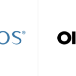
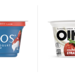
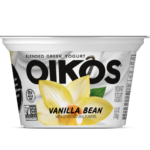
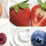
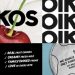
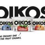
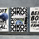
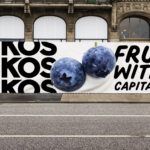
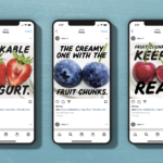
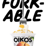
There are a lot of Greek yogurts out there. Recently, Oikos (Danone North America) introduced a new brand identity along with new packaging. New photography featuring ingredients boldly stands out on creamy, wavy yogurt backgrounds. The logo features a stronger sans serif with a softer secondary typeface that balances the bolder elements of the packaging. All are positive changes along with the “Forkable” descriptor and other bolder copy iterations. Definitely more distinctive, younger and energetic which should help to better compete with Chobani and others. Great effort all-around. Grab that Fork! Creative by Danone North America Brand Design and Brooklyn, NY-based Beardwood&Co.
Innovation for safety, health & wellness

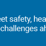
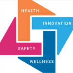
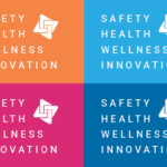


Kellyco@work | RAIsonance (brand identity, digital design, graphic design). Created new brand identity, website, mobile application and diverse marketing initiatives for new group of companies dedicated to providing artificial intelligence/machine learning (AI/ML)-based solutions for the safety, biometrics, digital health, medical diagnostics and big data markets. Developed new design and messaging platform, enabling more effective communication for both product and business development. New identity to represent innovation and company’s strengths in leveraging new technologies to deliver groundbreaking, high-impact and scalable solutions to today’s significant safety, health and wellness challenges. More on this project >


