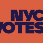
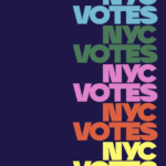
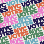
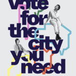
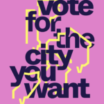
New York’s nonpartisan voting board, NYC Votes has just introduced both a new identity and a distinctive, bold new branding campaign led by Pentagram partner, Eddie Opara. From its new logo to its vibrant color scheme, NYC Votes greets city voters with a modern, bold voice befitting a city post-pandemic. Let’s vote for the city we want!
Category: Branding
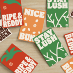
Active + Connected

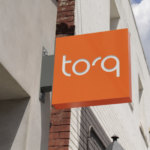
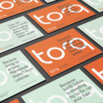

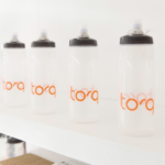
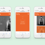
Identity for new fitness brand by Parcel Design. Like both the snappy, lively logotype and fresh color palette. Now, back to the gym!
Retro influence + flat design


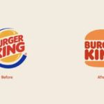
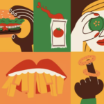
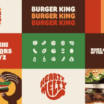
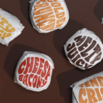
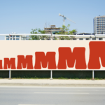
Burger King joins the flat design for the digital age movement. With a major brand refresh (by Jones Knowles Ritchie) recently introduced, the fast food giant embraces its past with a new logo that closely resembles a 1969 iteration and a new brand identity that brings a delightfully fun and robust visual language for broad applications. The new logo is again simply sandwiched between two halves of a bun. A new typeface, Flame, again calls to mind the earlier logo from decades ago, but brings back a cohesive and sense fun that is a welcome and positive change. A new color palette and playful illustration style gives the new visual platform both a fun-lovin’ energy and distinctiveness. Obviously, many big brands are wrestling with the move to flat design and the required simplified brand approach that resonates on smartphones as well as tablets, desktop computers and televisions. Of course, the challenge remain to creative and execute for maximum impact, distinctiveness and ideally, authenticity. We applaud Burger King’s move into the future with a delicious, engaging and fun nod to the past. MMMMMMMMMM! 🍔🍔🍔
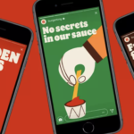
Thom Browne’s holiday fantasy
… mr. reindeer’s dream …
in the quiet of nowhere, a dream. empty but for a glowing house … up is down, down is up, looking up, a snow-flocked tree looks down, looking ahead, a blue-antlered reindeer enters the scene … a wooden dancer, at rest in black tie tails and tutu. mr. reindeer approaches, pulls out his grosgrain key and winds. one crank, two cranks, three… dancer, the masterpiece, springs to life … a plié, an arabesque, a grand jeté. dancer takes the stage, mr. reindeer applauds with delight, a magnificent show, soon to be shared … nearby, on mr. reindeer’s pebble leather desk pad, a list. a top secret, confidential, don’t tell anyone, very important holiday list … who gets what and what goes to whom, mr. reindeer takes note and examines his haul … four-bar holiday stockings … grosgrain ribbons … grey faille boxes … a tree trimmed with lights and grosgrain ribbon bows … the scene is now set, the guests enter, bundled in a holiday sweaters featuring holiday joys, bows and ornaments and hector in a hat a patchwork skirt, a patchwork sweater, a patchwork hand crocheted scarf … with a pirouette, dancer is at the pile of gifts. to you good sir, an aran cable classic crewneck. to you dear madam, a full set of fragrance. to both, a down-filled four bar scarf … floating through the air, another round of gifts, the guests are back for more … a holiday hector with snowman pullover, a prince-of-wales cardholder. for the study, a pen holder with gold pen and a black leather notebook … the guests once again, more gifts in the air, is hector wearing a tuxedo? it’s a black tie affair … with that, a “happy holidays”, and “thank you for coming” … “goodbye, my guests, see you next year” … for mr. reindeer and dancer, one last plié, one more arabesque. one more pirouette … before dancer winds down, he offers a note, with the gleam of a letter opener, pulled from its black pebble grain case. a flourish, a lightning swipe, the letter is clear … …thank you mr. reindeer… …oh no… …what have you done… …one tear… discover thom browne gifting now, on thombrowne.com
All about workspace + integration
It might sound familiar already, that’s probably because Google Workspace was previously called G Suite. The search giant introduces the new brand identity along with enhanced integration between included individual apps. On the brand identity side, the most noticeable change other than the name change is the new Gmail logo, which is now a colorful “M”, replacing the envelope icon. The logo shift is meant to represent the tweaks made to the service earlier this year, with the incorporation of video conversations and real-time chat. Google obviously sees the need to make its move on potential competition including Slack, Zoom, Facebook and Microsoft Teams. Hence, Meet’s video conferencing being built into Docs, Sheets and Slides, in order to the user fewer reasons to want to switch platforms. With Covid and many more of us working at home, the improved integration makes total sense. While we do find the numerous icons in the brand’s company roster of apps and features a bit confusing visually, they are “more Google” or on brand. We are big believers in giving new identities some time to be used and accepted. Fair enough?
With challenges, come progress + victory
After launching full-coverage swimsuits and hijabs to help make swimming more inclusive, Nike has just debuted a new Victory Swim ad that is another inspiring piece of advertising. The ad by longtime agency Wieden + Kennedy begins with a mom teaching her young daughter how to swim. It then cuts to women diving into pools, strapping into scuba gear, surfing the waves, and rowing along the water, showing all the places you can go and things you can experience when you learn to take that first plunge. As the daughter swims away on her own, her mom declares, “Don’t stop now!” Beautifully shot and scripted in signature Nike style. Empowering is a great thing these days. Girl power!
Act like a rock star and people take notice
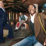
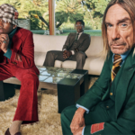
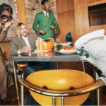
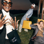
Gucci launches its latest Tailoring campaign with A$AP Rocky, Iggy Pop and Tyler, The Creator. The campaign stars are at home along with their exotic pets, including Pop’s parrot Biggy Pop and a blue hyacinth macaw. They are later seen together at a table with a pot of spaghetti, and in the lounge in the afternoon sunlight. Video features “Supernature” by Cerrone. Campaign by Gucci creative director, Alessandro Michele with photographer Harmony Korine and art direction by Christopher Simmonds. These brand “Stories” are one of the highlights of the brand’s marketing plan. They are chock full of product but more importantly, entertain and intrigue Gucci’s increasingly young and hip target market. The brand seems to get just bigger and better telling and selling its cool lifestyle story around the globe. Something to watch, that is for sure.
Taking it all to the next level
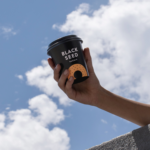
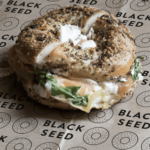
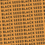
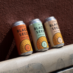
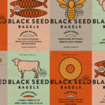

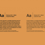
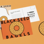
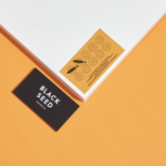
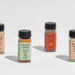
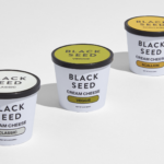
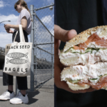
Recent brand refresh for Black Seed Bagels, NYC’s premiere artisan bagel shop renowned for their Montreal techniques, rave reviews and huge lines. Created by Saint Urbain, the goal was to give the brand a new more cohesive digital-friendly identity that effectively communicated its core values and provided both a distinctive and creative platform as the company grows and expands its product lines. Beautiful new color palette, clean and modern certainly, hopefully befitting the extraordinary bagels New Yorkers have come to love. We’ll take a dozen, s’il vous plaît.
Exuberance can lead the way


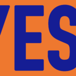

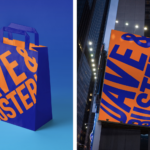
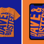
Visual identity refresh and new campaign for the popular arcade and dining chain, Dave & Buster’s. New tagline, “Ding Ding Ding” sets the stage for new tv spots, short social media videos and a comprehensive brand redesign. Creative all by Mother in New York. We love the energy on all fronts here. Should serve the client well. Ding Ding Ding!
Flat design trend continues
Nissan joins other major automakers and leading corporate brands embracing the two-dimensional or flat identity design. Its new identity has been in development three years since 2017. The brand name remains at the center of the new logo, but is no longer raised or contained in a band. Overall, all elements are thinner with the font refined and letter-spaced, resulting in a more modern feel. The new Nissan identity continues the brand’s guiding message— with a strong, determined belief, you can even penetrate the sun. Animated versions of the logo will be featured online, moving and pulsating against diverse backgrounds. A big improvement from the previous brand identity with a elegance and flexibility well-suited for the future and digital age. Plug it in and let’s hit the road…


