


Illustration SPOTTED. Louise Sheeran | artist, designer, printmaker & illustrator. Sheeran, now residing in Clermont-Ferrand, France, has a delightful body of work ranging from looser brush stroke illustrations to more graphic, composed pieces . Clients have included Borough Market, Toast Magazine, Lonely Planet, Noble Rot Magazine, Bloomsbury and Leroy Shoreditch. Diverse range of work, all smart, sophisticated and distinctively impactful. Look forward to an opportunity to work together…
Author: PaulK
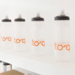
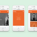
brand identity + logo + packaging
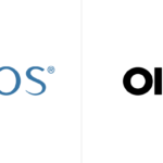
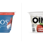
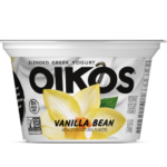
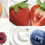

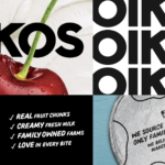
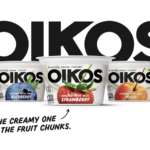
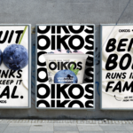
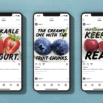
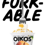
There are a lot of Greek yogurts out there. Recently, Oikos (Danone North America) introduced a new brand identity along with new packaging. New photography featuring ingredients boldly stands out on creamy, wavy yogurt backgrounds. The logo features a stronger sans serif with a softer secondary typeface that balances the bolder elements of the packaging. All are positive changes along with the “Forkable” descriptor and other bolder copy iterations. Definitely more distinctive, younger and energetic which should help to better compete with Chobani and others. Great effort all-around. Grab that Fork! Creative by Danone North America Brand Design and Brooklyn, NY-based Beardwood&Co.
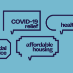
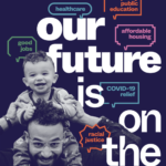
Innovation for safety, health & wellness


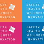


Kellyco@work | RAIsonance (brand identity, digital design, graphic design). Created new brand identity, website, mobile application and diverse marketing initiatives for new group of companies dedicated to providing artificial intelligence/machine learning (AI/ML)-based solutions for the safety, biometrics, digital health, medical diagnostics and big data markets. Developed new design and messaging platform, enabling more effective communication for both product and business development. New identity to represent innovation and company’s strengths in leveraging new technologies to deliver groundbreaking, high-impact and scalable solutions to today’s significant safety, health and wellness challenges. More on this project >
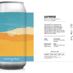
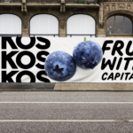
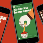
Packaging storytelling


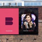
New brand identity for international content and distributor. Simple brand mark and distinctive color palette lays the groundwork for a clean, bold presentation of the company’s strengths and capabilities. Quality storytelling fro this brand all about storymaking. Designed by Moving Brands. Bravo!
Refinement is a good thing


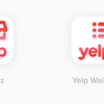
Yelp has just reintroduced a refined logo and set of icons that is intended to sync up with its new strategy of regaining the business and restaurant review market, as well launching services including a diner waitlist that integrates with takeout orders, backend analytics, POS integration and customer profiles. The modifications to the logo are modest, but positive. The new icons clearly serve a purpose in the brand’s new service strategy while also supporting brand consistency. While we have never been big Yelp fans (all those negative comments!), hats off to the brand moving towards a more clearly defined identity.
NYC Votes reenergized
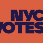
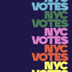
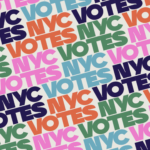
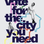
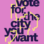

New York’s nonpartisan voting board, NYC Votes has just introduced both a new identity and a distinctive, bold new branding campaign led by Pentagram partner, Eddie Opara. From its new logo to its vibrant color scheme, NYC Votes greets city voters with a modern, bold voice befitting a city post-pandemic. Let’s vote for the city we want!
Active + Connected


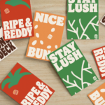
Identity for new fitness brand by Parcel Design. Like both the snappy, lively logotype and fresh color palette. Now, back to the gym!
GM repositions for the electric car


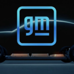

GM follows fellow carmakers Volkswagen, Toyota, BMW, and Nissan in adopting cleaner, more digital-friendly branding in anticipation of a future centered around electric vehicles. The new brand’s redesign features a reversal from white-on-blue to blue-on-white delivers a lightness that may help consumers accept the brand as a more environmentally responsive company. Moving to all lower case as many have done is understandable (more user-friendly/accessible/technology-driven), but seems unconvincing for the once-almighty GM. The underscore has been slimmed down significantly, now positioned only under the “m”. Apparently, the negative space here is meant to suggest or represent an electric plug. The new logo’s rounded corners and blue color scheme including a gradient closely resembles a smartphone app icon. Not a bad thing, certainly. GM is also featuring inspiring influencers who promote change in print, tv and video versions of the ads. They include professional surfer Bethany Hamilton, gamer Erin A. Simon, fitness instructor Cody Rigsby, and author Malcolm Gladwell. All in all, a rationale move by the former largest carmaker in the world. Does it represent a brand or company committed to change and electric vehicles (phasing out internal combustion engines by 2035)? We say it does not. The typography, the colors, the underline and the app-like frame. While we often support the evolution of a brand identity, this one just leaves us cold. Not cold in a techy kind of way, but cold in a bland and undistinguishable way. Remember, the brand represents values and personality. And then there’s Tesla…
Retro influence + flat design

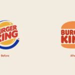
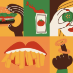
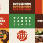
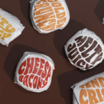

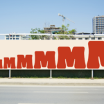
Burger King joins the flat design for the digital age movement. With a major brand refresh (by Jones Knowles Ritchie) recently introduced, the fast food giant embraces its past with a new logo that closely resembles a 1969 iteration and a new brand identity that brings a delightfully fun and robust visual language for broad applications. The new logo is again simply sandwiched between two halves of a bun. A new typeface, Flame, again calls to mind the earlier logo from decades ago, but brings back a cohesive and sense fun that is a welcome and positive change. A new color palette and playful illustration style gives the new visual platform both a fun-lovin’ energy and distinctiveness. Obviously, many big brands are wrestling with the move to flat design and the required simplified brand approach that resonates on smartphones as well as tablets, desktop computers and televisions. Of course, the challenge remain to creative and execute for maximum impact, distinctiveness and ideally, authenticity. We applaud Burger King’s move into the future with a delicious, engaging and fun nod to the past. MMMMMMMMMM! 🍔🍔🍔
Brand identity design for the sitcom (and Tina Fey)
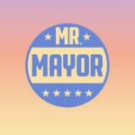

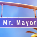
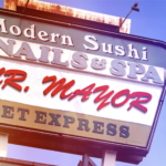

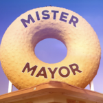
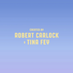
New logo and opening titles by Pentagram for “Mr. Mayor”, a new NBC comedy from Robert Carlock and Tina Fey staring Ted Danson and Holly Hunter. Bright, sunny with a touch of smart humor establishes the new show’s witty political and uniquely west coast point-of-view. We loved the first episode and applaud the oh-so-talented Ms. Fey (and NBC) for enlisting the prolific and design gods of Pentagram Longing for trip to sunny L.A.!


