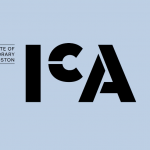
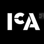
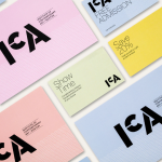
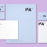
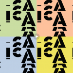
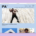
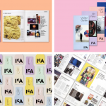
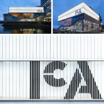
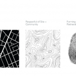
New brand identity for the The Institute of Contemporary Art in Boston dedicated to contemporary art. Pentagram delivers a new identity that is bold, flexible, modern and accessible. The new identity program elevates the museum’s position as a world-class arts institution and at the same time continues its support of the community and enhanced social engagement. The new logo is part of a comprehensive identity system that includes print collateral, website, animations, merchandise and a new program of signage and environmental graphics for both the original Diller Scofidio + Renfro designed building and the ICA Watershed. The color palette is bright, inviting and contemporary with an intentional playful edge that fits the renowned institution and its place in the art world. Let’s all plan a trip to Boston and see this impressive work in action…
Category: Identity
Maps get a mini-makeover
Google Maps celebrates its 15th birthday with a service refresh. New logo along with a redesign of the application itself. While we can’t say we’re the biggest fans of the search giant’s design aesthetic, these are all positive moves for the indispensable tool we have all come to depend on. So locate, navigate and explore away!
Branding today’s builder
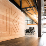
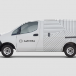
Pentagram’s new integrated rebranding of the technology-driven offsite construction company Katerra. The project encompassed brand strategy and messaging, iconography, promotional materials, packaging and livery, environmental graphics, website and digital applications, and a brand animation. It also required a brand architecture that could expand along with it, as it moves into launching a portfolio of products that offer everything needed to deliver high-quality building projects. We just simply love everything about this one (not a surprise from the almighty Pentagram). If innovation is in your company’s DNA, your branding should most definitely help lead the charge forward.
Child’s play
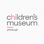
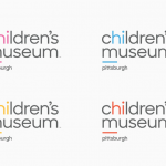
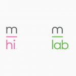
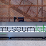
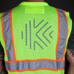
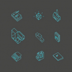
New brand identity for the Children’s Museum of Pittsburgh and its new MuseumLab. MuseumLab is a new maker space for older kids in the former Carnegie Free Library down the block from the Children’s Museum in Allegheny Commons. The refreshed brand identity introduces a new font and the “hi” in the name highlighted in color, and a line under the “M” doubles as an anchor and organizing element, also used in an abbreviated monogram version of the logo. The new identity also introduces a broader palette of bright colors, with the Lab appearing in green. The signs are designed in strong, simple black and white, with an outline that sets them apart from everything around them. The design team also created a series of custom icons for the system. Keep it simple is to everyone’s advantage. Not just for the kids, of course.
Visual power for good
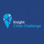
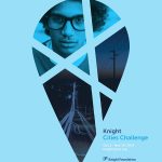
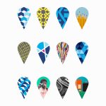


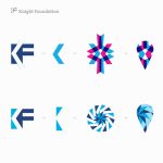
Brand identity for Knight Cities Challenge, a foundation that helps spur civic innovation in cities and urban neighborhoods. Great cause and a smart refresh that gives much life and vibrancy to the organization’s presence.
Survey the landscape

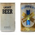

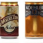
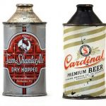
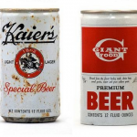
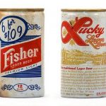


The wide world of vintage beer cans. Inspiring on many levels.
Keep it strong
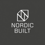
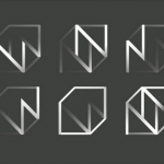

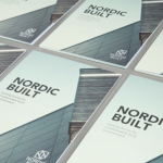
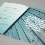

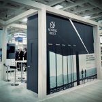
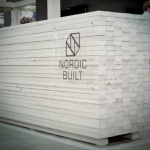
Identity and exhibit design for Nordic Built. A solid, cohesive design platform for the construction development organization.
Smart craftsmanship works
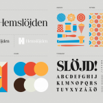
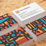
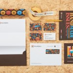
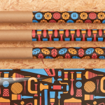

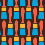
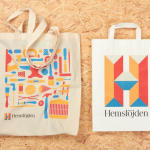
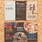
Identity design for Swedish Handicraft Association by SNASK.
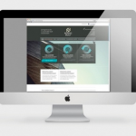
Designing for data

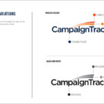
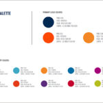

Kellyco@work | CAMPAIGNTRAC (brand identity, digital design and content development). Created identity and website for cloud-based data platform for data marketing firm. Developed both design and marketing content for new data service for agency media and marketing users, enabling prospect development, campaign management, tracking and analysis.
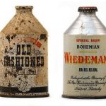
Looking to vintage to inspire
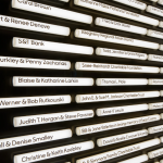
Signage design. Simple old-school perfection.


