


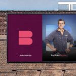
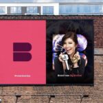
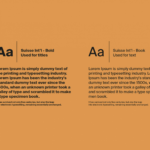
New brand identity for international content and distributor. Simple brand mark and distinctive color palette lays the groundwork for a clean, bold presentation of the company’s strengths and capabilities. Quality storytelling fro this brand all about storymaking. Designed by Moving Brands. Bravo!
Category: Identity
Refinement is a good thing


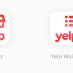
Yelp has just reintroduced a refined logo and set of icons that is intended to sync up with its new strategy of regaining the business and restaurant review market, as well launching services including a diner waitlist that integrates with takeout orders, backend analytics, POS integration and customer profiles. The modifications to the logo are modest, but positive. The new icons clearly serve a purpose in the brand’s new service strategy while also supporting brand consistency. While we have never been big Yelp fans (all those negative comments!), hats off to the brand moving towards a more clearly defined identity.
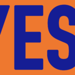
NYC Votes reenergized
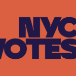
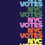
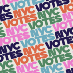
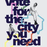
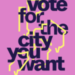
New York’s nonpartisan voting board, NYC Votes has just introduced both a new identity and a distinctive, bold new branding campaign led by Pentagram partner, Eddie Opara. From its new logo to its vibrant color scheme, NYC Votes greets city voters with a modern, bold voice befitting a city post-pandemic. Let’s vote for the city we want!
Active + Connected

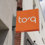
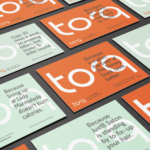

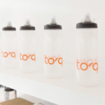
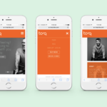
Identity for new fitness brand by Parcel Design. Like both the snappy, lively logotype and fresh color palette. Now, back to the gym!
GM repositions for the electric car


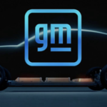

GM follows fellow carmakers Volkswagen, Toyota, BMW, and Nissan in adopting cleaner, more digital-friendly branding in anticipation of a future centered around electric vehicles. The new brand’s redesign features a reversal from white-on-blue to blue-on-white delivers a lightness that may help consumers accept the brand as a more environmentally responsive company. Moving to all lower case as many have done is understandable (more user-friendly/accessible/technology-driven), but seems unconvincing for the once-almighty GM. The underscore has been slimmed down significantly, now positioned only under the “m”. Apparently, the negative space here is meant to suggest or represent an electric plug. The new logo’s rounded corners and blue color scheme including a gradient closely resembles a smartphone app icon. Not a bad thing, certainly. GM is also featuring inspiring influencers who promote change in print, tv and video versions of the ads. They include professional surfer Bethany Hamilton, gamer Erin A. Simon, fitness instructor Cody Rigsby, and author Malcolm Gladwell. All in all, a rationale move by the former largest carmaker in the world. Does it represent a brand or company committed to change and electric vehicles (phasing out internal combustion engines by 2035)? We say it does not. The typography, the colors, the underline and the app-like frame. While we often support the evolution of a brand identity, this one just leaves us cold. Not cold in a techy kind of way, but cold in a bland and undistinguishable way. Remember, the brand represents values and personality. And then there’s Tesla…
Retro influence + flat design

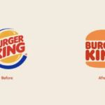
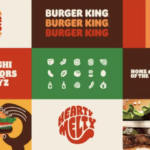
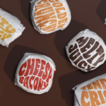
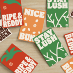
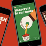
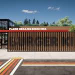
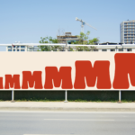
Burger King joins the flat design for the digital age movement. With a major brand refresh (by Jones Knowles Ritchie) recently introduced, the fast food giant embraces its past with a new logo that closely resembles a 1969 iteration and a new brand identity that brings a delightfully fun and robust visual language for broad applications. The new logo is again simply sandwiched between two halves of a bun. A new typeface, Flame, again calls to mind the earlier logo from decades ago, but brings back a cohesive and sense fun that is a welcome and positive change. A new color palette and playful illustration style gives the new visual platform both a fun-lovin’ energy and distinctiveness. Obviously, many big brands are wrestling with the move to flat design and the required simplified brand approach that resonates on smartphones as well as tablets, desktop computers and televisions. Of course, the challenge remain to creative and execute for maximum impact, distinctiveness and ideally, authenticity. We applaud Burger King’s move into the future with a delicious, engaging and fun nod to the past. MMMMMMMMMM! 🍔🍔🍔
Brand identity design for the sitcom (and Tina Fey)
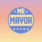

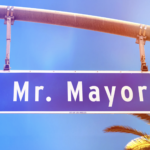
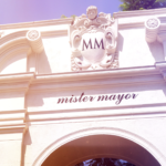
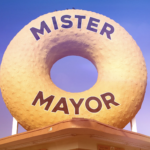
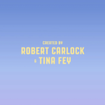
New logo and opening titles by Pentagram for “Mr. Mayor”, a new NBC comedy from Robert Carlock and Tina Fey staring Ted Danson and Holly Hunter. Bright, sunny with a touch of smart humor establishes the new show’s witty political and uniquely west coast point-of-view. We loved the first episode and applaud the oh-so-talented Ms. Fey (and NBC) for enlisting the prolific and design gods of Pentagram Longing for trip to sunny L.A.!
All about workspace + integration
It might sound familiar already, that’s probably because Google Workspace was previously called G Suite. The search giant introduces the new brand identity along with enhanced integration between included individual apps. On the brand identity side, the most noticeable change other than the name change is the new Gmail logo, which is now a colorful “M”, replacing the envelope icon. The logo shift is meant to represent the tweaks made to the service earlier this year, with the incorporation of video conversations and real-time chat. Google obviously sees the need to make its move on potential competition including Slack, Zoom, Facebook and Microsoft Teams. Hence, Meet’s video conferencing being built into Docs, Sheets and Slides, in order to the user fewer reasons to want to switch platforms. With Covid and many more of us working at home, the improved integration makes total sense. While we do find the numerous icons in the brand’s company roster of apps and features a bit confusing visually, they are “more Google” or on brand. We are big believers in giving new identities some time to be used and accepted. Fair enough?
Taking it all to the next level
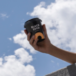
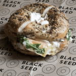
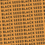
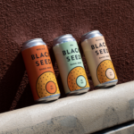
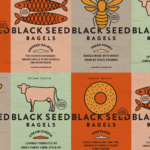

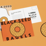
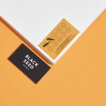
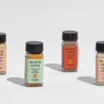
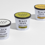
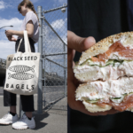
Recent brand refresh for Black Seed Bagels, NYC’s premiere artisan bagel shop renowned for their Montreal techniques, rave reviews and huge lines. Created by Saint Urbain, the goal was to give the brand a new more cohesive digital-friendly identity that effectively communicated its core values and provided both a distinctive and creative platform as the company grows and expands its product lines. Beautiful new color palette, clean and modern certainly, hopefully befitting the extraordinary bagels New Yorkers have come to love. We’ll take a dozen, s’il vous plaît.
Exuberance can lead the way


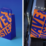
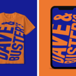
Visual identity refresh and new campaign for the popular arcade and dining chain, Dave & Buster’s. New tagline, “Ding Ding Ding” sets the stage for new tv spots, short social media videos and a comprehensive brand redesign. Creative all by Mother in New York. We love the energy on all fronts here. Should serve the client well. Ding Ding Ding!


