“Stay Home of the Whopper”, great advertising spot for Burger King that addresses the pandemic that the country is now facing, while maintaining brand personality and integrity. Creative by FCB NY. TV and online 🍔 🍔 🍔
Category: Digital
Refreshed daddy


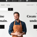
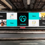
A new and welcome identity refresh for GoDaddy, the web hosting company just debuted. Gone is the bland wordmark which replaced the odd cartoon character and typography. The new brand identity and positioning is both modern and digitally friendly while welcoming a new shift in focusing on users’ experiences and successes. We applaud the significant shift and think if solid service and marketing prevails, it should all bring many new daddy fans.
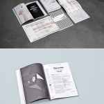
Designing for data

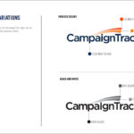
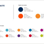
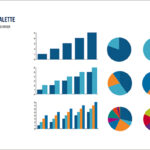

Kellyco@work | CAMPAIGNTRAC (brand identity, digital design and content development). Created identity and website for cloud-based data platform for data marketing firm. Developed both design and marketing content for new data service for agency media and marketing users, enabling prospect development, campaign management, tracking and analysis.
Celebrating magazines’ finest


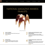
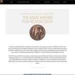
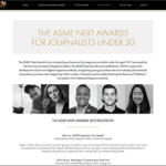
Kellyco@work | ASME Ellie Awards (digital, content development). Website design for National Magazine Awards (Ellies) for the American Society of Magazine Editors (ASME). Site included award finalists and was dynamically updated during annual event to highlight winners. Also included the ASME Award for Fiction 2019, the ASME Next Awards for Journalists Under 30, and Hall of Fame winners. Site was also designed to accommodate paid sponsorship as needed.
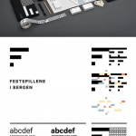
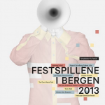
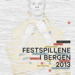
Essentially black & white
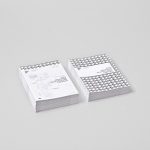

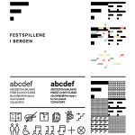


Visual Identity for Bergen International Festival, an annual international music and cultural festival in Bergen, Norway. Designed by Creative Endre Berentzen and Eric Amaral Rohter.
Community + technology
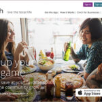

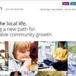
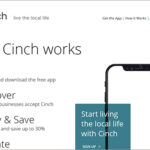
Kellyco@work | CINCH (brand identity, digital, promotion, social media). Designed new brand identity for consumer payment app that brings together residents, locally-owned businesses and local causes to foster meaningful community growth. Site content and design had goal of both reaching targeted consumers, as well as businesses. Tagline was also created following a series of user focus groups on brand perception. Promotion materials, presentations and social media standards were also developed.
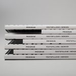
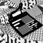
Contemporary beautifully executed
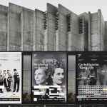
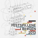
Identity design for Bergen International Festival by Anti, Oslo. Absolutely love everything about this effort…
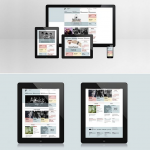
Staying on brand for digital
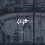
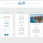
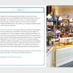
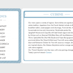
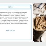
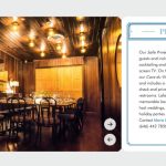


Site SPOTTED. Andrew Carmellini | Lafayette. Chef Andrew Carmellini’s new grand café and bakery opened last year to much fanfare . The restaurant’s website design does the celebrated chef’s new venture justice with a clean and modern presentation that echoes the traditional French brasserie aesthetic along with the latest in responsive web design. Beef tartare, roasted blanquette de veau and a side of pomme frites, s’il vous plaît…
Promoting the big event

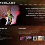
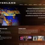
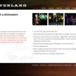
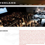
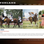
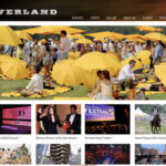
Kellyco@work | OVERLAND ENTERTAINMENT (identity, website design, social media, graphic design). Developed identity program and designed website for leading corporate event and entertainment company. Collaborated with client to identify and leverage company’s rich inventory of marquis event profiles and visuals. Content management system was developed for ease of update and additions.
Lufthansa looks to its future
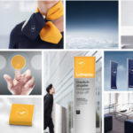
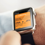
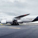
The renowned German airline recently announced a rebranding to better leverage its strengths in a digital world. The classic Lufthansa livery has been updated with a tailfin featuring a white logo on a deep blue background, without the brand’s yellow accent around the symbol. The plane’s grey underbody has also been changed to white. Otherwise, blue reigns dominant with the orange/yellow taking a more subordinate role. The redesign, especially the livery refresh has received a lot of negative feedback. The absence of the yellow on the plane has prompted comments including, “bland and pointless”, “design belly flop” and “It opts for a corporate blue that comes straight out of a late capitalist nightmare.”. Most are focusing on the plane branding which admittedly is more conservative with no pop of color. The other limited potential application all seem smartly executed with yellow playing an important secondary color role. We side on the positive with this refresh. Given Lufthansa’s track record with first rate identity and marketing creative, the changes seem to be in line with the move to digital. Mourning the loss of Lufthansa yellow seems both premature and a bit silly. Strategic change can be a good thing…


