
Lufthansa looks to its future
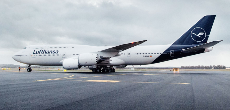
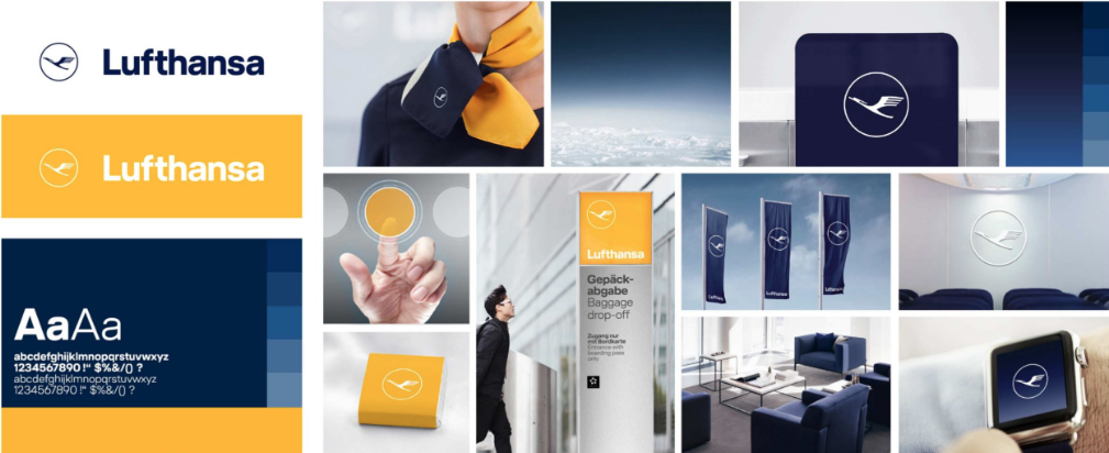
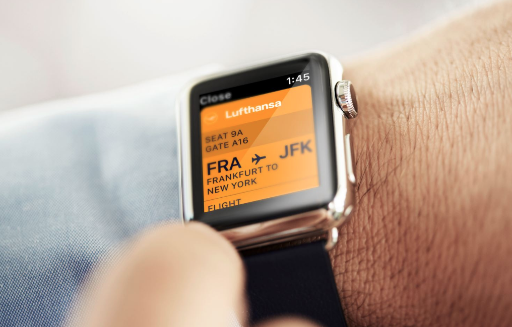
The renowned German airline recently announced a rebranding to better leverage its strengths in a digital world. The classic Lufthansa livery has been updated with a tailfin featuring a white logo on a deep blue background, without the brand’s yellow accent around the symbol. The plane’s grey underbody has also been changed to white. Otherwise, blue reigns dominant with the orange/yellow taking a more subordinate role. The redesign, especially the livery refresh has received a lot of negative feedback. The absence of the yellow on the plane has prompted comments including, “bland and pointless”, “design belly flop” and “It opts for a corporate blue that comes straight out of a late capitalist nightmare.”. Most are focusing on the plane branding which admittedly is more conservative with no pop of color. The other limited potential application all seem smartly executed with yellow playing an important secondary color role. We side on the positive with this refresh. Given Lufthansa’s track record with first rate identity and marketing creative, the changes seem to be in line with the move to digital. Mourning the loss of Lufthansa yellow seems both premature and a bit silly. Strategic change can be a good thing…


