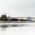

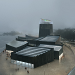
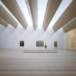
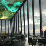
Winning design for the Guggenheim Helsinki, Moreau Kusunoki Architectes, Paris.
Category: Design
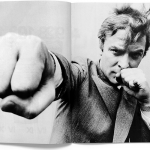
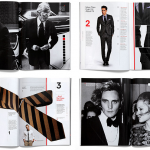
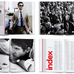
RIP David Bowie


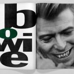


RIP David Bowie. Legendary singer, songwriter, musician, producer, arranger, painter, fashion icon and innovator, 1947 – 2016.
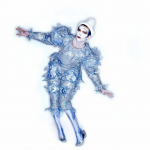
A little wild goes a long way
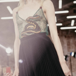
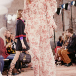
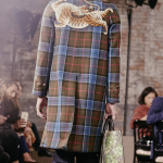
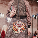
Gucci Cruise 2016
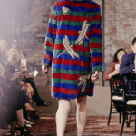
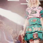
Take that motif and run with it
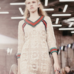
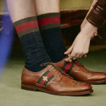
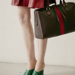
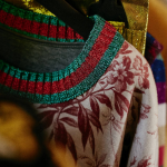
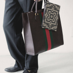
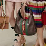
Reworking of the Gucci stripe, Cruise 2016.
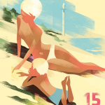
Illustration Spotted: Jennifer Heuer
Illustration SPOTTED. Jennifer Heuer | Illustrator and graphic artist. Jennifer Heuer is a grapher designer and illustrator working out of the Pencil Factory in Brooklyn. She graduated from Pratt in 2004, worked in-house at HarperCollins and Simon & Schuster and now runs her own studio designing and illustrating for a variety of publishers. She’s recently worked with The New York Times; Riverhead; Ecco; Little, Brown; Knopf; W.W. Norton; Scribner; Penguin; Simon & Schuster; Vintage; HarperCollins; Grand Central; Timeout; Random House; Columbia University Press; and Harvard Business Review Press. Jen’s been featured in Print Magazine, Casual Optimist blog, Faceout Blog, and has won a Type Director’s Club Honorable Mention.
Illustration Spotted: Mads Berg
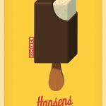
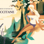

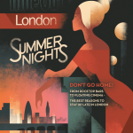
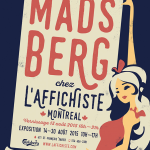
Mads Berg is an illustrator and artist living in Copenhagen. Mads graduated from the Danish Design School in 2001, and since then, he has been working independently as an illustrator. In 2009, Mads was the recipient of the Danish Design Prize followed by the Best Danish Children’s Comic prize in 2010. Mads’ poster art is now represented at the Danish National Design Archives at the Design Museum. His beautifully rendered vintage-inspired work has led to prominent assignments for leading editorial and advertising clients. His impressive client roster include The Washington Post, Time Out, Monocle, Coca-Cola, Fanta, SAS, Toyota, Orangina, Royal Mail, Eskimo-Hansen’s Ice Cream, Carlsberg, Lego and Occitane.
Design as a differentiator
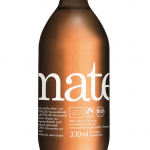
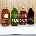
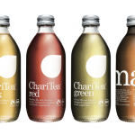
ChariTea and Lemonaid packaging by Swedish agency BVD… Company founded in Hamburg produces organic beverages that both promote fair trade and help to boost social and environmental conditions in supplier communities. Well done all-around. Cheers…
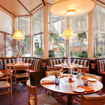
Editorial with flair

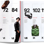
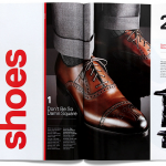
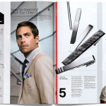
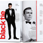
GQ Style Manual by Triboro.
Design that defines the experience
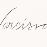
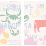
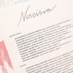
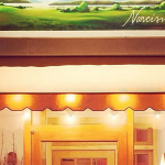

Narcissa identity by Triboro.
Here’s to American architecture

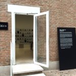
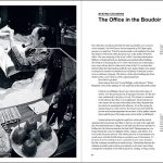
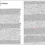
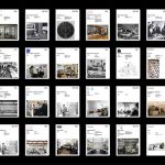
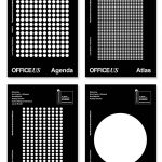

Identity, environmental graphics and publications for the U.S. Pavilion at the 14th International Architecture Exhibition—la Biennale di Venezia designed by Natasha Jen of Pentagram. Designed as a prototype workspace that will research and remake architectural projects from an onsite repository of 1,000 export projects conceived by 200 U.S.-based offices in the last 100 years. The graphic identity for the U.S. Pavilion provides a dynamic visual language built out of the simple efficiency of office culture. The system utilizes the ubiquitous typefaces Times New Roman and Arial, a black-and-white color palette, infographics, and architectural photography. The program includes the design of a series of four publications for the exhibitio— Agenda, Atlas, Manual, and New World published by Lars Müller Publishers, as well as the system of custom-designed binders that will display the 1,000 projects on the walls of the U.S. Pavilion. Again, beautifully realized by the ever-impressive Pentagram….


