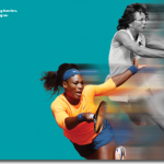
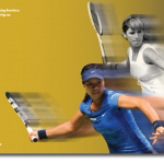
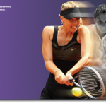
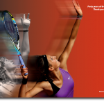
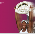
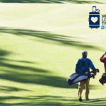
WTA 40th Anniversary ad campaign by Chermayeff & Geismar & Haviv.
Category: Advertising
Simplicity + clarity
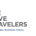

Kellyco@work | AMERICAN EXPRESS GLOBAL BUSINESS TRAVEL (identity). Designed identity for communications and promotional program for renowned financial services and travel company. Program’s focus was to drive loyalty and reinforce to travelers why they should continue to book through American Express. Program also sought to reinforce the company’s market and thought leadership position in the industry across both the service and transactional side of travel, as well as research, consulting and meeting planning services. Applications included print, social media and public relations.
Typography that makes the difference
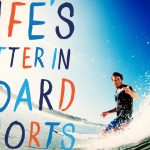
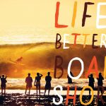
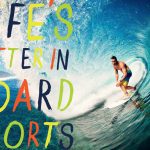
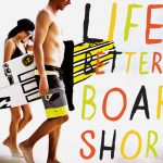
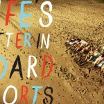
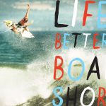
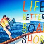
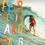
“Life is Better in Board Shorts” advertising campaign for Billabong by Mattson Creative.
Typography rules
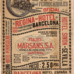
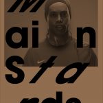
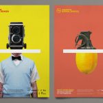
Spanish Railways timetable guide, 1929. Lovin’ the old-school typography.
Short + snappy
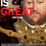
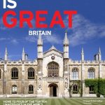
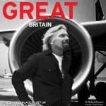
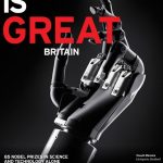
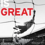
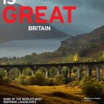
VisitBritain advertising campaign promoting Britain internationally as a place to visit and do business featuring stars from the worlds of sport, entertainment and the creative industries. Agency, Mother.
Execution is golden
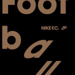
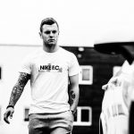
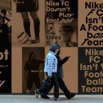

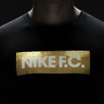

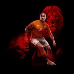
Sem Risco Não Há Vitória…. Without risk there is no victory. Nike ad campaign celebrates 20 years of football with its new Nike F.C. collection to “honor the all-or-nothing approach of athletes” the likes of Luís Figo, Fabio Cannavaro and Ronaldo who all exemplified the style and determination to do whatever it takes to win for their teams and countries. Black, white and gold color palette seems fresh in the world of football colors. Campaign is certainly consistent with the brand’s no pain-no gain style. We’re confident the new line looks like a (global) crowd pleaser…
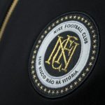
Designed for the win
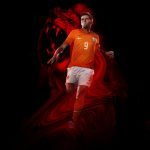
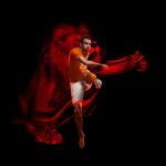

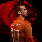
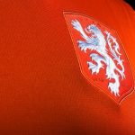
Nike celebrates the 125th anniversary of the founding of the KNVB (Royal Dutch Football Association) with the launch of redesigned World Cup uniforms featuring a striking new crest. An enlarged white lion symbolizes a new era in Dutch football and the team’s core values of simplicity, honor and unity. The lion has been used for the Dutch team since 1907. In the 1960s and ‘70s it appeared as large and free but in black, while in recent times only its head has been shown wearing a crown. The redesigned lion is white and larger, sitting on a traditional crest, representing the pride of Holland and the unity of their players. Nike collaborated with legendary Dutch graphic designer and typographer Wim Crouwel to create a new typeface for players’ names and numbers. The new font has a retro aesthetic reminiscent of the numbers famously seen in football (soccer) in the 1970s. Hup Holland hup…
Clever + inviting
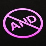
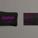
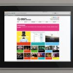
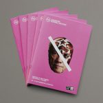
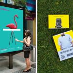
Branding and campaign work for the AND Film Festival in Liverpool featuring new cinema, digital culture and art. Work included brand identity and application across various printed items including posters, festival guide, flyers and teaser stings which were displayed on a huge screen outside Lime Street Station. Bright color palette is both captivating AND oh so happy…
Keep it simple (& fun)


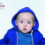


Baby & Me. Latest installation of the Evian Live Young advertising campaign. Photographed by Benni Valsson. Agency: BETC, Paris. Purity, youth, pH-neutral—yeah baby…
Heroic acts


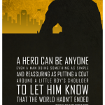
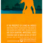
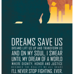
Trust that you’ll find your way. Design of inspirational poster series by designer Adam Thompson pairing superheroes with their own words. A hero can be anyone…


