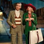
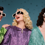
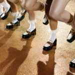
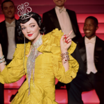
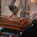
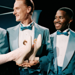
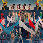
Shot and directed by Glen Luchford, the Gucci Showtime advertising campaign takes inspiration from classic Hollywood films and musicals of the 40s & 50s. Gucci extravagantly celebrates the vivid color, glamour and joyfulness of of the Golden Age of Hollywood. Production values are out of this world, not to mention the unique work of Alessandro Michele. Bravissimo, Gucci…
Author: PaulK
Showtime by Gucci
A new Gucci advertising campaign via Glen Luchford, salutes the beginnings of celebrity culture and the golden age of Hollywood musicals with a spotlight on the joyful and playful spirit of the era. The Spring/Summer 2019 collection by Alessandro Michele is showcased here, with characters impersonating stars from the 40s and 50s. Captured in grand theatres or on movie sets, the images mimic some of the greatest movies of all times including ‘There’s No Business Like Show Business’, ‘Singin’ in the Rain,’ ‘Gentlemen Prefer Blondes,’ ‘Cover Girl’ and ‘An American in Paris.’ The brand continues its lauded successful march forward. All with a joyous vintage wink.
Mailchimp evolves with personality
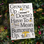
New identity for Mailchimp (by Collins) recently introduced. It’s keeping its logo-cum-mascot Freddie the Chimp (slightly modified), for starters, and using an analog typeface from the 1920s as its new typeface, and illustrating its new brand with a series of almost childlike drawings that look unpolished and rough by design. Mailchimp worked with both internal illustrators and artists from around the world to create drawings with a sense of perspective that’s slightly off-kilter–one that makes them appear like they were drawn by either a famed contemporary artist or a kindergartner. The new identity is both intriguing and polished. Not your typical tech approach to a maturing tech brand. Will be interesting to see how the larger corporate clients and prospects take to the new effort. We say, keep your quirky on, be yourself, Mailchimp.
Bright, happy air travel
Brand identity for London Luton Airport by Ico Design. The new identity included a commissioned typeface and icon set designed by Atipo.
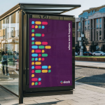
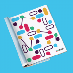
Slack moves on
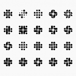
New brand identity for Slack (by Pentagram partner, Micheal Bierut) recently introduced. First rebrand since start-up. Cleaner, more distinctive, more consistent in wide range of applications (old brand identity was all over the shop!). And just before an IPO. “We’re more than group chat. We’re the future of group work.” A lot of opinions flying around out there, but from our POV, solid strategic thinking and execution for a bigger brand proposition. Forward you go, Slack.
The almighty poster design
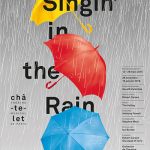
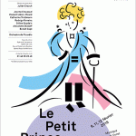
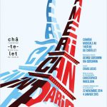
Poster series design for Châtelet Musical Theater of Paris by Apeloig.
Contemporary energy
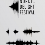
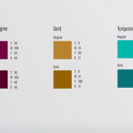
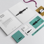
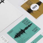
Identity for Nordic Delight Festival, a festival dedicated to the culture of Northern Europe. The festival features Scandinavian pop music, movies, stand-up comedy, fashion and design. Earthy and cool simultaneously.
The symbol is enough
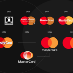
Mastercard has decided to remove its name from its logo, using only the symbol of red and yellow intersecting circles on all cards, advertising, digital, marketing initiatives and at physical and digital retail payment points. The subtle but important identity refresh by longtime Mastercard design firm, Pentagram, follows the credit card’s full rebrand two years ago. Following two years of research, Mastercard found that more than 80 percent of people recognized the Mastercard symbol without the name. Consequently, the company was ready to take this big step in brand evolution joining a small stable of brands like Nike, Apple and Target that rely on an image and not a name in all marketing communications. Yes, simplicity is a good thing. And yes, the world has embraced symbols and icons big time! We’ll see if it is a passing trend or just the beginning of what’s to come. Like many things, not for everyone…
Bold turquoise
Pop of Lachapelle
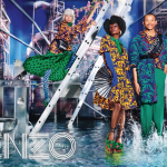
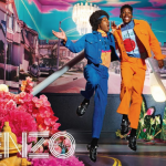
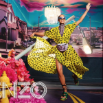
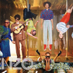
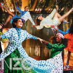
Kenzo Spring/Summer 2019 advertising campaign featuring Carol Lim and Wendy Leon. Photography by David LaChapelle.
