
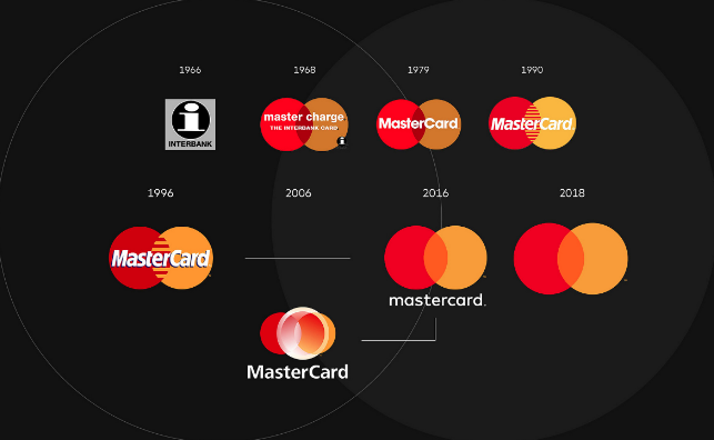

The symbol is enough
Mastercard has decided to remove its name from its logo, using only the symbol of red and yellow intersecting circles on all cards, advertising, digital, marketing initiatives and at physical and digital retail payment points. The subtle but important identity refresh by longtime Mastercard design firm, Pentagram, follows the credit card’s full rebrand two years ago. Following two years of research, Mastercard found that more than 80 percent of people recognized the Mastercard symbol without the name. Consequently, the company was ready to take this big step in brand evolution joining a small stable of brands like Nike, Apple and Target that rely on an image and not a name in all marketing communications. Yes, simplicity is a good thing. And yes, the world has embraced symbols and icons big time! We’ll see if it is a passing trend or just the beginning of what’s to come. Like many things, not for everyone…


