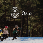
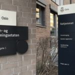

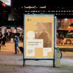
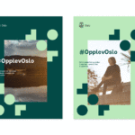


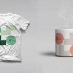
The city of Oslo welcomes a new visual identity with a simplified logo and identity system inspired by the city’s architecture. The comprehensive identity refresh by agency Creuna is intended to better communicate what the city provides to residents and how it works. The city’s logo has been redesigned for the first time since 1924 with a simplified St. Hallvard, the city’s patron saint. The new logo is better suited for small usage and digital use. The overall design system features three basic shapes which were inspired by architectural details found at many of the city’s landmarks like Oslo’s City Hall, the Vigeland Sculpture Park or its industrial Barcode district. Collectively, the shapes cleverly come together to form the word “Oslo”. There is also a new color palette inspired from Oslo’s cityscape, as well as a custom typeface, Oslo Sans. New distinctive illustrations provide another key component to reinforce the overall visual identity and design system. A new set of icons support the new system with a distinctive presence, whether online, in signage or diverse city communications. In short, a smart and beautifully realized identity program. Congratulations to all those involved. We hope to see it all one day soon.
Author: PaulK
Celebrating magazines’ finest


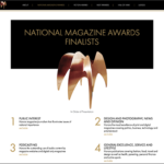
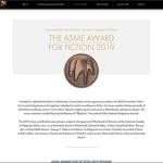
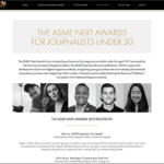
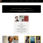
Kellyco@work | ASME Ellie Awards (digital, content development). Website design for National Magazine Awards (Ellies) for the American Society of Magazine Editors (ASME). Site included award finalists and was dynamically updated during annual event to highlight winners. Also included the ASME Award for Fiction 2019, the ASME Next Awards for Journalists Under 30, and Hall of Fame winners. Site was also designed to accommodate paid sponsorship as needed.
Identity matters


Brand identities by Massimo Vignelli.
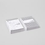
Essentially black & white
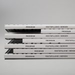

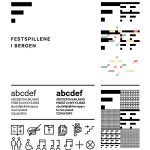
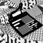


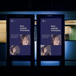
Visual Identity for Bergen International Festival, an annual international music and cultural festival in Bergen, Norway. Designed by Creative Endre Berentzen and Eric Amaral Rohter.
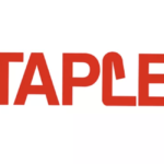
Staples rebrand falls flat

Rebranding Doyle Dane Bernbach
A fascinating look at the recent rebrand of the advertising giant, DDB (Doyle Dane Bernbach. The identity refresh is true to DDB’s extraordinary heritage and legacy, reflecting its classic approach with innovative thinking that salutes its storied past and an exciting and increasingly digital future ahead. The agency’s full name, Doyle Dane Bernbach, is retained within the redesigned mark in contrast to most agencies’ move to acronym of former principles’ names. The agency smartly retains the legacy of its founders who remain as two of the most celebrated figures in the history of advertising. We applaud the modernized identity and creativity demonstrated in this introduction. It will clearly serve as a flexible platform from which great creative work will undoubtedly flow.
Blush pink

Community + technology


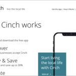
Kellyco@work | CINCH (brand identity, digital, promotion, social media). Designed new brand identity for consumer payment app that brings together residents, locally-owned businesses and local causes to foster meaningful community growth. Site content and design had goal of both reaching targeted consumers, as well as businesses. Tagline was also created following a series of user focus groups on brand perception. Promotion materials, presentations and social media standards were also developed.
McKinsey’s elegant refresh
McKinsey, the global management consulting firm has recently introduced a refreshed brand identity. The renowned consultancy that advises on strategic management to corporations, governments, and other organizations looks to better define its services along with its current philosophy. While most businesses have experienced significant change in the last five years, change for McKinsey has been especially extreme transitioning from big corporate strategic consulting to substantially more work in digital, analytics and design. The firm’s logo itself has not changed drastically (two lines vs. one line). Everything else seems to have either changed dramatically or evolved more subtly. A new approach to photography, data visualization, color palettes, fonts and other graphic elements give the brand an important new fresh point-of-view. A deeper blue is paired with white space to deliver high contrast and dramatic effect. Overall, it is a beautifully-executed, sophisticated refresh that demands attention and instills confidence.
Say it is forever


Recently introduced redesigned “LOVE” stamps for U.S. Postal Services. Antonio Alcalá, art director; Jessica Hische, illustrator; Studio A (Alexandria, VA), design firm. Now someone just needs to redesign the post office itself.


