

Staples rebrand falls flat
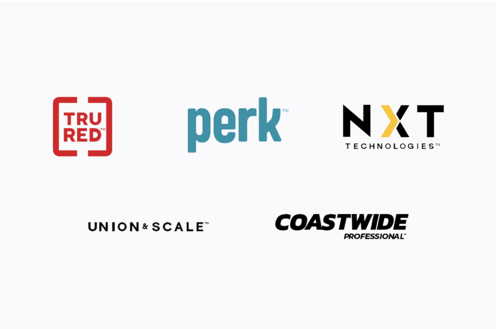
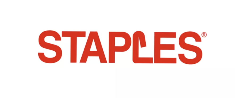
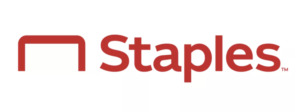
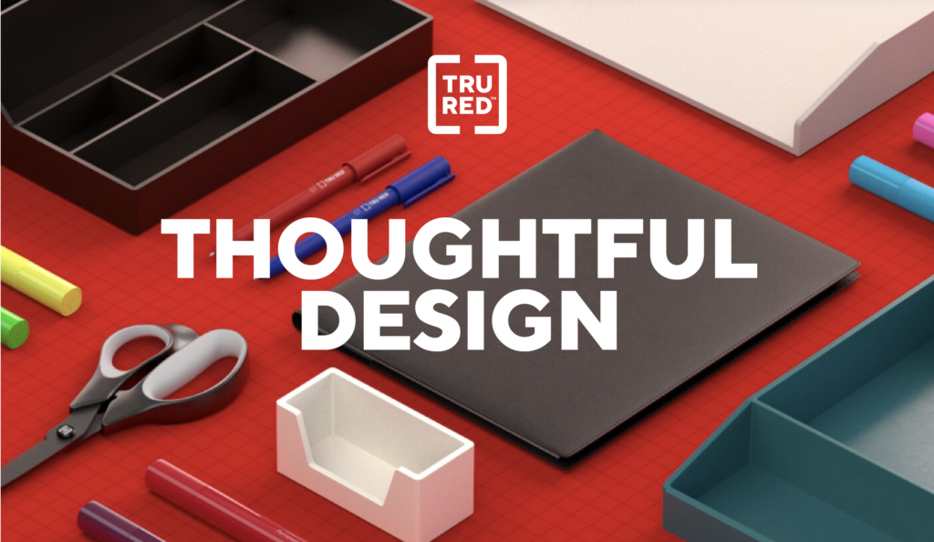
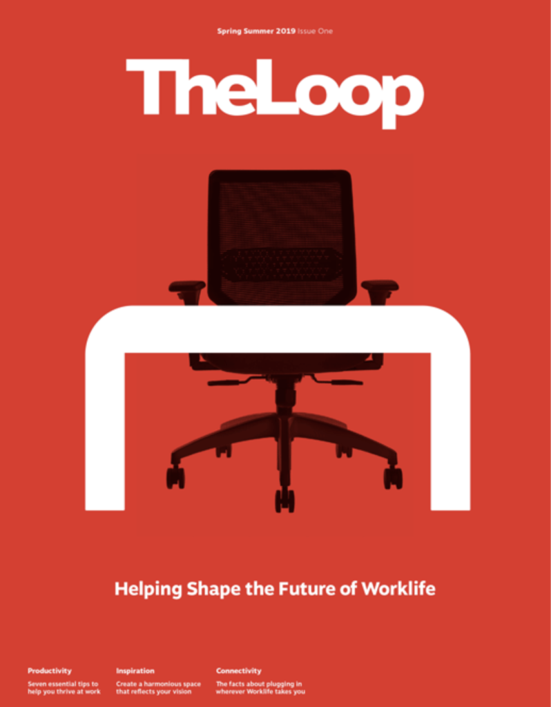
Staples recently presented its rebranding. The logo has been redesigned including a staple icon that also can represent a desk. The logotype has moved from all caps to upper and lower case. As part of the brand refresh, the company introduced five new internal brands including Tru Red, for notebooks and pens, Nxt Technologies, for internal tech services, Coastwide Professional, which provides facility supplies, Union & Scale, a furniture collection, and a soon-to-be-released brand Perk, which will sell products for office breakrooms. Staples also created a new guide on its products, called The Loop. To market the new offerings and branding, the chain, which is now using hashtag #WorklifeSolutions, is rolling out new social media pages on Twitter, LinkedIn, Instagram and Facebook. While we see the rationale for a rebrand, this one seems very middle-of-the-road at best. The logo refresh seems adequate at best. The brand extensions do not really work to help the parent brand at all. Applications of the new branding are largely uninspired. Suspiciously missing are any store changes that would be the most likely vehicle to highlight a major brand refresh introduction. During these challenging times and with the mighty Amazon gaining market share in just about every category imaginable, rebrands really matter.


