
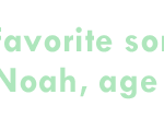


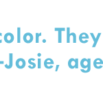


J. Crew (under renowned chairman and retailer wizard, Mickey Drexler) introduces its Spring 2013 Crewcuts collection. In addition to cute clothes for the little one in your life, you have to admire the clean, crisp and catchy marketing this line has delivered since its inception. Visuals are always bright, active and engaging. Photography and copy follow suit and are consistently both approachable and fun. The new season’s video is also adorable with kids answering questions on color and inspiration behind the new collection. And we’ll agree with Noah. Lime sorbet is pretty awesome…
Month: March 2013
Spring into promotion mode… Barneys New York launching their spring season with two promotional videos (mens and women) under the direction of photog/filmmaker Barnaby Roper with Barneys New York Creative Director Dennis Friedman. Seems to be inspired by highly lauded Prada Real Fantasies lookbooks and companion videos. Both Barneys videos feature animated illustration mixed with a single model outfitted in spring’s latest and greatest. We certainly love the lightheartedness and energetic mix of cartoonish, almost superhero graphics. Using Liveclicker technology, the video player features “shop all” buttons– one leading to an interior page with all video merchandise and another off the share button cleanly displaying products in a neat and tidy band over video image. Products worn in any particular sequence are more prominently featured below player. Share and embed options complete the well-dressed season launch. Who said e-commerce had to be down and dirty without any imagination and style? Bravo Barneys…
(Source: https://www.youtube.com/)
Welcome Uniqlo

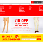

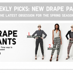


Uniqlo, the Japanese clothing giant, has always held both innovation and design as core components of its brand identity. The launch of the U.S. site last fall pushes its affordable, yet stylish minimalism with a healthy dose of the latest in dynamic and responsive site design out into the very competitive mass market apparel industry. The new site is structured more like a Tumblr blog vs. your typical apparel or retail site. The catalog or magazine-influenced layouts that have dominated the retail category are nowhere to be found with a long scrolling homepage, highlighting both the latest promotional efforts, as well as regular site features. Graphics and copy are bold and pared down, allowing easy movement from the desktop computer to tablets and smartphones. It all looks and smells like the next generation of online mass marketing to us…

Rei Kawakubo… Photograph by Irving Penn. Published in Vogue, March 1993.

Pared-down, Swedish-style.
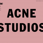


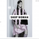

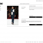

Site SPOTTED. Acne, a Swedish fashion collective stands for Ambition to Create Novel Expressions (not the adolescent skin condition). Founded in Stockholm in 1996, Acne Studios is a clothing company, a production company, an advertising agency, and a publisher with one of the coolest print magazines on the market, Acne Paper. Acne markets and communicates exclusively through its own media (website, print, video). Like almost all things Scandinavian, its site presents the clothing line in a classically pared-down approach. Photography is a mix of runway shots, silhouettes of fresh-faced models or simple product images. Typography is clean and tasteful with a small dose of boldness. Descriptive or promotional copy is minimal. Navigation is straight-forward. E-commerce and customer service pages are both concise and reassuring. Skinny jeans aside, if you are looking for the minimal chic thing for wardrobe basics, think Acne…
Minimalism meets craftsmanship

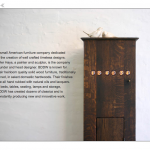


Site SPOTTED. BBDW, is a small American furniture company owned by Tyler Hays, a painter and sculptor. Each piece of BBDW furniture is built by hand in the company’s Brooklyn studio. Their web presence reflects both their high level of craftmanship and a minimalist approach to design. Beautifully styled photographs against a clean white background dominate the site. Minimal description and navigation queues easily guide the visitor around this artfully imagined site. If you’re finally ready to take the plunge into adult home furnishing and love the idea of warm, natural American craftmanship meets modern styling, BBDW could be a good match. All solid investments for a well crafted home life…
Chilly cool
Underpass, a film for Dior Homme, by Willy Vanderperre. The well-shot if not slightly haphazard short film (promoting Spring/Summer 2013) establishes a feeling of the sublime with its multiple deserted underpasses cut along with the atmospheric “How Does It Feel?” by British psychedelic rock band Spacemen 3. If discipline comes at some cost to accessibility, it’s a tradeoff you imagine the designer, Belgian Kris Van Assche, would approve. These are clothes to be worn seriously—or maybe enlisted in. Right in line with the honed brand image that Dior Homme has cultivated for years…
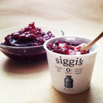


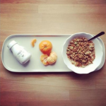
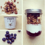
Product photography… Distinctive & engaging. Photos used on Facebook and other social media often lacks any kind of impact. Companies and brands often pull disparate imagery missing an opportunity to both tell a story and support the bigger brand picture. Our favorite new-school yogurt Siggi’s does an amazing job with simple setups and simply lovely composition. Comforting, aesthetically pleasing and downright appetizing. Snacktime…

Catch the bug… Jonah Berger, whiz kid marketing prof at Wharton School, details 6 criteria for why things go viral. It makes for an entertaining read, but does not necessarily tread new waters in the world of marketing and advertising. Pretty obvious that exclusivity makes an object desirable and that attaching emotions to a concept can make it more appealing. We do like the bright orange cover and simple design, but for a more nuanced take on social epidemics, may be better off reading Malcolm Gladwell’s The Tipping Point. Not sure that Contagious will go viral…


