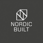
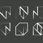

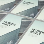
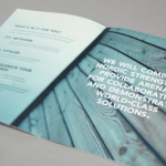

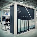
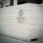
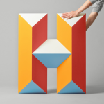
Identity and exhibit design for Nordic Built. A solid, cohesive design platform for the construction development organization.
Author: PaulK
Autumn rust

#d67a29 (prettycolors)
Smart craftsmanship works
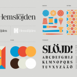
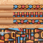

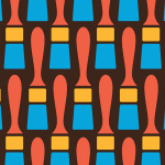
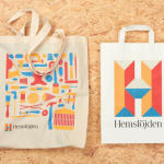
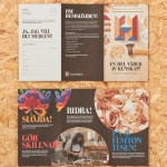
Identity design for Swedish Handicraft Association by SNASK.
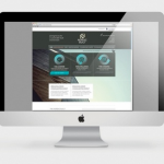
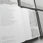
Designing for data

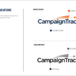
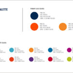
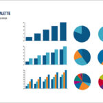

Kellyco@work | CAMPAIGNTRAC (brand identity, digital design and content development). Created identity and website for cloud-based data platform for data marketing firm. Developed both design and marketing content for new data service for agency media and marketing users, enabling prospect development, campaign management, tracking and analysis.
The art of making money
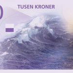
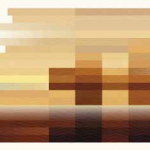
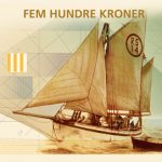
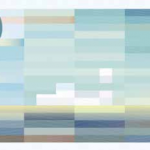
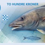
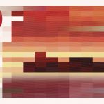
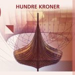
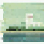
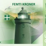
Not your average bill… Norway’s new currency design, with front side designed by The Metric System featuring variations on the theme of “The Sea” and the required security elements, while the backside designed by Snøhetta renders images from the Norwegian coastal landscape with the amount of distortion depicting wind speed in a mosaic pixellated form. The notes will increase in length with the denomination. Simply brilliant and wouldn’t it be a pleasure to spend (or save) a lot of these? Oslo anyone…
Art to promote
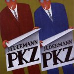
Poster design for the clothier PKZ, Otto Morach, 1928.
Looking to vintage to inspire
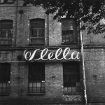
Signage design. Simple old-school perfection.
Rebrand of global giant is just golden
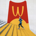
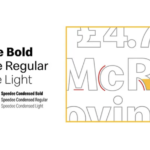
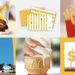
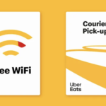
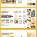
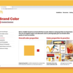
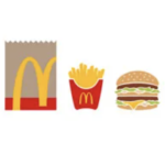
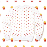
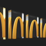
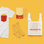
A recent rebranding for the mega global brand McDonald’s was just introduced. Although the logo itself remains unchanged, the scale of the brand refresh is significant and far-reaching. Color usage was dramatically reigned in with a substantial new focus on the “golden arch” yellow. Photography moved to more contemporary, active shots depicting more at home and on-the-go along with more carefully art-directed in restaurant scenerios. Branding firm, Turner Duckworth also introduced a bold, creative use of the renowned Golden Arches. A new set of flat-design icons featuring a range of McDonald’s menu times was also created. Patterns were also developed for both digital applications and branded apparel. Finally, a new typeface, Speedee, was designed, inspired by the Golden Arches and the brand’s wordmark. Intended to streamline the use of multiple fonts, it is friendly, accessible and flexible in all applications, especially digital. We have only praise for this effort. It brings a new vitality to an overly complicated and unmemorable brand identity. Now, let’s get some of those fries!
Content matters
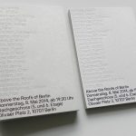
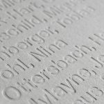
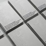
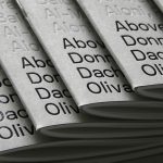
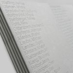
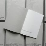
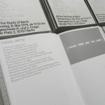
Above the Roofs of Berlin, exhibition catalog design by Neubau.
Another refresh for the digital world

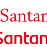
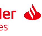
Santander, a leading bank based in Boston, recently introduced a significant rebranding initiative. The longstanding flame symbol have been revisited with a modestly reworked version designed for clarity and diverse applications including digital. New typography is also a welcome change to the bank’s identity. A new sans serif now sits next to the redesigned symbol. A full family of fonts were created for Santander’s marketing efforts. The application of these typefaces across applications delivers much improved consistency while supporting the new logo. Photography standards were reexamined and new emphasizes more active shots projecting both busy lives of customer and an optimistic viewpoint. New color icons add some interest with simple red versions offer flexibility with applications. Overall, this refresh delivers on digital-friendly simplicity as well as a nice evolution toward a more modern, friendly brand presentation. Kudos to the well orchestrated effort…


