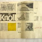
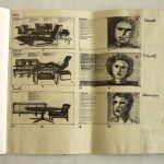
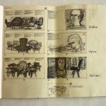
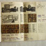
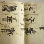
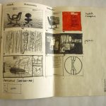
Design sketches for Knoll au Louvre exhibition catalog. The Vignellis designed the Knoll au Louvre exhibition which was held at the Musee des Arts Decoratifs in the Pavillion de Marsan in 1972. The Vignellis also designed the catalog for the exhibition. Photography by Herbert Matter.
Author: PaulK
Envy green

#5da265 (prettycolors)
Designed for the win
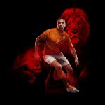
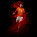
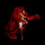

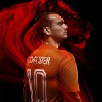
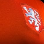
Nike celebrates the 125th anniversary of the founding of the KNVB (Royal Dutch Football Association) with the launch of redesigned World Cup uniforms featuring a striking new crest. An enlarged white lion symbolizes a new era in Dutch football and the team’s core values of simplicity, honor and unity. The lion has been used for the Dutch team since 1907. In the 1960s and ‘70s it appeared as large and free but in black, while in recent times only its head has been shown wearing a crown. The redesigned lion is white and larger, sitting on a traditional crest, representing the pride of Holland and the unity of their players. Nike collaborated with legendary Dutch graphic designer and typographer Wim Crouwel to create a new typeface for players’ names and numbers. The new font has a retro aesthetic reminiscent of the numbers famously seen in football (soccer) in the 1970s. Hup Holland hup…
Austrian Airlines identity refresh for digital age
Austrian Airlines is joining many other companies in rolling out a refreshed brand identity including a new more digital-friendly logo and design system, all to debut in May. Part of the redesign will include a new livery with the new Boeing 777 OE-LPF making its debut appearance with the refreshed identity in Vienna in May. Repainting the fleet is set to be completed over the next seven years. While we have yet to see any plans for advertising or marketing efforts to be reimagined with the new brand approach, these changes all seem positive. Clarity for digital and a move to a bolder, more visible mark all are solid steps for most brands today, especially for a commercial airline with so many consumer touch points. Hopefully all for more than just efficiency. Happy travels…
Tap into the brand’s voice
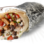
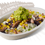
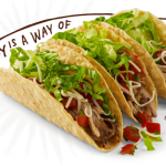
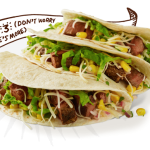
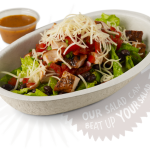
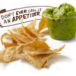
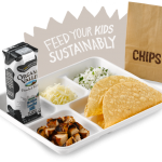
Chipotle menu items with illustrated copy. Casual. Tasty. And downright nutritious. We’re big fans, but not addicted. Branding included…
Promoting the big event

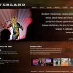
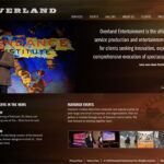
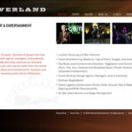
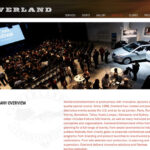
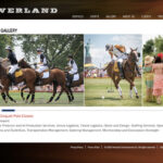
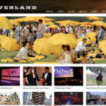
Kellyco@work | OVERLAND ENTERTAINMENT (identity, website design, social media, graphic design). Developed identity program and designed website for leading corporate event and entertainment company. Collaborated with client to identify and leverage company’s rich inventory of marquis event profiles and visuals. Content management system was developed for ease of update and additions.
Clever + inviting
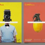
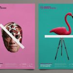
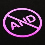
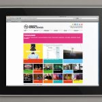
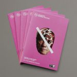
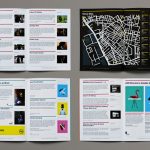
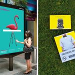
Branding and campaign work for the AND Film Festival in Liverpool featuring new cinema, digital culture and art. Work included brand identity and application across various printed items including posters, festival guide, flyers and teaser stings which were displayed on a huge screen outside Lime Street Station. Bright color palette is both captivating AND oh so happy…
Saluting a master
Google and their eclectic homepage graphics (aka Google Doodle) salutes legendary American graphic designer and filmmaker, Saul Bass. Bass was best known for his cinema title sequences and movie posters, working with such directors as Alfred Hitchcock, Stanley Kubrick and Martin Scorsese. Bass is also known for his successful corporate identity work including, Bell Telephone, Alcoa, Avery International, Dixie, Frontier Airlines, United, Continental, Frontier Airlines; North American Rockwell, Hunt Wesson, Quaker, Alcoa, Lawry’s, Saturday Evening Post, Warner, Minolta, The United Way and the Girl Scouts. Saul Bass’ work is timeless and has gone on to inspire many other great designers and illustrators and has won the admiration of diverse film and design communities. The animated video showcases some of his best work from a prolific Hollywood career which spanned five decades. Bass title sequences included Hitchcock’s Vertigo (1958), North by Northwest (1959)and Psycho (1960). His work also included Spartacus (1960), West Side Story (1961), The Shining (1980), Goodfellas (1990), Cape Fear (1991)and Casino (1995). So stylish, clever, classic and always inspiring. Thanks and happy birthday, Saul…
Keep it simple (& fun)


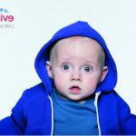


Baby & Me. Latest installation of the Evian Live Young advertising campaign. Photographed by Benni Valsson. Agency: BETC, Paris. Purity, youth, pH-neutral—yeah baby…
Historical meets modern
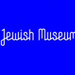
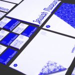
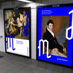
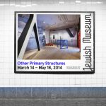

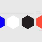
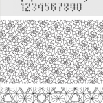
Graphic identity for The Jewish Museum designed by Sagmeister & Walsh. The new graphic identity, being implemented throughout the Museum’s building, digital, and print materials, reflects the Museum’s commitment to exploring art and Jewish culture, historical and contemporary, while infusing it with an up-to-date sensibility and a global perspective. Visuals are based on a series of grids and patterns derived from the same geometric systems as the Star of David, the Flower of Life and Metatron’s Cube. The origin of this geometry goes back to the belief that God created the universe according to a geometric plan. Its roots are in the study of mathematics, and many forms in nature can be related to this geometry. The primary color palette is black, white and blue. The blue is inspired by Tekhelet, a dye cited in the Hebrew bible and an important color in Jewish culture. A new website launches in June 2014, balancing aesthetics and functionality while serving the growing digital needs of the institution and its diverse audiences. Distinctive, sophisticated with just the right touch of modernity and mass appeal. Mazel tov…


