The new world is flat
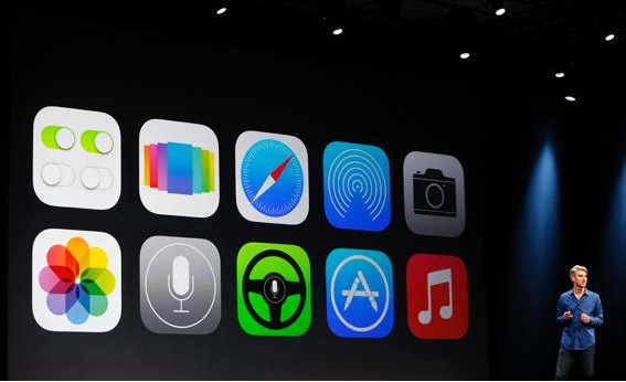
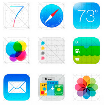
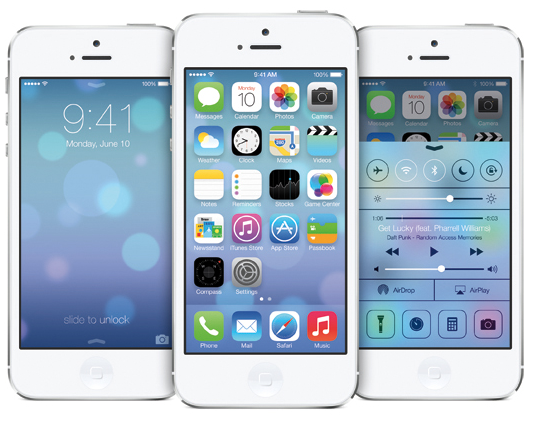
It’s goodbye to faux wood, felt and metal as Apple unveils a sleek new UI design for iOS 7 under the direction of celebrated Apple design chief Jonathan Ive. The new iOS 7 was unveiled today at Apple’s World Wide Developer Conference in San Francisco after months of speculation that Ive and team was about to ditch its increasingly outmoded attachment to skeuomorphism and move to a clean, flat color version already taking the industry by storm (i.e. Microsoft Windows 8 prodded along by superstar design firm Pentagram). A new tech minimalism is definitely well on its way. These may sound like small tweaks, but they combine to make iOS look elegant and grown-up. The design now feels like it belongs on a touchscreen. As Apple states, the higher purpose is to create “an experience that is simpler, more useful, and more enjoyable”. New features such as Control Center (organizes your most used apps), AirDrop (send photos faster vs. having to text or email), enhanced camera capabilities, better photo management and smarter multitasking were also announced along with the redesign. It’s all good but, should be interesting to see how this translates to the next generation of mobile devices (they have to have something up there well-endowed sleeves). Gotta love all the big boys embracing simplicity. Now, all we need is a cooler phone. We’re rooting for you, Jony…

