Mailchimp evolves with personality
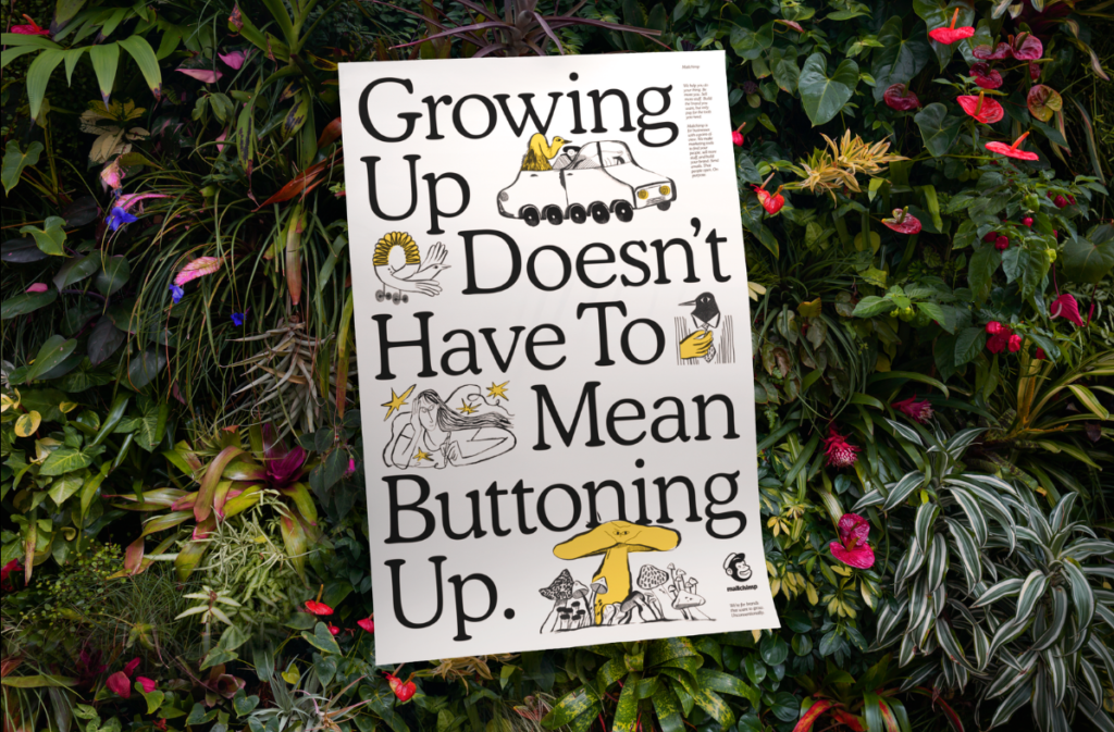
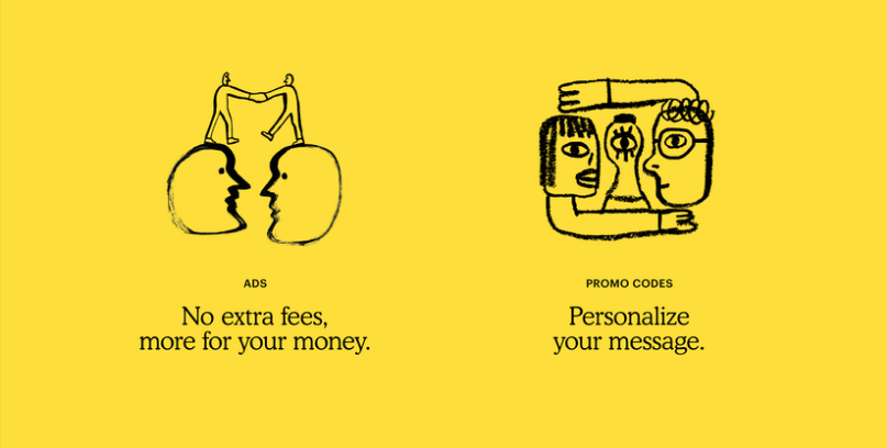
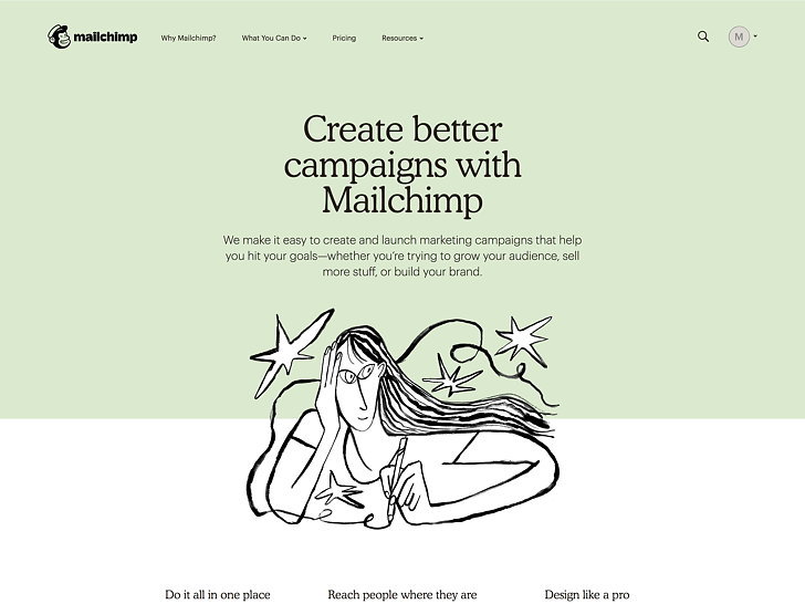
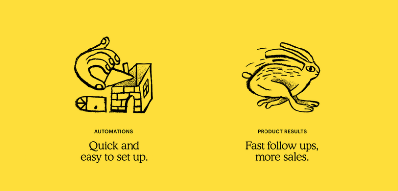
New identity for Mailchimp (by Collins) recently introduced. It’s keeping its logo-cum-mascot Freddie the Chimp (slightly modified), for starters, and using an analog typeface from the 1920s as its new typeface, and illustrating its new brand with a series of almost childlike drawings that look unpolished and rough by design. Mailchimp worked with both internal illustrators and artists from around the world to create drawings with a sense of perspective that’s slightly off-kilter–one that makes them appear like they were drawn by either a famed contemporary artist or a kindergartner. The new identity is both intriguing and polished. Not your typical tech approach to a maturing tech brand. Will be interesting to see how the larger corporate clients and prospects take to the new effort. We say, keep your quirky on, be yourself, Mailchimp.

