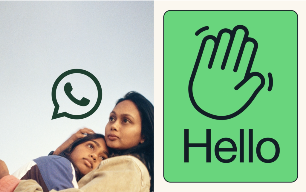
WhatsApp looks to new identity for a better user experience (and marketing)
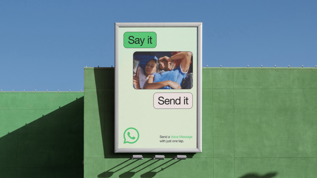
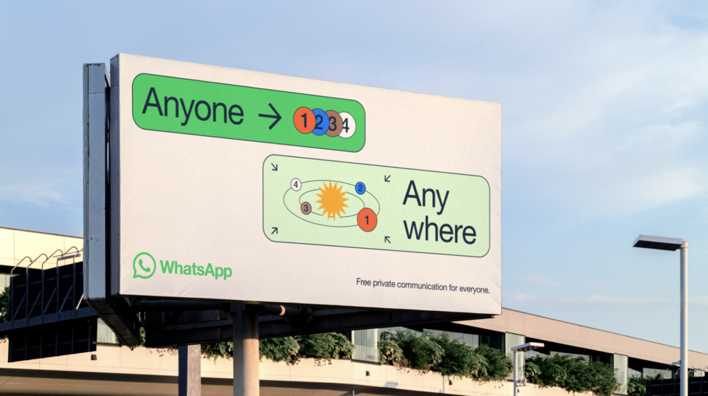
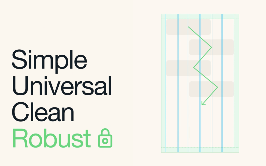
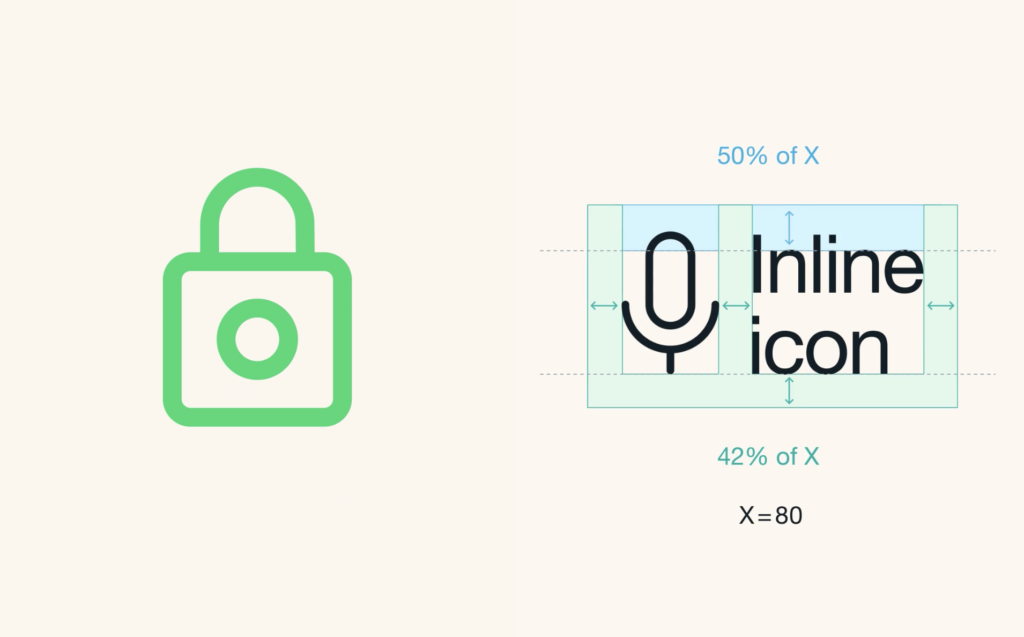
New design for WhatsApp which further blurs the line between product experience and marketing. Overall concept is “forward”, aspiring to deliver a more accessible robust experience for WhatsApp’s 2 billion+ users. A new extensive color palette is employed across different touchpoints, complementing the brand’s primary color, WhatsApp green. Dark mode settings are also effectively addressed. The primary graphic element, graphic modules housing messaging and content become flexible blocks for a broad range of storytelling. Classic Helvetica Neue is used as the primary font which provides clarity and a very clean modern aesthetic. The use of a thin black stroke around the rounder-corner boxes that house all of the content is both functional with different backgrounds, as well as a design-forward device.. Design firm, Koto has successfully delivered a needed reimagined app design for the Meta (Facebook) product. Bravo on all accounts.


